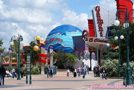
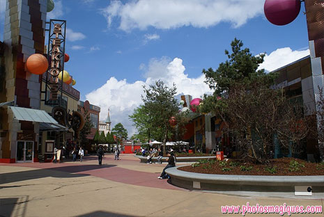
You might be rubbing your eyes in disbelief (or at least hayfever) as you stroll toward Disney Village this Summer. Because, this once famously dank and industrial entertainment district has turned a new leaf. We saw the work begin and progress start to be made, and now we can see it in bloom for the first time…
At least 8 new planters and over 30 large new trees have suddenly transformed the space into a welcoming, green, human environment. Each planter automatically serves as a new place to sit and watch the bustle of the Village pass by, whilst breaking up the expanse of buildings and that unforgiving, minimal industrial architecture of the original build.
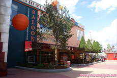
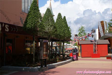
Most thankful for the changes is sure to be Billy Bob’s Country Western Saloon, now surrounded by customised planters with stylised, pruned trees and a fully-covered terrace complete with heavy wooden furniture. Suddenly, the bar is modern and appealing — but not without a little Western charm.
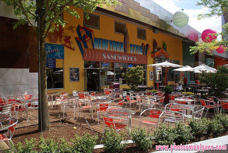
Equally transformed by a new terrace is the other side of the street, outside Sports Bar and New York Style Sandwiches. Here, a fantastic thin, curved planter encloses a wooden-decked terrace complete with trees and shrubs. The red Coca-Cola chairs add a splash of colour outside the Sports Bar, whilst trendy wooden parasols on the customised New York Style Sandwiches-branded tables make the space ever more modern and human.
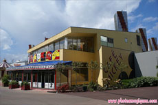
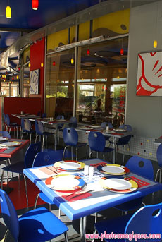
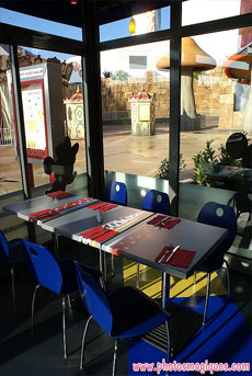
At the far end of Disney Village, Café Mickey now has an increased capacity for the Summer thanks to its fully-enclosed terrace, functioning as a full extension to this, the most popular restaurant. The curved glazing wraps around the front of the building with several regular doors and several patio-style doors which slide open, all decorated with white and silver branding with red Café Mickey logos.
The blue, white and red decoration around the roof still appears to be as flimsy and creased as when we thought it was a temporary decoration during construction. Against the yellow of the actual building, it all adds up to looking like a circus tent or a poor ‘Dizneeland’ imitation of the original Café. Not great when you see the prices on the menu that apply equally here.
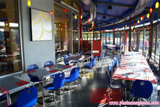
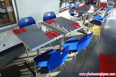
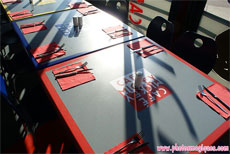
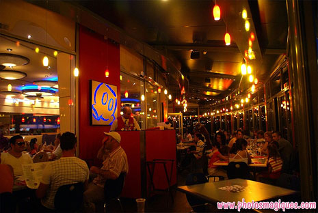
Inside, you might think the primary colours and modern furnishing look like something straight from IKEA, but don’t judge just yet. Look a little closer and you’ll see there is actually a nice attention to detail here. Tables are decorated with dalmatian spots, Minnie Mouse polkadots and contrasting Café Mickey logos. Portraits of Mickey Mouse body parts on the walls are illuminated from behind.
Tiles surround the bottom of the old exterior wall, dotted with several red, yellow and blue colours. From here, you get a great view across the lakeside of Disney Village and PanoraMagique.
Admittedly, the terrace doesn’t quite have the same warm feel or spacious round tables as the original restaurant area. You might feel a little cheated if you were seated here and paid the same price for your meal. But, as a Summertime overflow area, it already seems to be serving its purpose well. And, once Chef Mickey arrives, no-one cares about anything else.
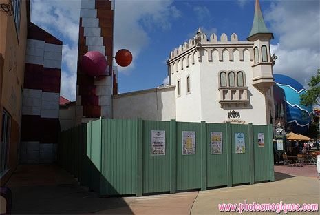
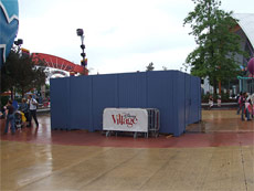
Similar expansion plans now also appear to be afoot over at King Ludwig’s Castle. Designed and built by EDLI (the Paris branch of Imagineering) for the German beer firm which owns and operates it, the restaurant appears to be building a more permanent terrace of its own. The space which used to simply host a few tables and chairs — plus the red carpet leading into the restaurant — has been surrounded by construction fences for several weeks now.
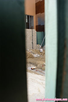
Behind, movement is slow and no visible progress has yet been seen, even in the latest photos from the past few days. Foundations and a new brick wall were certainly spotted by Photos Magiques on 22nd June, however.
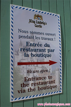
The restaurant of course remains open throughout the works, with the entrance instead through the medieval boutique — as highlighted on the sign (above). Notice the background there? That’s Neuschwanstein Castle in Bavaria, from which Le Chateau de la Belle au Bois Dormant took much inspiration.
Photos: Disneytheque.com
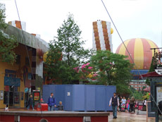
Finally, the erasing of the past. When Frank Gehry envisaged a giant “open air warehouse”, held up by giant steel pylons made out of scaffolding, did he know they’d be erased so brutally? The concrete bases of the old pylons have been lying around for several years now, serving no purpose other than to have their paint worn away within a few months, and so it’s a real pleasure to see the money finally spent on removing them for good:
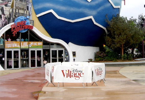
Photo: Scrooge, Disney Magic Interactive forum.
At least three have now been replaced by appropriately-coloured concrete flooring, whilst a couple which fall inside one of the new planters have actually been kept for use as small performance stages during special events.
In fact, it transpires that these trees and planters were intended to be implemented as early as 2005, when Karl Holz joined the resort and was apparently quite horrified by what he saw here. Alas, money did not allow it — until now. Thanks Karl & co, we no longer have to pretend Disney Village doesn’t exist when we dream of the magic. In fact, on a warm Summer’s day, those cafés and terraces suddenly seem quite tempting.
Now, about replacing the rest of that concrete floor…
[Photos: Photos Magiques (more), Disneytheque.com, Scrooge]
