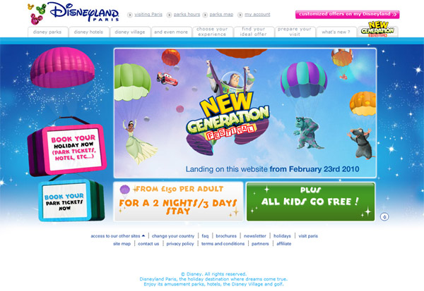
Yes, it’s finally goodbye to this…
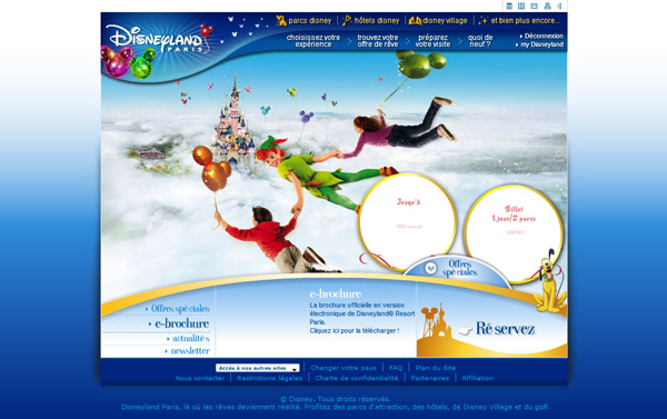
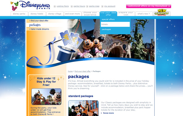
And hello to this…
The change is radical in some places — not only are pages finally allowed to “breathe” with a wider format, but the Disneyland Paris resort logo has finally thrown off that curvy corner enclosure it’s been stuck inside-of in so much print and advertising since as far back as 2002. Unfortunately, it retains three unnecessary balloons from the outgoing Mickey’s Magical Party design theme.
Because yes, in other areas it’s not too different — the menu options remain essentially the same, simply listed all on one line and presented using basic HTML rather than animated Flash as before, a big “no no” for accessibility these days. This replacement, though, currently looks somewhat unfinished, with the two-line options not quite fitting in the boxes and the grey text colour being noted by many people as too light.
And that old dependence on Flash-heavy pages? Still there. The entire home page, including the “book” buttons on the left (which aren’t even animated) are rendered using this animation format, including a musical intro which doesn’t remember your “mute” preference. Perhaps just temporary?
The website pages themselves are exactly the same as before, only having a new background added and the top menu replaced (which has also unfortunately taken away the option to mute some animations):
So far, so disappointing. But there’s hope for the future — thankfully, we’ve heard that new pages are being developed. Perhaps that main box on the new homepage, stating the New Generation Festival is “landing on this website from February 23rd 2010” gives a clue as to when they’ll launch? Only a week left to wait and see.
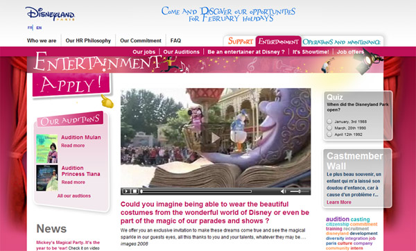
Hopefully they’ve been inspired by another website in the resort’s portfolio — the rather nice Casting website which opened exactly one year ago. Featuring wide pages, clear information and good use of colours, it’s a real pleasure to browse in comparison to the current visitor site:
This site also crucially handles things like navigation and page URLs (addresses) so much better. When the official Disneyland Paris website relaunched in 2006, it introduced a mind-bending array of different domains and sub-domains as you navigate through the site, so that all the UK pages are on a “.co.uk” website separate to the “.fr” site. Within this, pages such as What’s New are located at “news.disneylandparis.co.uk” whilst park information is at “parks.disneylandparis.co.uk”, adding up to a completely confusing way of setting out the website to the end user.
Though this new menu on Disneyland Paris.com has retained the same sections as before, including “Choose your experience” (Experiences?), “Find your ideal offer” (Booking?) and “Prepare your visit” (Plan?), can we expect more than just just a re-dressing of the old pages, and see things be simplified yet further for the user?
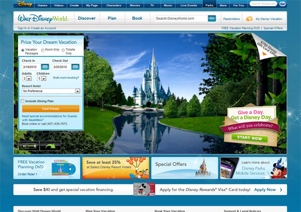
The gold standard for this is the US website for Walt Disney World, which has a wonderfully boiled-down top menu of simply “Discover”, “Plan” and “Book”, not to mention something we’ve never had on the current Disneyland Paris site — a search function.
But, all criticism aside, a quick surf around the other Disney resort websites — particularly California and Tokyo, or the abysmal UK version of the Walt Disney World site — reveals we’re actually not doing too badly. Hong Kong relaunched its website last year with a lovely initial design, but within a few pages you find yourself in the same situation as the current Paris website, with the new menu at the top and an older page sitting uncomfortably below.
Hopefully Disneyland Paris won’t spend quite so long in this web design limbo…
Images © Disney.
