Construction of World of Disney at the entrance to Disney Village really powered through its final months, with Disneyland Paris’ merchandising teams having the new flagship store stocked and ready to open its doors right on schedule for the first time last week. First came the Cast Members, always given the privilege of first previews, on Thursday 5th July, followed by two planned previews for both Shareholders Club members and Annual Passport Dream holders on Friday 6th.
Then, from this Saturday 7th, conveniently the start of the busy summer season when the esplanade in front of the store will be at its busiest with guests walking to and from the parks, the store opened its doors to everyone. This remains a “soft opening” period ahead of the official inauguration this Thursday, 12th July 2012, meaning the store could be closed at any time, but so far it is following its soon-to-be-regular 9am to 1am opening hours.
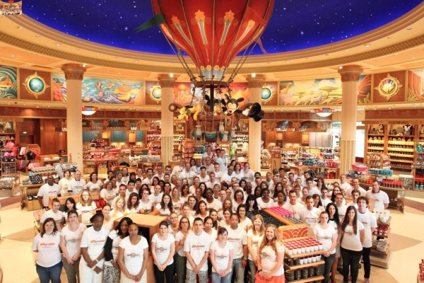
Inspired by the great department stores of Paris and beyond, World of Disney stocks a full range of Disneyland Paris merchandise. Clockwise from the main entrance, you can discover 20th Anniversary, collectibles, pins, candy, media, Paris, “Oh Mickey!”, adult clothing, kids clothing, costumes, plushes, toys and Disney by Britto ranges. The central domed area, where Mickey, Minnie and Pluto wave from a hot air balloon having enjoyed an evening in Paris, is dedicated to homewares and accessories.
Designed to present a “best of” from the resort’s other boutiques, World of Disney nevertheless still has some of its own exclusive products, indicated by special signs on each display. These include the limited edition T-shirts and lithographs, reproducing the beautiful murals which adorn the shop itself.

World of Disney Grand Opening Cast Members
The entire store is both far better organised and easier to browse than its generically-titled Disney Store predecessor, having wide, clear aisles and a central concourse which loops right around the store connecting the three entrances. In the middle of the store, under the hot air balloon, is not another sales display but a comfy four-sided seat. Unlike other areas of the resort’s merchandising, where shop display rails fall, desperately, out into the pathway in a horribly tacky way, this is a store which draws you in and encourages you to linger. Pinging cash registers will surely follow.
And then there’s the design: Art Deco, 1920s/30s/40s inspired, nods to True-Life Adventures and even rare globe-trotting animations such as Saludos Amigos (find Pedro the plane!). The ten “21st Century Art Deco” murals designed exclusively for the space by Mike Kungl are a true asset to the store and the resort. Cast Members wear special period costumes, not generic off-the-hanger shirts, the entire interior and sales displays custom designed just for this space.
Outside, the public realm thankfully shrugs off, even completely ignores, the inhuman concrete warehouse architecture of Disney Village for something decidedly more “real” and town-like. High quality paving, steps, handrails and planters surround the exterior with its fun bas-relief panels featuring Disney characters restyled in Art Deco. Like the pleasing Earl of Sandwich, bookending the other end of Disney Village, this is hopefully the vision for further future development.
![World of Disney at Disneyland Paris [(C) Alex, Disney Central Plaza] World of Disney at Disneyland Paris [(C) Alex, Disney Central Plaza]](http://dlpguide.com/images/2012/07/5513_3-600x450.jpg)
Photos: Alex, Disney Central Plaza
True, the striking, slowly turning landmark glass dome with its recycled castle Tinker Bell looks somewhat less delicately ornate than may have been desired after the addition of its colourful globe motif, which in strong sunlight gives the effect of flat stuck-on transfers rather than a real opaque stained-glass effect; but see it at nighttime, when illuminated from within, for best effect.
Even the slightly odd-looking, off-model Mickey and Minnie statues, borrowed from the former World of Disney store in New York City, can be forgiven when you cast your eyes on the simply gorgeous “World of Disney” marquee signage itself, styled with a luxurious blue and red marble-effect. Earlier concepts showed the “o” of “World” styled as a Mickey Mouse shape; thankfully, this was styled back to a much classier plain “o”, avoiding the “Mickey fatigue” which can plague projects like this.
Though significantly more “petite” than its American cousins, this World of Disney makes up for its comparably quaint size with its bespoke design. There’s no other store like it, at Disneyland Paris or beyond; the Imagineers have successfully created a store that’s a destination all of its own and gives the previously colourless resort hub area a much-needed feel of “place”.
World of Disney will be officially inaugurated tomorrow, Thursday 12th July 2012, with a special ceremony at 3pm (for 3.30pm) in the presence of Philippe Gas, CEO
Preview photo round-up and interior videos follow…
- Disney Showcase Key shares photos from the cast preview with a focus on merchandise
- VDR posted photos from the passholder previews on the DisneyGazette.fr forum
- NewsDLRP has a photo report from the passholder preview and Imagineer presentation
- guimik on Disney Central Plaza posted an excellent Facebook album giving a comprehensive look at the store from the cast preview in over 100 photos
YouTube user bottomcircle shared one of the first video walkthroughs of the store:
Meanwhile disneylandream captured the Imagineering presentation of the store (in French) which was given as part of the Annual Passholder previews:
![World of Disney at Disneyland Paris [(C) Alex, Disney Central Plaza] World of Disney at Disneyland Paris [(C) Alex, Disney Central Plaza]](http://dlpguide.com/images/2012/07/5513_1-600x450.jpg)