Some might say it’s a way to save paper. Others might say it’s to coax more people across to the Studios. The more romantic might even say the “love” theme of The Enchanted Fireworks brought them together at last.
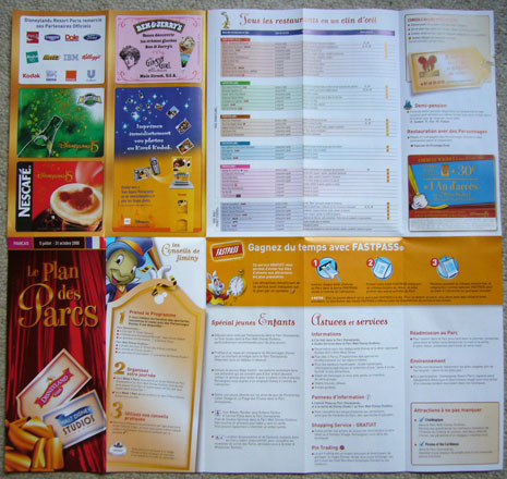
In fact, several months in the planning and design, yesterday saw the launch of a brand new park map ready for the Summer season. As expected for a while now, big changes lie in store for us. There are no more “Little Park Guides” and no more blue or pink covers. No longer will each park have its own, unique leaflet to guide you around.
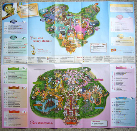
Meet the new… Plan des Parcs. Two park maps… in one.
The pocket size of recent years is ditched in favour of a size more similar to the maps pre-2003, a regular leaflet size, which folds out across five sheets horizontally and double the size vertically. This seems like a big park guide, but then it does need to cover two entire Disney Parks:
It’s a landmark day for Disney theme parks, the first time two parks have ever shared the same plan. But why? Well, imagine this scene…
You’re visiting Disneyland Resort Paris just for one day. Naturally, you pick Disneyland Park to spend all your time in and stroll straight past the entrance to the Studios. What’s in there? No idea. As you pass through the turnstiles and pick up your map, you get a full guide to Disneyland Park, and nothing more. That other park across the way looked like nothing more than a series of giant yellow buildings — there’s no way of really knowing what lies beyond the imposing Disney Studio 1. You can’t be blamed for missing such top-rated classics as Rock ‘n’ Roller Coaster, CinéMagique or Crush’s Coaster.
Now, with the two maps in one, a visitor just stopping by at Disneyland Park opens their map to find a whole new park at the top, with plenty of rather interesting sights. Attractions themed to new films like Cars and Finding Nemo, not to mention truly special experiences like The Twilight Zone Tower of Terror and Stitch Live!. You’d want to hop over and check it out, wouldn’t you?
Rather than keeping visitors in the dark about what lies within the park next door, it does indeed make much more sense to advertise it to all, make the most of its great guest satisfaction scores.
Are there bad points? Sure. Beyond the fact that converging the parks like this might make their individuality a little less special, the new design has for some reason completely dropped the descriptions for some of the major attractions. How are first-time visitors really meant to know what happens in Pirates of the Caribbean, Phantom Manor or Art of Disney Animation? The restaurant listing also exposes a real horror for Walt Disney Studios Park‘s dining, listing its limited number of eateries in one category, alongside entire lands at Disneyland Park.
The good points and the positive effect this double park plan should have on guests’ awareness of the two, separate parks, especially now Walt Disney Studios Park has some top-notch themeing along with great attractions, will far outweigh any niggling negatives. Last month we consolidated our two cumbersome Entertainment Programmes into a single, simpler leaflet, and now we only have a single park map to carry around.
Not that we need a map to find our way around Disneyland Resort Paris, of course, but we still have that collection to think of…
[Photo credit: Mouetto, Disney Central Plaza forum]
Discover more from DLP Guide
Subscribe to get the latest posts sent to your email.

