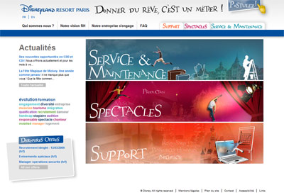
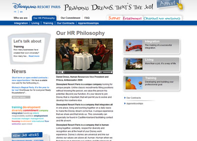
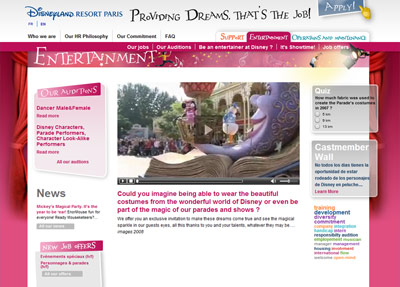
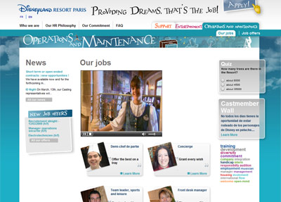
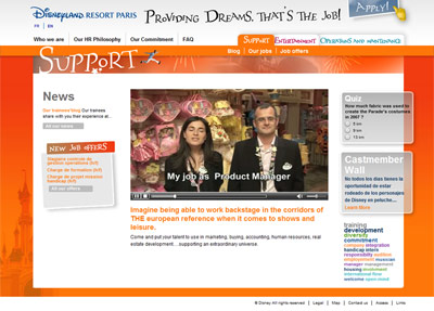
This new website can be found at the same address — www.disneylandparis-casting.com — but takes on an entirely new and entirely modern design, very different to the current www.disneylandparis.com or Euro Disney SCA corporate sites. Clean, simple navigation, blogs, keyword searches, Cast Member “walls”, colour-coordinated sections, videos and interactive quizzes.
Arriving on the new homepage, you’re confronted not by a flash animation filling the screen but primarily by just three large, simple boxes — Support, Operations & Maintenance and Entertainment — which, curiously, change position between the French and English versions.
The first few sections introduce the resort as a whole, including several new videos — both flashy B-roll footage of the resort and useful interviews with actual Cast, such as here 2009 Resort Ambassador Prisca interviewing Vice President of Human Resources Daniel Dreux, or here a look at the lives of the Big Thunder Mountain cast.
Once you get into the key sections for the employment categories, such as Entertainment, they’re each colour-coded and nicely customised, with even more videos, blogs and news updates specific to each department. Here, for example, you see the latest auditions for character look-a-likes and other roles.
Operations & Maintenance offers another look behind Big Thunder Mountain in its key video, but check out the second page, too, for a smart commercial showing Cast Members remembering the “first time” they did things ranging from booking someone’s trip or preparing Buffalo Bill’s horse!
Surprisingly, it’s the Support pages you might want to check out though.
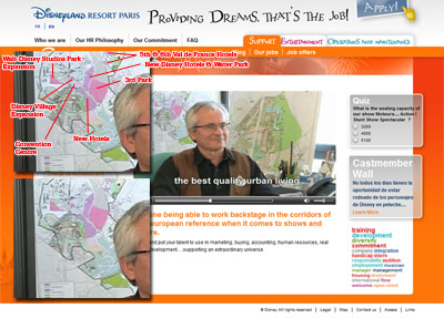
Because, there’s something in the first video — namely when we’re watching one of the Architecture & Urban Planning cast members — that we’re not entirely sure they wanted us all to see so clearly. Or maybe they did…
That’d be the current future development plan of the entire resort, as it currently stands. Now, you may well have seen one of these plans before, but this is their current plan, and it seems to reveal a few new specific details…
Note, for example, the 5th and 6th hotel at Val de France, the huge space reserved for a dedicated Convention Centre, the masses of land awaiting new Disney Hotels either side of the main parking lot access road and the brand new patch next to Val d’Europe also ready for hotels (in the very, very far future).
Happily, there’s (slightly realigned) space still ready and waiting for a 3rd park, but the most interesting and probably most relevant aspect here is Walt Disney Studios Park — now extended into a huge rectangle, more than double its current size, extending off to the West. As you’d enter this fully built-out park, it’d actually therefore be more of a stretched diamond shape. It’s finally a specific expansion footprint, not the general shaded area we’ve seen in the past.
But, leaving those dreams of the future behind… the new casting website. Clean, easy to navigate, flash animations only where they’re necessary and full of information in a design that makes you want to click another link.
We’re left wondering… why can’t the resort’s actual website be more like this?
Discover more from DLP Guide
Subscribe to get the latest posts sent to your email.
