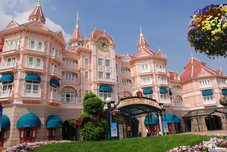
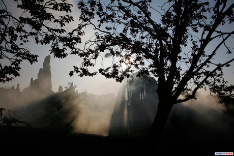
Popping up out of nowhere, and only so far on the German press website, these few images are a rare delight worth sharing. Apparently someone, somewhere, realised that there’s a luscious, extraordinary Disney park behind whatever theme year is currently being peddled.
Looking through the latest official brochure (PDF), you could be forgiven for thinking the park was yet to open its gates with the airbrushed, photoshopped and hazy imagery filling page after page. Between the huge, fake images of the Mickey’s Magical Party events being previewed, guests are given little to no real glimpse at the parks themselves.
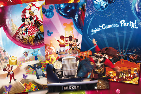
Well, flying cowboys! Is this really Disneyland Paris?
Of course, there is reason for this — since the start of the 15th Anniversary, the resort has been on a new drive to promote limited-timed offers and calls to action.
People were found to wait until their children were older before visiting, whilst Disneyland wanted their custom now. But how are these potential guests to know that this place really is so beautiful, so much better than any other theme park on the continent, and worth the high prices listed on later pages?
Images like these might help…
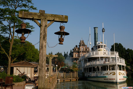
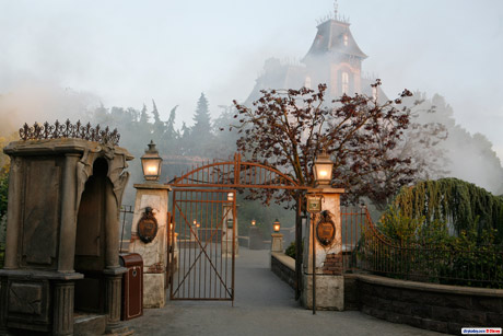
Several of the photos focus on Frontierland, with an eerie mist rolling around Phantom Manor and the Molly Brown standing proudly in the dock.
Even classic E-Tickets, like Phantom Manor itself, rarely seem to be given much attention these days. The opening of The Twilight Zone Tower of Terror was criminally glossed-over in favour of the extended 15th, the consensus simply being that this €180-million attraction wouldn’t be enough for the bookings to roll in — people would conclude that, unlike the anniversary events, “it’ll still be there in a few years” and postpone their trip.
As recently as 2001 and 2002, however, each land would be given its own lavish, themed page in the brochures, filled with photos of the environments, attractions and entertainment. After all, it’s these legendary attractions and the landscape of the park — the things designed and built by the Imagineers — that we visit time and time again for… isn’t it?
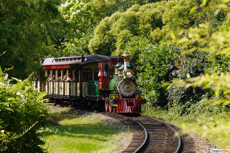
Say, the Disneyland Railroad majestically skirting its way around the greenery of the berm…
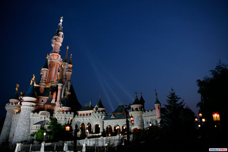
Or the spires, towers, walls, windows, tapestries and pure beauty of the Castle…
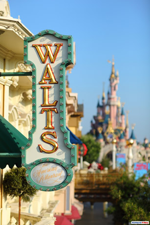
No wonder some people think we’re mad to be in love with Disneyland at our age, considering the “kids’ crèche” style of recent advertising, completely shunning any images like this gorgeous new view past the Walt’s restaurant sign…
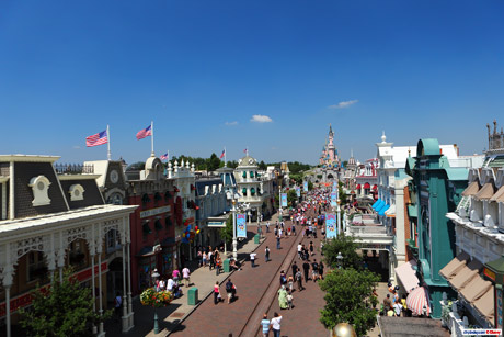
Or this stunning, elevated view right down Main Street, U.S.A...
You can click any of these new official images above for a large 1600px version. We’ll probably never see them make the brochures or advertising, so go on — stick them on your desktop and show people what Disneyland Paris is really like.
Pictures © Disney.
Discover more from DLP Guide
Subscribe to get the latest posts sent to your email.
