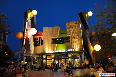
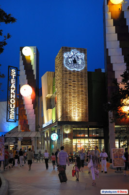
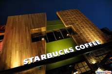
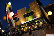
With its huge, framed windows and earthy, warehouse feel, the mermaid-topped coffeehouse has become a beacon for what could be a “new” Disney Village.
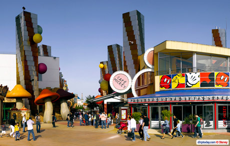
Sure, with the long-delayed planters and trees finally spread throughout the entertainment centre since Spring 2008, it’s been looking very, very different for over a year already.
But this is the first actual step in putting some of that feeling into the buildings themselves, the first major addition to the Village since those trees set it on a new path last year. It might have taken a slightly controversial icon of globalisation to achieve it, but the result is incredibly good for the place.
It was all designed jointly by Starbucks and the former Disney Construction Company (DCC, who were behind Val d’Europe), which is now part of DLP-I — the Paris branch of Imagineering, in charge of smaller projects, and especially non-park work (thanks Kristof, magicforum). Between the many Disney-owned and several tired-looking venues in the Village, a Starbucks as swanky as this really gives the street the feel of a “happening” place.
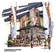
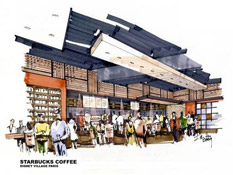
Even better, it’s genuinely eco-friendly, too. Starbucks gushed about the new store on their blog back in June, and included two previously unseen pieces of concept art:
Starbucks at Disney Village Paris
Have you heard the buzz about the new Starbucks store in France? On June 20th, we opened a new store in the Disney Village Paris that is truly in a class of its own. It is the first international store to be built using our new design concept that connects our stores to our coffee heritage. This store is also the 50th Starbucks store in France and marks the 5th anniversary of this important market.
So, what’s so special about this new store? Inspired by artists’ studio environments and modern design in Europe in the 1930’s, this store is not only beautiful but also includes local materials and green design to enhance the customer experience. This new store design is part of our effort to have all of our new company-operated stores worldwide certified by the end of 2010 under the U.S. Green Building Council’s Leadership in Energy and Environmental Design (LEED) program. This is a key component contributing to the Starbucks ™ Shared Planet ™ goals in environmental stewardship.
The LEED ® Green Building Rating System evaluates a building on various criteria including energy performance, indoor environmental quality, community connectivity and regional materials. Accordingly, the innovative design of this store includes the following features:
- Adjustable, low-energy lighting system
- Mixed-mode HVAC system (mechanical and natural ventilation) saves energy and makes use of existing building tower feature
- Large, operable windows provide natural ventilation, ample daylight and fresh indoor air quality
- Water efficient fixtures in restrooms and bar areas
- Low emitting materials reduce off-gassing and allow the aroma of our coffee to be the star
- Salvaged and recycled construction materials & furniture (including reuse of local French wine barrels and authentic champagne riddling racks)
- Recycling available for customers and store partners
- Measurement and verification plan to monitor energy and water savings over the life of the store
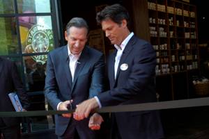
The new location was officially opened on 20th June 2009 by Euro Disney CEO Philippe Gas and Starbucks Coffee CEO himself, Howard Schultz:
You can find a whole fact sheet about the store here, which reveals, for example, that certain wood is from used barrels reclaimed from the French wine industry, the exterior wooden cladding is made with reclaimed Champagne racks from France, the countertop uses a material containing recycled mobile phone parts, and so on.
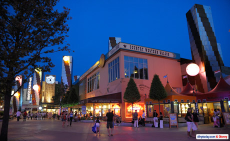
Compare the design of the new Starbucks Coffee to the corner of The Steakhouse just to its left, and the remnants of rethink after rethink are all too clear. The minimalist Frank Gehry architecture of 1992 meets the new colours of 2005, meets the balloons of 2006, meets the red horseshoe border of 2007, and so on.
Hopefully this modern and clear vision set out by the Starbucks won’t just be applied to any other new buildings but to the older buildings, too. That said, it’s not necessarily the design style of Starbucks’ exterior that most of us would like to see transplanted to the other locations like The Steakhouse, Hurricanes and World of Toys…
Since the post-1992 additions of Planet Hollywood and King Ludwig’s Castle, for example, there couldn’t (and probably shouldn’t?) be a consistent, shopping mall-type design through this street.
But at the same time, should every location be as loud as this Starbucks or King Ludwig’s? No, smaller stores like Hollywood Pictures should probably have a more standard exterior, with only the larger, more special locations “jutting out” with more outlandish architecture, like the style used at California’s Downtown Disney. The only problem is that those forgotten stores currently have near-enough cardboard cut-outs for their signage, cheaper than those you see in your local town. So, you can guess what it all boils down to in the end — money. Something which Starbucks could pour a lot of into their project.
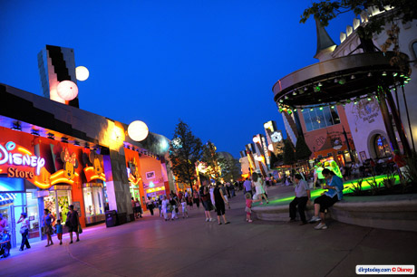
However, if or when this long, long looong-awaited World of Disney mega-store finally opens in front of the Gaumont Cinema, the Village’s existing Disney Store will likely be redundant. It might even clear out the need for the Hollywood Pictures and World of Toys stores further up, since the former is very similar to those in the Studios and the latter rather dated.
In that respect, you could argue it’s barely worth spending too much money on those old locations — just enough to keep them ticking over until they’re consigned to Yester-Disney Village. But, with the World of Disney forever on hold, that might not be any time soon.
Realistically, Starbucks only adds to the jumble of Disney Village — but it does it with such style and thought that it’s really something to celebrate for the place. Here, at least, the original 1992 vision has finally been successfully updated for the 21st Century.
Perhaps if the entire area were being built today it’d all be like this — a real mixture of materials and textures, trees and planters from the start — the first environmentally-aware entertainment centre? As it happens, we’ve only the mermaid to cling onto… for now.
Pictures © Disney/Starbucks.
Discover more from DLP Guide
Subscribe to get the latest posts sent to your email.
