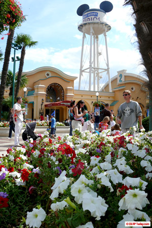
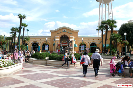
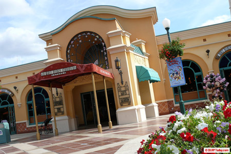
Front Lot is awash with beautiful red, white and purple flowers this Summer. Over there, on your left, the completely “opened up” Walt Disney Studios Store now sits proudly and prominently — no longer blocked by planters, nor hidden behind small windows.
There’s not even a hint of meddling with the red canopy (like its Princesses retheme last year), nor a single cheap clothes rail lingering outside the store. This may well be the only shop in the resort not to have exploded out into the street.
Let’s step back and take it all in. To jog your memory, here’s how it looked before.
An improvement? Certainly. Though the visible wooden panels hiding the back of the pay desks by two of the new windows seems a little messy, the new store now positively beckons you toward it.
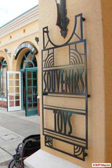
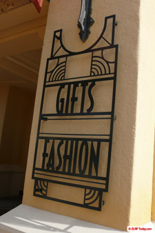
Getting closer — well, will you look at that! New signage!
These two ornate metal pieces have just been added to each side of the main entrance, finally plussing an exterior which has so long been a sea of yellow with just the occasional “Walt Disney Studios Store” — a far cry from the signage-encrusted shops over on Main Street, for example. Now, guests can tell from afar that it sells souvenirs, toys, gifts and fashion.
The text is actually a little reminiscent of the signs over on the Franklin Department Store façade on Hollywood Boulevard, and note how the curve at the top nicely wraps around the existing lights. Excellent work!
Into that door we go… and, oh…
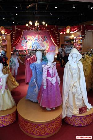
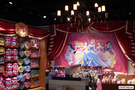
Is this what you expect at the Walt Disney Studios, a park full of action adventures and very un-royal Toons? Apparently so. In fact, since we last balked at the covering-up of the large Walt Disney centrepiece at the back there, it’s been elaborated on quite a bit more.
The new background and its surrounding shelves have been draped with royal red curtains and filled with even more Disney Princess merchandise.
Compared to the blandness across the rest of the store, it actually looks rather appealing when you’re there. Unless there’s some huge unknown market for Princess merchandise at the Studios we’ve missed though, it is strange positioning. Displays dedicated to say, the Disney Villains, could be more appropriate.
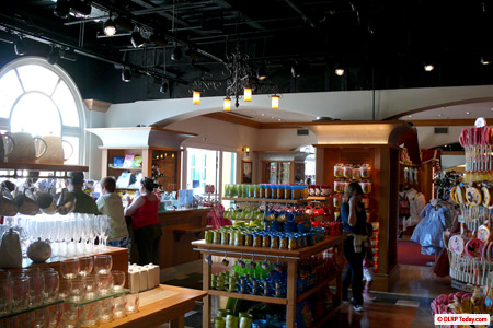
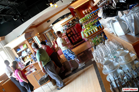
Stepping to the right, into the section of the store nearest Disney Studio 1, things suddenly get a whole let better. There are some brand new display units here, and a lot of quality merchandise.
Tasteful homewares, with lots of space to move between the shelves, and over behind the shot below, a great display of retro Minnie Mouse-themed polka dot accessories. It’s a great improvement on what the space was like before.
It also gives the feeling that a retro, Mickey and co, 1930s, Disney shorts theme would have been better for the store. Rooms themed to Walt Disney’s earliest creations (Bambi for the baby accessories, for example), rather than sparingly decorated with pictures of the man himself.
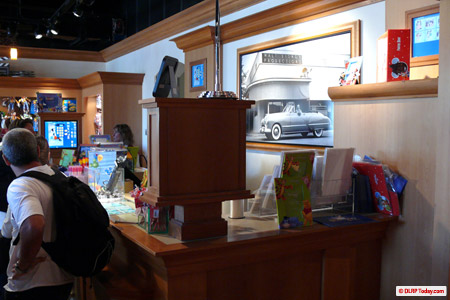
Talking of pictures — the second photo desk, over on the other side of the store, was open for use for the first time, perhaps… ever. Visitors now have a little less of a queue to pick up their souvenir photos from Toon Studio characters and so on.
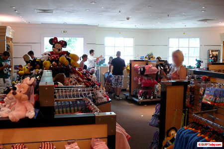
Princesses aside, it’s looking ok, right? Wrong. Head into the final, separate room, nearest the park exit gates, to be met with…
Briefly dedicated nicely to plush toys, this room has become — no, not a poor version of your local charity shop — but a place for baby accessories, and all that stuff which doesn’t really interest a Disney fan. Good job too — with those bare white walls and the cheap display units, Oxfam suddenly looks like Selfridges…
A project with yet still more to come, or the final reel?
Pictures: DLRP Today.com
Discover more from DLP Guide
Subscribe to get the latest posts sent to your email.
