It seems like only a few weeks ago we were adjusting to a new layout for the all-important Programme. Probably because it was just a few weeks ago.
Well, they’ve been at it again! Take a look:
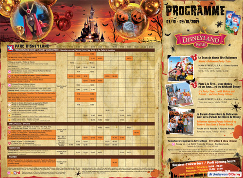
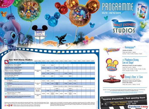
The new format spreads itself much more freely over three pages, with one side for each park.
Rather than having both times grids together in the middle, they’re now positioned horizontally on each park’s page, surrounded by additional images and graphics. On the front, the “featured” events remain from the previous design, giving extra prominence to the key events of the day.
For the Disneyland Park programme, the entire side has been given a very smart Halloween dressing, far better than we’ve become used to in recent years. The Halloween events themselves are picked out with an orange background, courtesy of the new full-colour printing method.
Will it be all-change again once Halloween is over? Hopefully not — the Programme could look fantastic with a full-colour Christmas overlay, although whether such “extravagance” would continue into the quieter Winter months is debatable. This format is surely somewhat more expensive than the previous, greyscale on lower grade paper, but does help make the Halloween Festival seem that little bit more special.
Discover more from DLP Guide
Subscribe to get the latest posts sent to your email.

