What is it about brochures and Disneyland Paris? No other group of Disney fans gets so excited or worked up about their resort’s promotional materials as us, but here are again, about to pour over every page of New Generation Festival detail. Or rather, the Disney new generation festival, as it now has to be written. But more on that later…
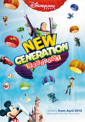
We naturally begin with the cover, where the prophecies were correct — it’s the image of Buzz Lightyear parachuting in behind the festival logo, which is far more prominent than even the Disneyland Paris logo, as the other characters are arranged, fridge magnet-like, behind.
At the bottom, “Landing from April 2010“, with not only a thin typeface but a mixture of bold and light weights together. It’s all very modern, this.
But maybe we should be happy. Look back at the advertising styles from 1992 and they were completely fitting for the period, all colourful shapes and crisp white backgrounds. Maybe it’s a great thing that the resort is being contemporary, rather than continuing the dull fantasy-styles we saw earlier this decade.
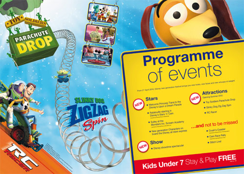
And so we see the “Programme of events” above, with the various new additions for this theme year thankfully sorted into neat categories so that prospective guests can see what’s worth bothering with (attractions) and what’s more a load of puff (stars). Indeed, we’ve still yet to find out just how the Monsters Inc. Scream Academy can be considered “new”, given that it was added in 2006.
This is also our first encounter with lower case madness. Normally, it’s the done thing to use capital letters in the name of a show or event — like Toy Soldiers Parachute Drop. But as we’ve touched upon in the past, and is now confirmed here, the ‘Disney new generation festival’ won’t be following those boring old rules, oh no! So, very much helping the grammar of our text messaging generation, we’ll be welcoming not ‘Disney Showtime Spectacular’ but ‘Disney showtime spectacular‘. Not ‘Disney All Stars Express’ but ‘Disney all stars express‘.
It wouldn’t be noticeable, but this strange stylistic choice is forced into every instance of these names. It’s probably meant to look fresh and hip, but it ends up looking like they forgot to hire a proofreader, we’re sorry to say…
Neurotic grammatical asides complete, the look of this brochure is very pleasing. You’ll see very few actual images of Disneyland Paris in here, but yes it looks very smart — a definite step up from the horribly garish second brochure for Mickey’s Magical Party we’re leaving behind.
Nope, no pictures yet…
Still waiting…
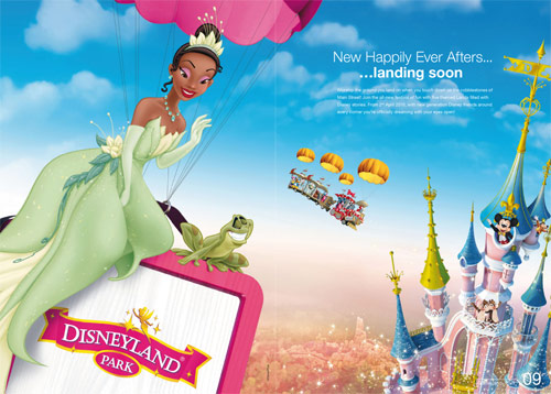
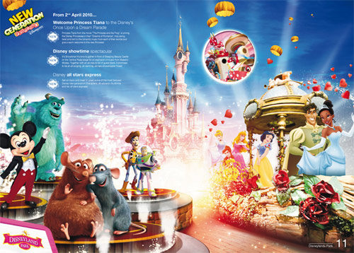
Nice to see the chopped-up image of Tiana and Naveen on the parade float made it through quality control…
Ahaa! Pictures!!
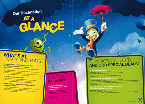
Yes, we’re spoiled a full three real images from within Disneyland Park (including the Castle background). Surrounding those, a Cinderella picture (from Walt Disney World), a false Space Mountain: Mission 2 promo picture and the doctored Disney all stars express promo image.
You can’t be down about this lack of photography for long though, or worry too much that the brochures continue towards being just catalogues of Disney character stock images, because the next page is rather stunning…
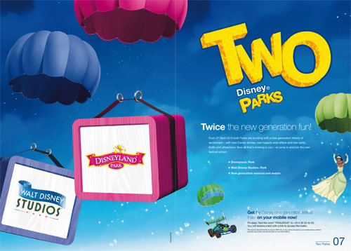
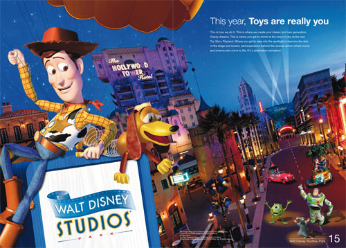
Not only is this (mostly) a real photo — and a beautiful photo at that — no, finally the powers that be have discovered Hollywood Boulevard. The gorgeous little street has been there for two years already and now it’s being utilised and advertised for the first time. Normally, you’d see nothing of the Walt Disney Studios Park exteriors in the brochures, only the insides of attractions.
Add to that some character stock images which almost look to be tailored specifically to this page and we’ve got one of the best brochure pages for years. And it might just be the matching colour palettes, but Woody and Slinky feel quite at home next to that logo there.
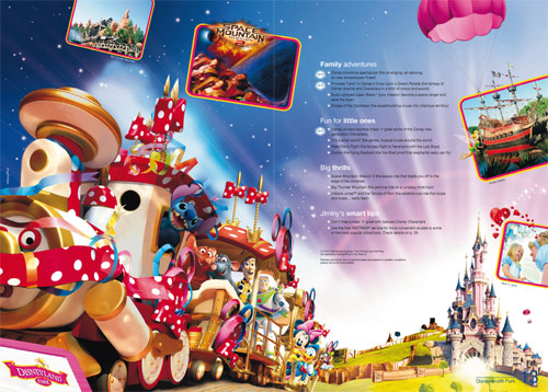
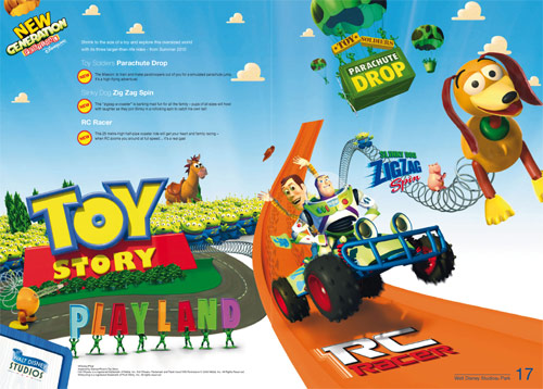
Alas, with every up, there’s a down. After that terrible use of a real photo, this is the centrepiece of their Toy Story Playland launch…
It’s a shame Disneyland Paris don’t appear to want to make concept art public these days, because the ‘TSPL’ artwork is arguably a million times more endearing than this collection of visual junk, inspired by your local crèche.
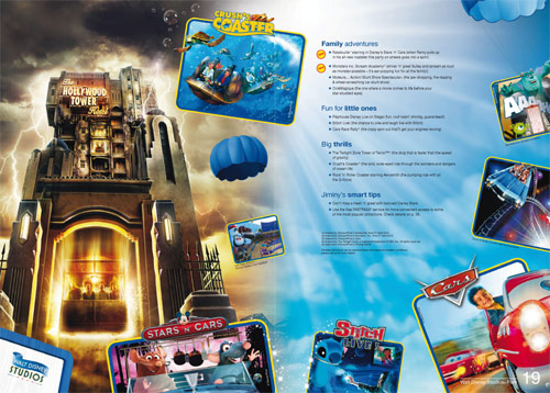
The second Walt Disney Studios Park page is good enough, with the investment in this park now adding up to a very marketable, colourful set of attractions.
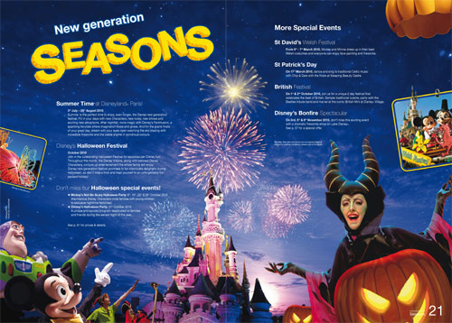
Park seasons appear to get a bigger showing this time, with a full double-page detailing everything from Summer Time (finally branded into a proper season) to the, er, British Festival at Disney Village, where you can see, first-hand… a British Mini! No, really!
Rearing its head again here, though: the marketeers’ disgust for poor old Sleeping Beauty Castle. Since opening day its been mirrored, warped and chopped up to fit their visions. This must be one of the most drastic yet, covering the entire front window with one of the turrets from the side.
Note here and in the image on page 13, at least, that the Castle is decoration free… or almost decoration-free. When editing the spire tops out of that photo above, Tinkerbell was left in place, along with the piping leading up the main tower. Just the choice of the marketing department, or a sign that this decoration is due to cling on?
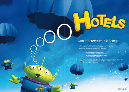
Next, Hotels = Aliens.
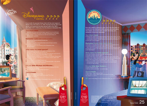
The hotel pages have seen the biggest changes in this new brochure, with the usual format of a white background and one large image replaced by this, “immersive”, style…
Colours, designs and furniture from each hotel dress each page fully, attempting to give us a “feel” of the hotels more than accurate pictures. Each page features only two real images — the view of the hotel out the window and a tiny view in a picture frame — but the style is clever.
In any case, these pages are likely only a teaser — anyone really looking into spending vast sums of money on Disney Hotels surely goes online to find more photos anyway, right?
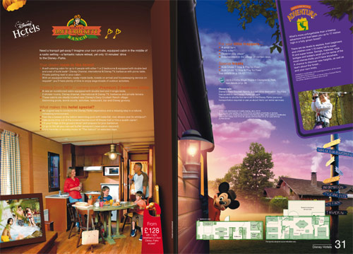
Davy Crockett Ranch is also presented well, with a view of the cabins inside and out…
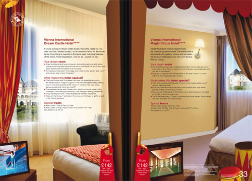
Whilst the Selected and Associated Hotels seem to be given more prominence than usual, with their more discreet design touches used to create the same effect…
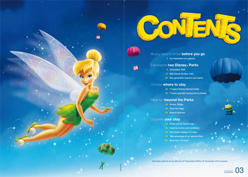
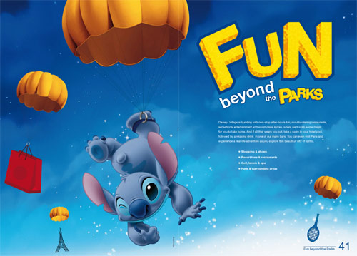
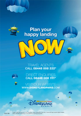
Maybe they should offer real parachuting lessons beyond the parks…
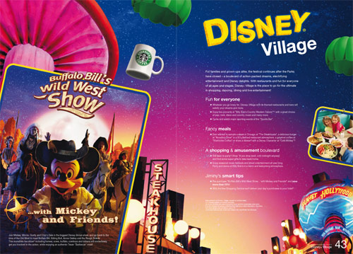
Although lessons may not be necessary, if even an inanimate Starbucks mug can manage it.
Yes, the coffee chain is now very much a feature of Disney Village, whilst Mickey and Friends will continue to cameo in Buffalo Bill’s Wild West Show for at least 12 months more (and in fact, there’s no reason to see that this isn’t permanent now).
Much as the constant character clip-art is off-putting for people who’d prefer to see the majesty of Thunder Mesa and the intricate detailing of Fantasyland, at least this “new generation” really has ushered in a refreshingly different set of characters to be featured throughout the brochure.
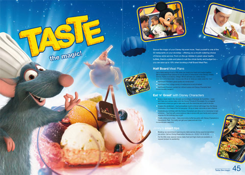
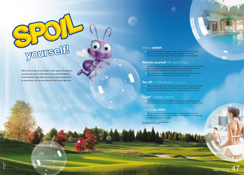
Not only Rémy but Chef Gusteau feature on the restaurants page, whilst little-seen Princess Dot pops up on the leisure and relaxation page, yes really — a character from A Bug’s Life!
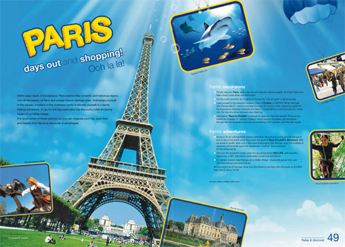
Paris…
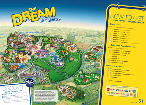
And the new resort map, complete with well-placed Google Earth 3D plug.
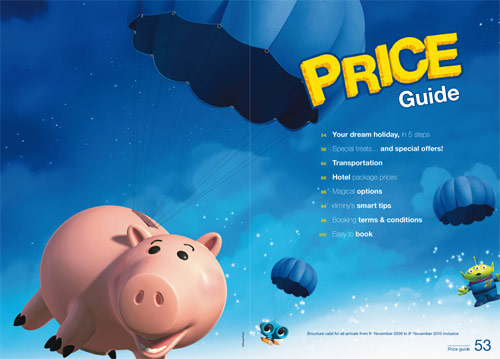
Hamm is a fitting choice for the Price Guide…
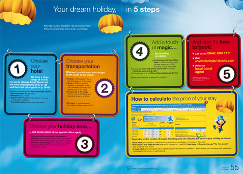
Whilst the “5 Steps” page attempts to simplify the booking process…
…but perhaps the colours make the text a little hard to read.
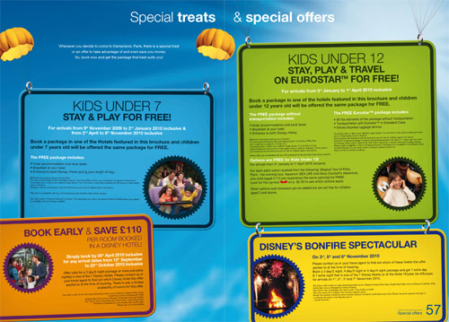
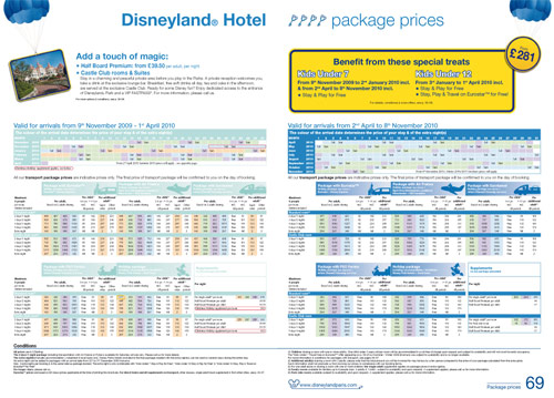
The price guide pages themselves are mostly unchanged…
And there we go.
It’s a definite step up from the last, very disappointing, off-putting brochure, but say it once, say it again — there’s still not enough “Disneyland Paris” in here. Not enough real photos, real information or real feeling for the place between all the thousands of character images.
Perhaps, with the internet, it doesn’t matter. In a few seconds you can find a great site like Photos Magiques. But picking this clip art catalogue up off the shelf, will most people actually bother to go that far?
We all know the place we visit — the amazing lands, the fantastic rides, the beautiful sights and the escapist themeing. What place are they thinking about?
• Download the full PDF Brochure (16.6Mb).
Images © Disney, Disney/Pixar.
Discover more from DLP Guide
Subscribe to get the latest posts sent to your email.
