If you thought Starbucks changed the vibe of Disney Village or at least gave it a fresh kick, this new British-themed sandwich shop should do the same ten times over.
Not only will it provide a desperately-needed rival to McDonald’s, it’s in a brand new building — an actual addition to the entertainment district — and, looking at these plans and concepts published online by Mouetto at Disney Central Plaza, it’ll have a great Lake Disney view…
Yes, one of our theories was right!
“A more likely area of this inlet to be filled in would have been the corner between Rainforest Cafe and the bridge, allowing an Earl of Sandwich to use both this and the area vacated by the old carousel, becoming a part of the main thoroughfare.”
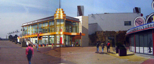
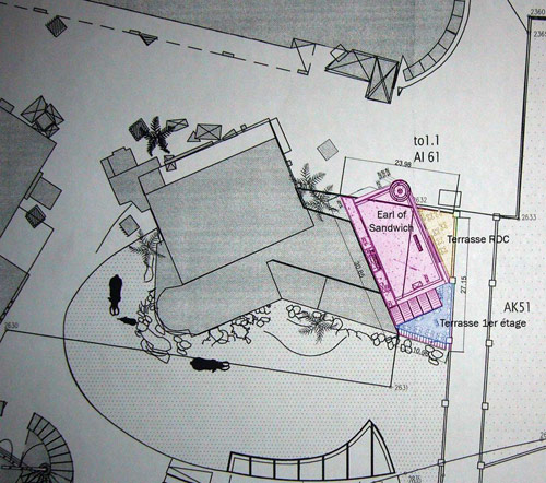
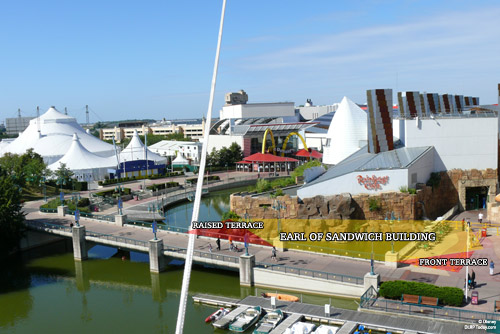
And good thing, too — as the plans seen here confirm, carefully captured at Chessy’s planning department by Mouetto, this brand new, two-storey building will slot snugly into the corner between Rainforest Cafe and the Lake Disney marina, opposite Café Mickey. The footprint will include some of the area vacated by the carousel and then extend out, over the current square of water, in all providing two floors of seating and two separate terraces — one out front at ground level, and another on the first floor at the back, elevated above the water.
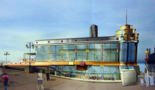
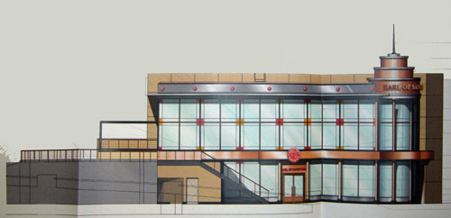
Design-wise, it’s a restrained affair, much more in the traditional IMAX/NEX style than the recent Starbucks Coffee eco-meets-Gehry boldness. That means circular corner sections, strong horizontals and a slight Art Deco flair.
Rather than green, though, the palette here is more of oranges, reds and yellows. The Earl of Sandwich branding, modelled on a vaguely British theme, is modestly portrayed through the red and yellow squares and their placement between the window frames, almost mimicking a traditional Plaid style. The firm’s logo is equally modest, simply their red circular envelope seal design above each door.
The top of the circular section looks to be clad in separate brown pieces, rather than being a flat finish. Overall, it looks like a very successful merging of some very diverse styles, although the pale yellow finish (almost like bathroom tiles) on the exterior wall at the back looks like a strange choice.
From what we can see, the back wall inside appears to depict a giant map, with tables and chairs continuing a red/black theme. However let’s not forget, these smaller design aspects — particularly the interior — could still change from these planning applications. The general layout and footprint will be as seen here.
Clever use of the space sees the kitchens and service area hidden under the first-floor terrace. This platform — and the whole first floor — will offer a great view over the lake and small bay behind.
Due to its location on the end of the main Disney Village street, this build offered the opportunity to hide the rather unpleasant side of Rainforest Cafe/Hurricanes Discotheque which faces the lake.
Though the plain white building won’t be completely hidden, at least it won’t be the only thing seen from the opposite shore of the lake, outside Sequoia Lodge. And, placed on the corner here, Earl of Sandwich might just draw a few more people down this end of the Village — not to mention helping to kick-start any further expansion, onwards across the bridge…
But let’s not get ahead of ourselves. With the above applications from the Earl stamped and sealed, construction should start in the New Year with the hope of completion by the end of 2010. And whilst that’s happening, nearby PanoraMagique will be the place to go for construction photos. Here’s our “before” shot:
Now, save us a place on that lovely first floor terrace and we’ll study the menu…
Pictures: Disney/Earl of Sandwich (credit to Mouetto), DLRP Today.
Discover more from DLP Guide
Subscribe to get the latest posts sent to your email.
