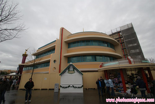
As discovered previously, this lengthy refurbishment spanning almost the entire year has not simply brought the façade back to its clean and crisp original state but attempted to “plus” it at the same time, with a wider palette of colours used to emphasise its features.
Is it ready for the catwalk? Not quite, but it’s getting there…
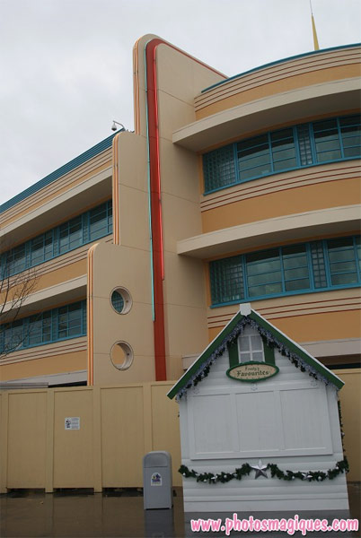
The latest section to be revealed is the round corner piece and its two striking Art Deco fins. Where originally these were painted entirely in the same cold yellow with turquoise accents, now they’ve been given a less sharp main colour with a deeper yellow at each end, in the space where the neon lights sit.
Most noticeable, though — the turquoise has become a warm red, matching the new kiosk next door and hopefully giving this corner a slightly more “1950s” feel. Pleasingly, the red, turquoise and yellow neon lights all remain.
Last time we ended with an “unfortunately…” about the still-missing ‘Walt Disney Television Studios’ sign (which would probably be a finishing touch anyway). This time, it has to be said that it’s a shame such lengths would be gone to for a refurbishment without that damn security camera being concealed a little better.
Yes, you see it, the round thing on the white pole, sticking out the roof of the building. It’s the kind of thing you normally don’t spot — but once you do, you spot it every time. Sorry. Look closely at the Studios and you can also see them hanging from Art of Disney Animation and Flying Carpets Over Agrabah. We never manage to spot them in Disneyland Park, so why force supermarket chic on the Studios?
But no-one’s ever completely happy these days. Blame TV.
• See more new pictures from the resort in the latest Photos Magiques update.
Discover more from DLP Guide
Subscribe to get the latest posts sent to your email.

