Welcome to turn of the 20th Century America! At least, that’s what
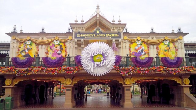
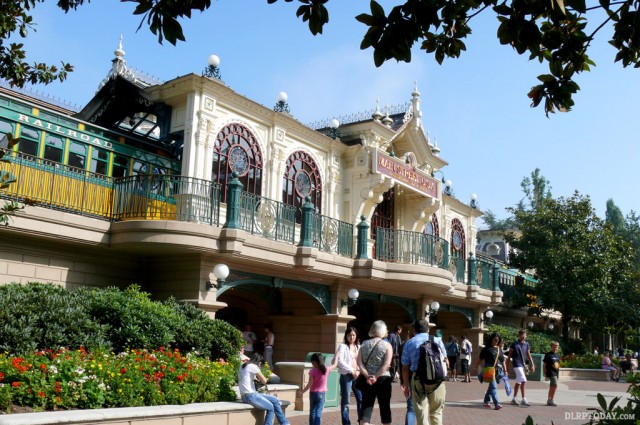
Main Street Station was designed to say. In practice, it has suffered an innumerable series of seasonal overlays over the years that often do little to embellish its period style. The latest, for
Swing into Spring, was completed this week ahead of the new season’s launch on 5th April.
Production quality looks surprisingly good for a fledgling season — the main “Swing into Spring” marquee is
big but thankfully well-designed, compared to previous efforts. The way the typeface springs out of the oversized daisy is quite classy, the character illustrations are a welcome “Disney” touch, the flowers (albeit fake) give a feeling of life. From a distance it looks like a fantastic, bright, fresh welcome into
Disneyland Park for Spring. Great job!
It’s just a shame it’s all over Main Street Station. After the
20th Anniversary overlay,
Halloween,
Christmas, and many more in the years before, you almost need to remind yourself what this landmark is
supposed to look like. So here we go:

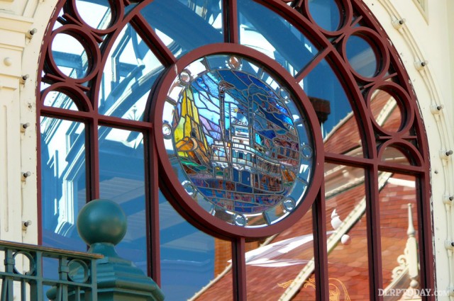
Now where do you begin? Let’s start with the windows. The four stained glass windows of the original station are beautiful and should simply never, ever be covered over. Definitely not with flat yellow backgrounds for 2D cut-out Disney characters.
Then there are the
20th Anniversary leftovers. The two plasticy gold garlands along the top of the façade, the three golden arches above the walkways and the four circular castle motifs are all still in place two years later. The thinking could be they’re yellow (ish) and vaguely fit the colour scheme, the reality is that they cheapen a building which, along with the stunning
Disneyland Hotel, was designed to instantly tell guests they’re
not in any old tacky theme park.
Also part of that overlay was the black “Disneyland Paris” sign. It seemed fitting for the 20th Anniversary, but isn’t it about time the old “Main Street Station”, with its higher quality embossed gold letters and warm red background returned?
After all that, the flowers and even the logo are rather inoffensive. Indeed, imagine how good the station could have looked if it was simply “plussed” with a colourful floral overlay, not just treated like a blank canvas — as if there’s
nothing of quality there to actually work with and the only option was for the designer to cover it with their own, bright yellow, canvas.

It’s been easy to shrug off the Halloween and Christmas overlays in the past because, besides the fact they’re well-established holidays, they’re only there for one and two months respectively, giving us nine more months to see the park entrance as it should be seen.
Swing into Spring will last for a record
three months. If it returns with the same decorations next year (spending on these seems to suggest it will), that means only six months to see the station untouched: January to March and July to September. That’s provided they ever take the 20th Anniversary elements down. The situation is similar to the
oversized Tinkerbell of the 15th Anniversary castle overlay, which
outstayed its welcome (and spoilt the forced perspective of the castle) for several years after the anniversary ended.
At least, these days, it’s
not the castle. That’s what we need to remember.
• Discover more Disneyland Railroad Main Street Station photos on the Guidebook
LEAD PHOTO @DisneylandBerry (Twitter)
Discover more from DLP Guide
Subscribe to get the latest posts sent to your email.
Follow DLP Guide on X and Facebook for Disneyland Paris news and updates as they're posted.