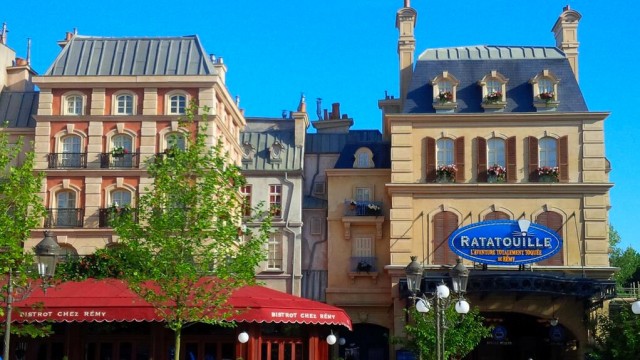
Like any great recipe, it needs a little refinement: A new, redesigned
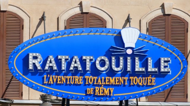
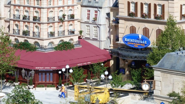
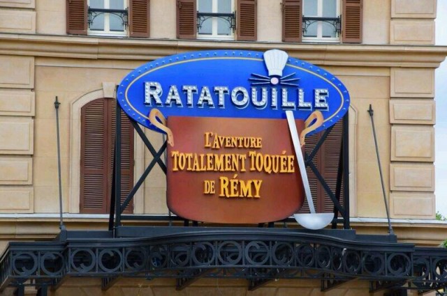
Ratatouille: L’Aventure Totalement Toquée de Rémy entrance marquee has been installed at Walt Disney Studios Park this morning, pictured above by
DisneylandBerry. The final signage design features just the blue ellipse of the movie’s logo with the subtitle included, far more subtly, inside.
This replaces the original design of the entrance marquee, which was installed some time ago only to disappear again shortly after, leaving an empty space. A giant copper cooking pot was designed to hold the lengthy subtitle, L’Aventure Totalement Toquée de Rémy, with the
Ratatouille logo above.
But once this appeared on
La Place de Rémy, many fans were immediately honest that it just wasn’t quite they expected. Wasn’t the pot going to be 3D? And isn’t it all a bit ostentatious and yet, dare it be said, “cheap-looking” for such a classy new mini-land? It seems between the Imagineers and management, someone agreed.
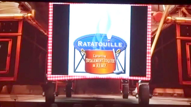 Tom Fitzgerald introduces the original marquee at the Shareholders preview presentation
 Original entrance marquee (Photo: InsideDLParis)
The compromise on the new marquee is to drop the 2D cooking pot altogether, losing some of the city advertisement billboard aesthetic which jarred with the decoration around it. The subtitle is now placed somewhat awkwardly on the logo itself, but the general impression is better and seems more in-keeping with the surroundings.
Close-up, the marquee still has a glitzy, LED “popcorn” light display to light up the square at night, reminiscent of
Meet Mickey Mouse. On the whole, it’s remarkably
similar to the very first concept art we saw. Sometimes, the first ideas are the best.


• More photos — DLP Welcome: New sign on Ratatouille and more
Discover more from DLP Guide
Subscribe to get the latest posts sent to your email.
Follow DLP Guide on X and Facebook for Disneyland Paris news and updates as they're posted.
 Tom Fitzgerald introduces the original marquee at the Shareholders preview presentation
 Original entrance marquee (Photo: InsideDLParis)