The oft-criticised
official Disneyland Paris website has seen a complete relaunch of its UK edition today, bringing it in line with the websites for its American cousins in perhaps the biggest update yet both visually and technically.
Based on the same design and layout as the
Disneyland Resort and
Walt Disney World websites, the new UK website marks and enormous leap forward for the presentation and usability of the official Disneyland Paris website. Though last relaunched
less than a year ago in October 2013, with a design that solved many of the earlier versions’ flaws, the previous site still lacked crucial polish for such a large organisation and felt clumsy compared to the glossy American sites.
In fact, many British visitors had begun to switch their browsers to the cleaner and prettier
Walt Disney Travel Company website, similar in style to today’s new website.
• Click here to visit the new website (you may need to select UK edition)
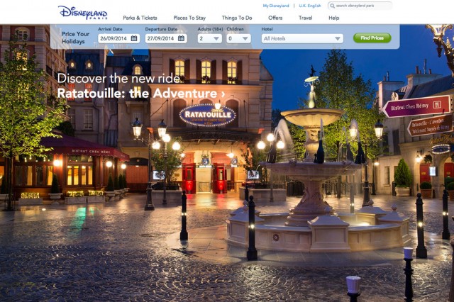
Opening with a bold, crisp single image
on its homepage, the new website has a huge amount of new pages to explore, encompassing
both parks,
attractions,
hotels,
Guest Services,
Disney Village,
seasons and events,
dining,
travel and much more. On first glance, the updated
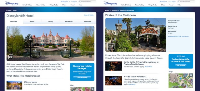
hotel pages appear to be the most impressive, incorporating far more photos and several separate pages for each hotel detailing rooms, dining and recreation.

The “search results” style of the park listing pages allows visitors to filter attractions based on type, interests, age range and accessibility. Fans have been
quick to joke that filtering for “Stage Shows” in both Disney Parks
returns a grand total of zero results.
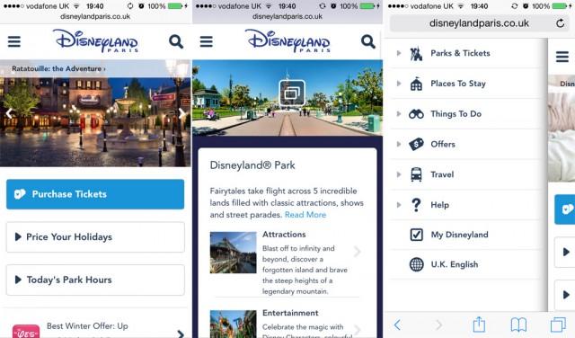
Browsing the new website on a mobile device is also a breeze — not all that long since the website couldn’t be viewed on an iPhone or iPad at all. With the template fully optimised for smaller screens and prominent links front and centre to book park tickets and packages, the improvement from a business point of view will surely be enormous.

A surprise inclusion, perhaps, is a
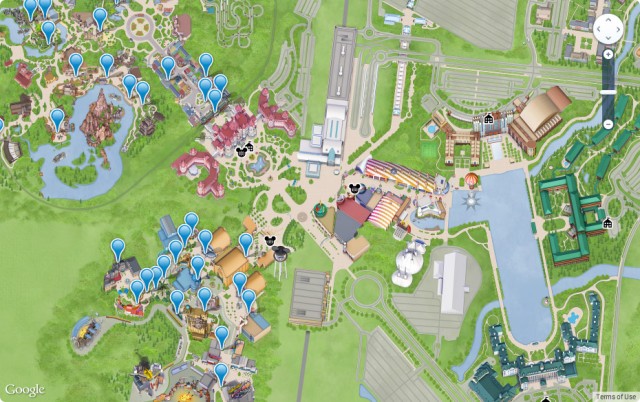
brand new resort map. Ditching the
earlier illustrated designs, the
brand new zoomable map is based on a Google Maps framework and uses the same design style as the
latest California and Florida park maps. While this design is more geographically precise, in practice the 3D design feels too sterile and it suddenly makes both parks look much emptier — Walt Disney Studios Park in particular, which must also now be explored from an awkward north-facing angle. Disneyland Park meanwhile sits awkwardly on its side, the precise drawing making painfully clear the huge vacant expansion plots still remaining in many corners of the park.

Another criticism remains the
Park Hours calendar, which can still only be browsed in a day-by-day format. Perhaps we’re just
too enamoured with the idea of seeing a whole month’s park hours at once, but this seems an unhelpful and frustrating way to present the information. Visitors are forced to
click through day-by-day to see when attraction closures are scheduled, for example, rather than
just being able to see a simple list.
Meanwhile, the
entertainment programme remains a downloadable PDF rather than having the times programmed into the website itself, meaning visitors can rarely plan more than a week ahead (although in contrast, the
enormous hour-by-hour list provided by Walt Disney World is surely overkill). Details such as restaurant opening times and dates are also not presented, despite them now being
released to independent websites on a regular basis. Let’s not mention
menus, either.
Currently only the UK version of the website has been updated. It’s to be presumed the others will follow although, given that
countries such as the Netherlands are still stuck on a layout two versions back now, don’t start hitting that refresh button just yet…
Discover more from DLP Guide
Subscribe to get the latest posts sent to your email.
Follow DLP Guide on X and Facebook for Disneyland Paris news and updates as they're posted.