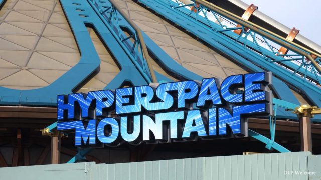
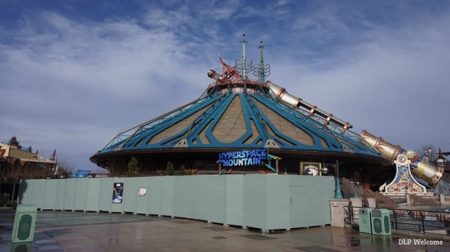
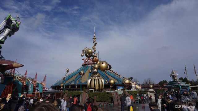
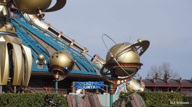
Some useful photos featured here by DLP Welcome show how the new, possibly unfinished, marquee sits both outside the attraction and within this wider area of Discoveryland, directly opposite Orbitron and the Hyperion Airship.
Although more elements could yet be added, the signage doesn’t yet feature either the “Star Wars” or “Rebel Mission” of its extended title. • Previously — Hyperspace Mountain: Rebel Mission poster art features new, non-Star Wars trains Disneyland Paris fans and visitors on Twitter were overwhelmingly negative about the installation.By request, all three logos side-by-side from almost the same angle (cc: @CafeFantasia) ???? #SpaceMountain #HyperSpaceMountain pic.twitter.com/qmjLosktJh
— HyperionPilot (@HyperionPilot) March 2, 2017
@HyperionPilot @CafeFantasia you forgot this one ;) pic.twitter.com/pBTD9qWfjV
— kristof de smet (@kristofdesmet3) March 2, 2017
@HyperionPilot @CafeFantasia The new one is so wrong! ?
— Quinten (@xQx_VanDamme) March 2, 2017
@HyperionPilot @CafeFantasia ..Sadly, this is a huge visual intrusion. With the reopening 2 months off, this may not be the finished product
— CountryBearJohnboree (@MrsHaggisHilson) March 2, 2017
The Hyperspace Mountain logo is fine as a temporary one, but if our’s truly is permanent it must be changed. It’s shockingly cheap looking.
— NI DLP Geek (@NI_DLP_Geek) March 2, 2017
@HyperionPilot @CafeFantasia What a shame @DisneylandParis That’s so cheap and out of place: you’re losing it!
— @JNutterville (@_JNutterville) March 2, 2017
@SalonMickeyBlog Yeah. ? The idea was kind of fun, as just a temporary overlay thing. But, permanent, with THAT sign out front? ?
— CafeFantasia ? (@CafeFantasia) March 8, 2017
.@ED92live Creativity is dead at WDI. pic.twitter.com/GkVqT3m45T
— Kristoff (@KristofThijs) March 2, 2017
Not feeling the #hyperspacemountain sign at all
— Krissie Williams (@krissie2212) March 2, 2017
@ED92live I really like the sign itself, but it’s at odds with the themeing of the surrounding area.
— PlayWearTalkRed (@PlayWearTalkRed) March 2, 2017
@ED92live the name is so far from the external theme as to make it comical.
— Richard Summers (@RichardSummers) March 2, 2017
@DisneylandBerry Graphic design fail.
— Mark Rendle (@marky_rendle) March 3, 2017
@DisneylandBerry Looks incongruous and cheap. What a fail.
— Patrick (@Webor09) March 4, 2017
@DisneylandBerry Thanks for the photo, but compared to the SM 2 sign it’s ugly and doesn’t fit with the dome.
— Archibald Powers I (@88Bttf) March 2, 2017
@CafeFantasia @SalonMickeyBlog Hyperspace Mountain works really well at HKDL, but it’s going to be a horrendous mess in Discoveryland!
— mattwindsor (@mattwindsor83) March 8, 2017
@InsideDLParis @DisneylandBerry This looks so wrong! Nothing at this sign matches … not even the colors ?
— Quinten (@xQx_VanDamme) March 2, 2017
An opening date has still not been announced for the reworked Disneyland Park attraction, although refurbishment schedules now suggest Sunday, 7th May 2017. The signage has appeared surprisingly early in its four month conversion. Photos: DLP WelcomeHyperspace Mountain sign overlays Space Mountain sign. pic.twitter.com/W8DJTbJ483
— Jeeves Williams ?? (@jeeveswilliams) March 2, 2017
Discover more from DLP Guide
Subscribe to get the latest posts sent to your email.


