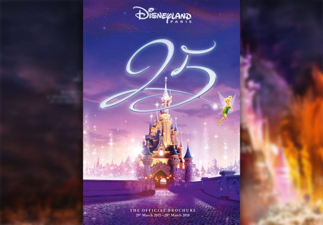
You’ve read the announcements, gazed at the trailer and pored over the detail. Now it’s time to start planning your Disneyland Paris 25th Anniversary adventure. Read More…
News / Brochures
Tuesday, 25th October 2016
Disneyland Paris 25th Anniversary Brochure & Price Grids Now Officially Available
Sunday, 23rd October 2016
Oh boy! Soon you’ll be able to meet Disney Characters at Disney Hotels again
Disney character encounters will return to six Disneyland Paris hotels soon, reversing a change which has seen Mickey and friends removed from all on-site accommodation since November 2014. Read More…
Saturday, 22nd October 2016
First look: Disneyland Paris 25th Anniversary brochure reveals more celebration secrets
The official Disneyland Paris 25th Anniversary holiday brochure is here! Well, if you know where to look. Though not accessible directly from the resort’s website, a simple change of a web address now suddenly reveals a whole load more “sparkling” secrets… Read More…
Saturday, 22nd October 2016
First Disneyland Paris 25th Anniversary trailer teases “sparkling celebration”
After a non-stop week of Disneyland Paris 25th Anniversary news and reaction, excitement for next year’s celebrations has stepped up another gear with the release of the resort’s 2017 brochure. Hidden inside the online version, the very first video trailer for the year, with new animated graphics offering a look at what’s to come.
Read More…
Monday, 9th November 2015
9 Things to Learn from the New 2016/2017 Disneyland Paris Brochure
With every new Disneyland Paris brochure, every avid fan must scour the pages cover-to-cover for additions, changes and updates to keep their Disney resort knowledge fully up-to-date. From new room types to new seasonal events, price increases to (the occasional) price decreases. Read More…
Friday, 15th February 2013
Golden Forest Club to add new premium tier at Disney’s Sequoia Lodge from April
You’ve already upgraded from a standard lodge room to a Montana room, perhaps even a Lake View. But from April, Disney’s Sequoia Lodge begins offering an altogether more “exclusive” category of room with the launch of its own Golden Forest Club.
Modelled on the successful Castle Club of Disneyland Hotel and Empire State Club at Disney’s Hotel New York, these rooms will be located in the top floors of the main building and come complete with their own Golden Forest Club Lounge. Besides the privileged room location, benefits include breakfast with Disney characters and private reception, plus free soft drinks and afternoon snacks in the adjoining lounge, which is said to have a “beautiful tree” as its centrepiece.
Special Disney’s Fastpass tickets are also a benefit, although not as generous as the other “Clubs” which provide unlimited VIP Fastpass tickets: For Golden Forest Club, you’ll only receive one “Disney Hotel Fastpass” per person per day, which is a single-use, any-time, any-attraction ticket.
A higher tier means a higher price, and that’s especially true here. For one night including park tickets for two adults sharing a Golden Forest Club room, prices start at €634 according to Disneyland Paris’ standard pricing grids. That compares to €498 for a standard room at Sequoia Lodge and is notably more than the €596 for the same stay at the Admiral’s Floor of Disney’s Newport Bay Club, which doesn’t offer the private lounge nor any special Fastpass.
The rooms of Disney’s Sequoia Lodge were completely refurbished throughout 2011 and 2012, adding light “Bambi” touches. Current hotel refurbishment efforts now centred on the lowest tier Disney’s Hotel Santa, adding touches from Disney-Pixar’s “Cars” to the rooms. Up next for a major update is said to be Disney’s Newport Bay Club, which rumour suggests could enhance its “Admiral’s Floor” offer to become more like these Club rooms.
Meanwhile, within the next year all Disney Hotels are finally due to provide free Wi-Fi. We’ll take that over any expensive private lounge, personally…
VIA Disneyland Paris Spring-Summer 2013 Brochure
Thursday, 17th November 2011
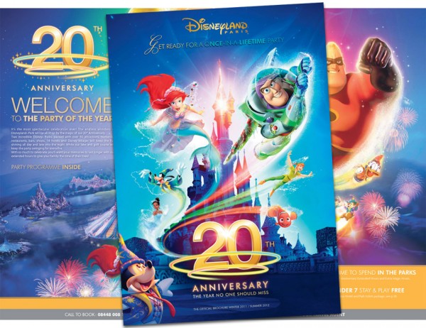
20th Anniversary Disneyland Paris brochure now available, events line-up confirmed
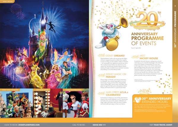
Here it is: the 20th Anniversary Disneyland Paris brochure! The multicoloured edition has been spotted out in the wild at travel agents in the UK since its limited launch a couple of weeks ago, but now it’s available online for all to see. Check it out here. Of course, there are new prices, new options and yet another new design for all the pages, but it’s the 20th Anniversary events and images we want to see. The final line-up to make the brochure cut is modest but promising. Star of the show in 2012 will no doubt be Dreams – the “magical, immersive” nighttime spectacular that’s due to take over the Castle, Central Plaza and even Main Street with projections, special effects and — yes — at least a few fountains, as it plunges guests inside a journey through classic Disney dreams.
Also given top billing is Disney Magic on Parade!, actually a reworking of Disney’s Once Upon a Dream Parade that will see the 15th Anniversary‘s showstopper (certainly the best parade ever to be seen in Paris) given new costumes, music and characters. The current Dreams of Romance Finale float will be turned into a mountain ledge for Sorcerer Mickey, with the gang expected to appear in their spangly multi-coloured outfits seen throughout the brochure, while the original opening float will become home to the fairies, wizards and sorcerers of the Disney world. Oddly, that appears to oust the Princesses from the parade almost entirely, although Rapunzel and Flynn are said to be taking over from Aladdin and Jasmine on the smaller Romance Prelude float to freshen up that aspect.
The new magician-themed permanent meet ‘n’ greet for Mickey is advertised simply as Meet Mickey Mouse, while the fourth and final 20th Anniversary event is the mysterious Main Street, U.S.A. Celebrates. The brochure blurb is suitably blurry but its references to “twinkles” and “glowings-on” are spot on with our sources, suggesting a gold theme for the street and certainly a lot of lights…
As we revealed in September, longer opening hours for Disneyland Park are due to be one of the big bonuses of the year. Advertised as 20th Anniversary Extended Hours, they’re confirmed to be in operation from 1st April to 30th September 2012, although there’s no mention of just how many extra hours we can expect beyond the usual closing time. Presumably, just as many as it takes for the park to see nightfall, providing a suitable canvas for Dreams.
Whilst the 20th Anniversary doesn’t coincide with any major attraction investments, the chance to stay in the park until nightfall every day of the year represents a big gear-change for Disneyland Paris. Add to that a real, signature finale to each day with Dreams — produced by Disneyland California entertainment legend Steve Davison and the team behind World of Color, did we forget to mention? — and the culmination of a huge investment in refurbishments. Looks like an E-Ticket year here.
VIA Disneyland Paris 2012 Brochure
Sunday, 22nd November 2009
New Generation of brochures for Summer 2010
What is it about brochures and Disneyland Paris? No other group of Disney fans gets so excited or worked up about their resort’s promotional materials as us, but here are again, about to pour over every page of New Generation Festival detail. Or rather, the Disney new generation festival, as it now has to be written. But more on that later…
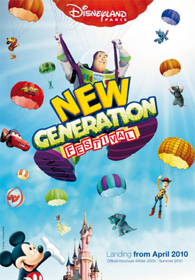
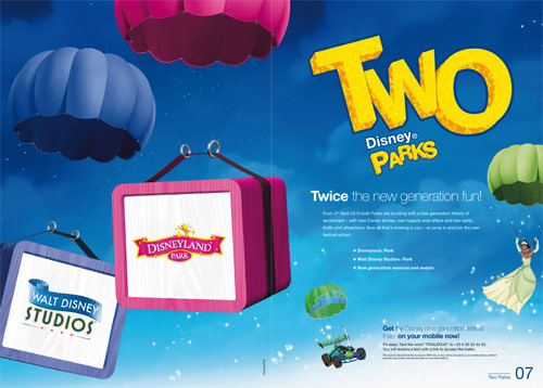
We naturally begin with the cover, where the prophecies were correct — it’s the image of Buzz Lightyear parachuting in behind the festival logo, which is far more prominent than even the Disneyland Paris logo, as the other characters are arranged, fridge magnet-like, behind.
At the bottom, “Landing from April 2010“, with not only a thin typeface but a mixture of bold and light weights together. It’s all very modern, this.
But maybe we should be happy. Look back at the advertising styles from 1992 and they were completely fitting for the period, all colourful shapes and crisp white backgrounds. Maybe it’s a great thing that the resort is being contemporary, rather than continuing the dull fantasy-styles we saw earlier this decade.
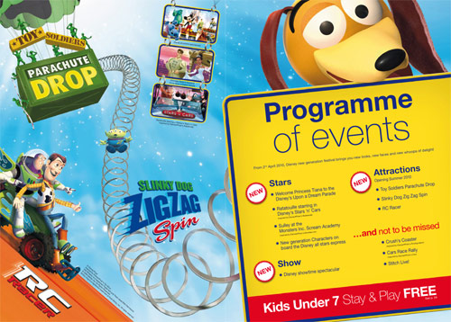
And so we see the “Programme of events” above, with the various new additions for this theme year thankfully sorted into neat categories so that prospective guests can see what’s worth bothering with (attractions) and what’s more a load of puff (stars). Indeed, we’ve still yet to find out just how the Monsters Inc. Scream Academy can be considered “new”, given that it was added in 2006.
This is also our first encounter with lower case madness. Normally, it’s the done thing to use capital letters in the name of a show or event — like Toy Soldiers Parachute Drop. But as we’ve touched upon in the past, and is now confirmed here, the ‘Disney new generation festival’ won’t be following those boring old rules, oh no! So, very much helping the grammar of our text messaging generation, we’ll be welcoming not ‘Disney Showtime Spectacular’ but ‘Disney showtime spectacular‘. Not ‘Disney All Stars Express’ but ‘Disney all stars express‘.
It wouldn’t be noticeable, but this strange stylistic choice is forced into every instance of these names. It’s probably meant to look fresh and hip, but it ends up looking like they forgot to hire a proofreader, we’re sorry to say…
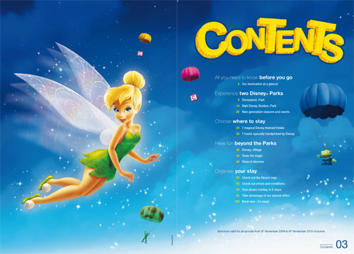
Neurotic grammatical asides complete, the look of this brochure is very pleasing. You’ll see very few actual images of Disneyland Paris in here, but yes it looks very smart — a definite step up from the horribly garish second brochure for Mickey’s Magical Party we’re leaving behind.
Nope, no pictures yet…
Still waiting…
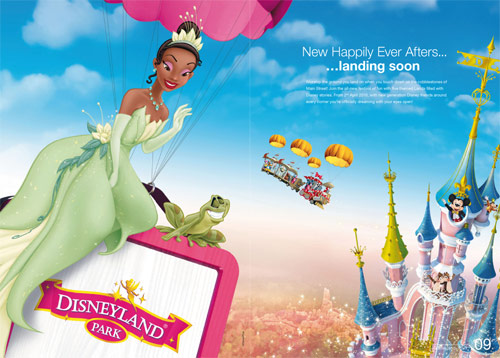
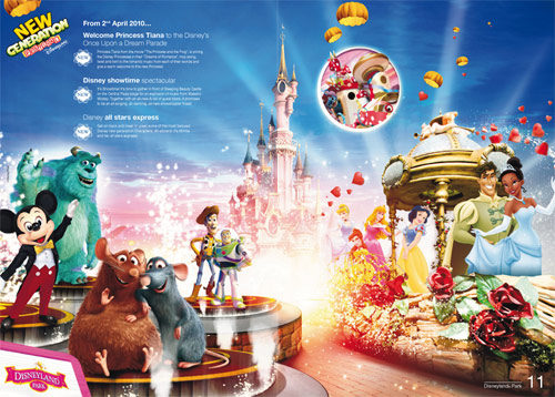
Nice to see the chopped-up image of Tiana and Naveen on the parade float made it through quality control…
Ahaa! Pictures!!
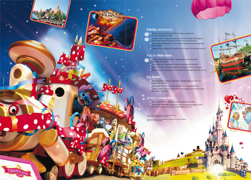
Yes, we’re spoiled a full three real images from within Disneyland Park (including the Castle background). Surrounding those, a Cinderella picture (from Walt Disney World), a false Space Mountain: Mission 2 promo picture and the doctored Disney all stars express promo image.
You can’t be down about this lack of photography for long though, or worry too much that the brochures continue towards being just catalogues of Disney character stock images, because the next page is rather stunning…
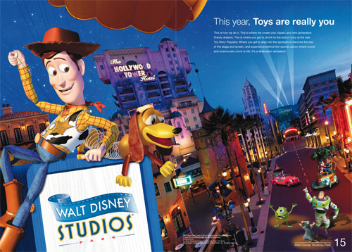
Not only is this (mostly) a real photo — and a beautiful photo at that — no, finally the powers that be have discovered Hollywood Boulevard. The gorgeous little street has been there for two years already and now it’s being utilised and advertised for the first time. Normally, you’d see nothing of the Walt Disney Studios Park exteriors in the brochures, only the insides of attractions.
Add to that some character stock images which almost look to be tailored specifically to this page and we’ve got one of the best brochure pages for years. And it might just be the matching colour palettes, but Woody and Slinky feel quite at home next to that logo there.
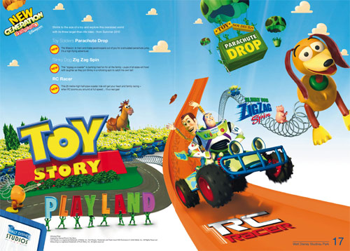
Alas, with every up, there’s a down. After that terrible use of a real photo, this is the centrepiece of their Toy Story Playland launch…
It’s a shame Disneyland Paris don’t appear to want to make concept art public these days, because the ‘TSPL’ artwork is arguably a million times more endearing than this collection of visual junk, inspired by your local crèche.
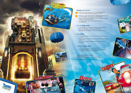
The second Walt Disney Studios Park page is good enough, with the investment in this park now adding up to a very marketable, colourful set of attractions.
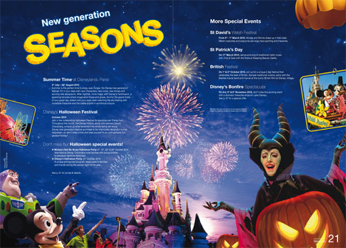
Park seasons appear to get a bigger showing this time, with a full double-page detailing everything from Summer Time (finally branded into a proper season) to the, er, British Festival at Disney Village, where you can see, first-hand… a British Mini! No, really!
Rearing its head again here, though: the marketeers’ disgust for poor old Sleeping Beauty Castle. Since opening day its been mirrored, warped and chopped up to fit their visions. This must be one of the most drastic yet, covering the entire front window with one of the turrets from the side.
Note here and in the image on page 13, at least, that the Castle is decoration free… or almost decoration-free. When editing the spire tops out of that photo above, Tinkerbell was left in place, along with the piping leading up the main tower. Just the choice of the marketing department, or a sign that this decoration is due to cling on?
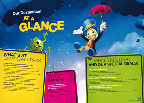
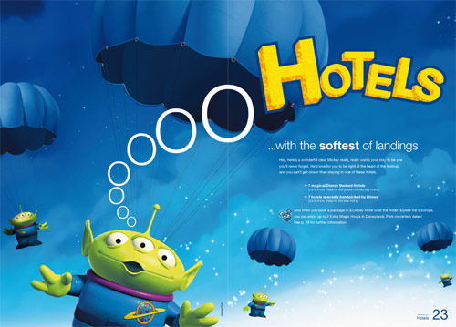
Next, Hotels = Aliens.
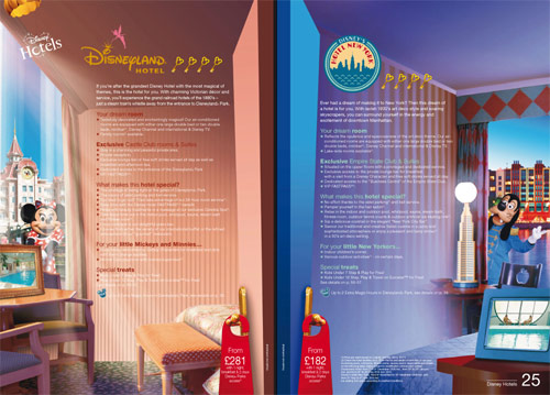
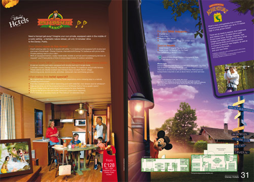
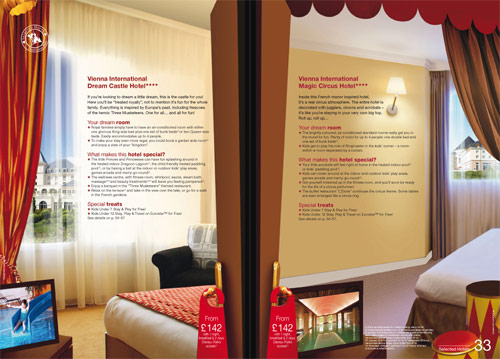
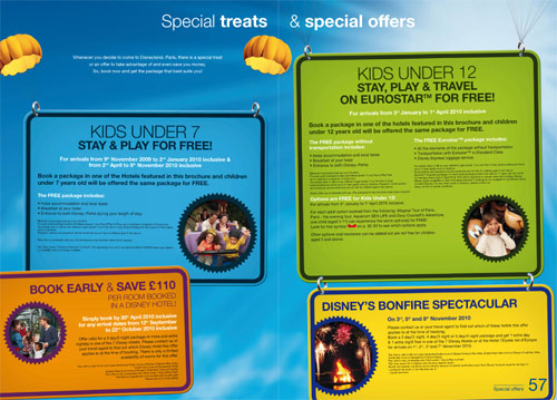
The hotel pages have seen the biggest changes in this new brochure, with the usual format of a white background and one large image replaced by this, “immersive”, style…
Colours, designs and furniture from each hotel dress each page fully, attempting to give us a “feel” of the hotels more than accurate pictures. Each page features only two real images — the view of the hotel out the window and a tiny view in a picture frame — but the style is clever.
In any case, these pages are likely only a teaser — anyone really looking into spending vast sums of money on Disney Hotels surely goes online to find more photos anyway, right?
Davy Crockett Ranch is also presented well, with a view of the cabins inside and out…
Whilst the Selected and Associated Hotels seem to be given more prominence than usual, with their more discreet design touches used to create the same effect…
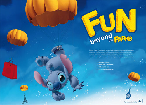
Maybe they should offer real parachuting lessons beyond the parks…
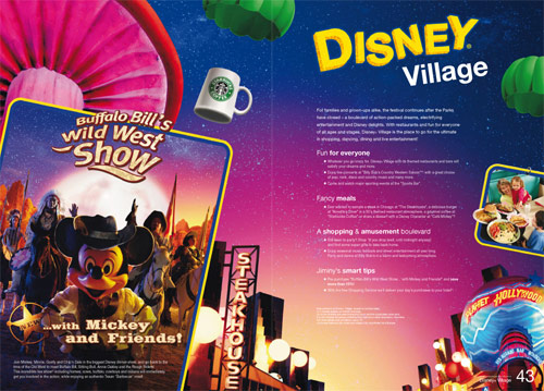
Although lessons may not be necessary, if even an inanimate Starbucks mug can manage it.
Yes, the coffee chain is now very much a feature of Disney Village, whilst Mickey and Friends will continue to cameo in Buffalo Bill’s Wild West Show for at least 12 months more (and in fact, there’s no reason to see that this isn’t permanent now).
Much as the constant character clip-art is off-putting for people who’d prefer to see the majesty of Thunder Mesa and the intricate detailing of Fantasyland, at least this “new generation” really has ushered in a refreshingly different set of characters to be featured throughout the brochure.
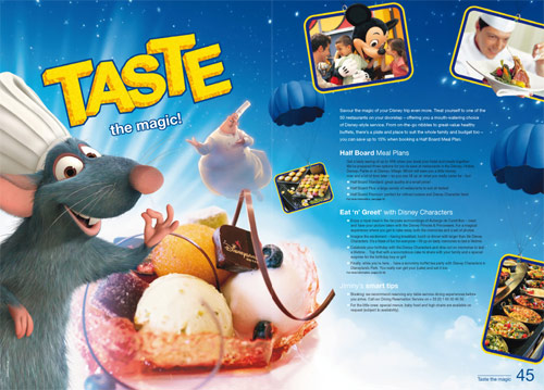
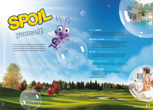
Not only Rémy but Chef Gusteau feature on the restaurants page, whilst little-seen Princess Dot pops up on the leisure and relaxation page, yes really — a character from A Bug’s Life!
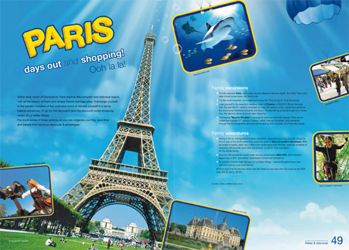
Paris…
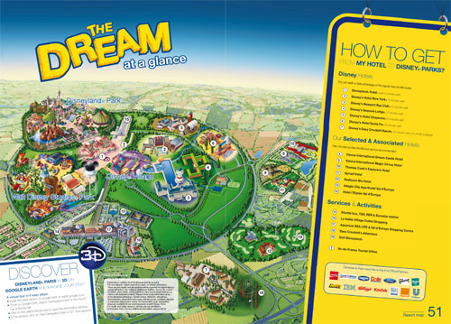
And the new resort map, complete with well-placed Google Earth 3D plug.
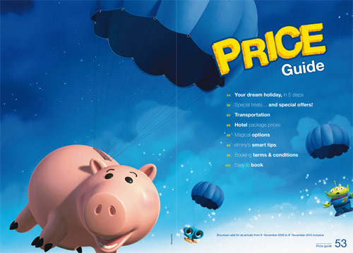
Hamm is a fitting choice for the Price Guide…
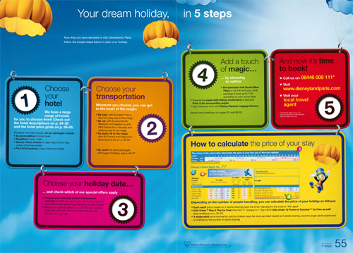
Whilst the “5 Steps” page attempts to simplify the booking process…
…but perhaps the colours make the text a little hard to read.
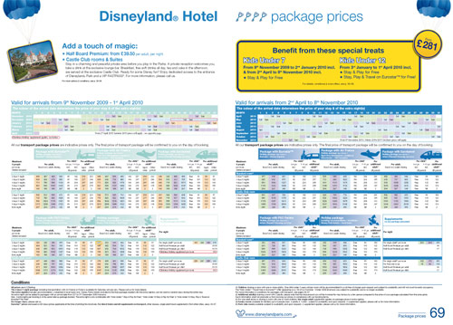
The price guide pages themselves are mostly unchanged…
And there we go.
It’s a definite step up from the last, very disappointing, off-putting brochure, but say it once, say it again — there’s still not enough “Disneyland Paris” in here. Not enough real photos, real information or real feeling for the place between all the thousands of character images.
Perhaps, with the internet, it doesn’t matter. In a few seconds you can find a great site like Photos Magiques. But picking this clip art catalogue up off the shelf, will most people actually bother to go that far?
We all know the place we visit — the amazing lands, the fantastic rides, the beautiful sights and the escapist themeing. What place are they thinking about?
• Download the full PDF Brochure (16.6Mb).
Images © Disney, Disney/Pixar.
Sunday, 18th October 2009
Meet the New Generation of brochures
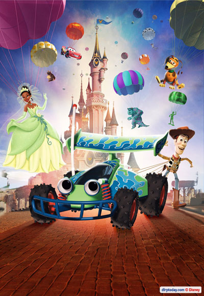
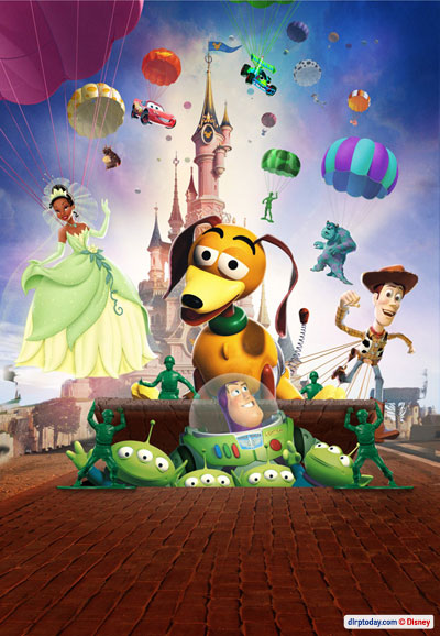
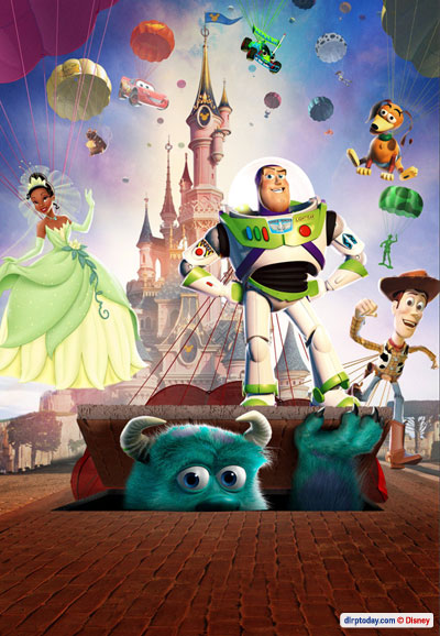
We actually saw the first of these images in September, featuring Sulley peeping out of a trapdoor as Buzz Lightyear, Princess Tiana and a host of other characters parachuted down in front of Sleeping Beauty Castle. This new set of images, provided for travel companies to use as their Summer 2010 brochure covers, follow the same template.
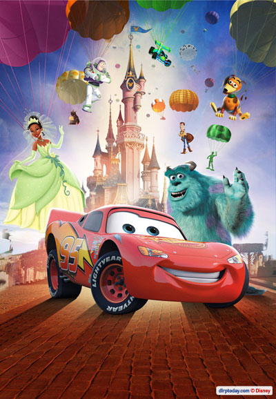
The first is a real surprise. RC in the spotlight? A minimal character really only in the first Toy Story, who can’t even talk? Well, it’s a refreshing change from the usual Mickey, and he does have that still as-yet-unannounced attraction at Walt Disney Studios Park coming up next year. (Come on Euro Disney SCA, the game is up!)
Next up, another star from Toy Story Playland — Slinky Dog. Underneath him, Buzz peers out of a trapdoor in Main Street (you know, that trapdoor on Main Street), held up by Toy Soldiers, alongside four Little Green Men.
In the background of this one, spot Emile from Ratatouille, Jessie with a suitably cow-themed parachute and, er, Nemo. In some of the images he’s been shown floating down in a kind of water bubble… not this time. You also have to wonder about the fate of racing car Lightning McQueen as he smashes to earth, but maybe we’re over-thinking the concept.
Sulley and Buzz Lightyer feature most heavily in the next option for those travel companies. This one we’ve already seen:
Oh, well look at that! Lightning McQueen made it down safely!
Here we also spot a couple of new poses — yes, the folks at Pixar were nice enough to send over several different stock images of their characters — so we see Woody holding his cowboy hat as he parachutes and Buzz folding his arms. All in a day’s work for a toy who can fly!
One nice feature of the parachutes concept, at least, is that most of them are becoming “themed” to their respective character. So we see Emile with a cheese-patterned parachute, Woody with one to match his shirt, etc. In case you still don’t “get it”, it seems like the “Big Idea!” on the giant boardroom paper pad for 2010 is to show these “new” characters “parachuting” into the parks to visualise their arrival and new-ness. Got it?
Plus, in these images, compared to the main New Generation Festival image (which will probably be the official Summer 2010 brochure cover) the characters floating down in the background have even actually been scaled and faded properly, so the image — however much still constructed like a series of stuck-on fridge magnets — does have a bit of depth.
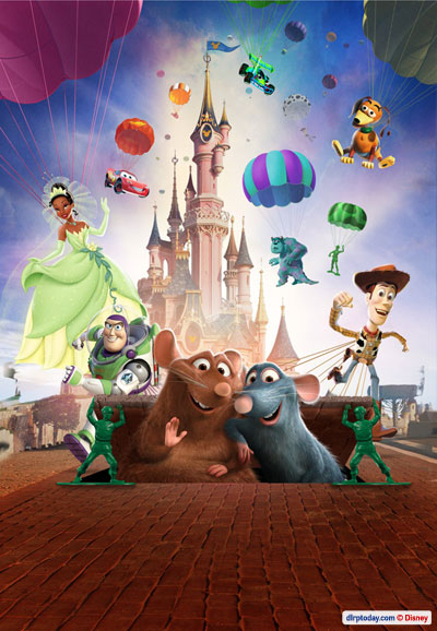
Finishing up, we’ve got Rémy and Emile from Ratatouille.
There you go. Expect to see those on a travel company brochure near you in just a few months. Now, if you were sitting in the offices of one of those companies, which would you choose? Strangely, the RC version looks the most appealing from here.
It’s worth repeating the slight moan from the article featuring the first of these images last month: what’s the need to mess with Sleeping Beauty Castle? Does sticking little Mickey silhouettes over its ornate stained-glass windows really achieve anything? If certain people had their way, would it not be a fantastical medieval palace but a monument to Mickey Mouse, with Mickey shapes on every spire and a hideous character decoration stuck on it’s fron… oh, wait.
And here’s one extra criticism not from DLRP Today. Member MagicStar on magicforum was keen-eyed enough to notice the odd situation to the left of the Castle, where one of the famous square trees has been… squashed! Clearly, that pesky castle wall the Imagineers designed was getting in the way of the character clip-art, so it had to be shrunk down… taking the tree with it! Even more oddly, there’s a spot of branch — or something — still there on the right, sticking up into the air. Good to see important images like these are checked thoroughly.
Even better — no, surely worse — something else has now cropped up on the left of these images, which isn’t there on the original one. Take a look just to the bottom-left of Tiana’s dress in the final image. Looks like the castle hill — almost — got the chop, but a dirty trail of Photoshop remnants was left behind.
Disneyland Paris marketing, we know your secrets.
Images © Disney.
Friday, 31st July 2009
Did we miss anything..?
Well yes, quite a lot obviously. Just shows you shouldn’t go wandering into the Adventure Isle caves just before park closing… it’s been four long months!
If you’ve been similarly deprived of Disneyland Resort Paris news, given up trying to translate what they’re saying on the French forums, sit back and enjoy a quick and concise round-up of all the big stories of recent months — here we go!
SLEEPING BEAUTY’S BLING
Was it coincidence that updates here ended just about the time that Sleeping Beauty Castle succumbed to its most horrific, misguided meddling-with to date?
The birthday cake, the jester’s hat, the Epcot wand, the MGM hat… you’ve met your match. There truly aren’t enough negative adjectives in the dictionary.

— — —
MAGICAL PARTY LAUNCHES WITH MEGA-PARTY
‘You’re invited!’ …but not to this. Press and media types were schmoozed in spectacular fashion as new theme year Mickey’s Magical Party kicked off with fireworks, projections, lights and so many characters they couldn’t even all fit on the damn stage.
Did it generate headlines, articles, media coverage? No.

— — —
ACTUAL PARTY GROWS ON FANS
Frustratingly-titled new Central Plaza show ‘It’s Party Time… with Mickey and Friends’ initially looked rather like a drab flop on an overbearing and unnecessary new stage, but it has grown on most fans. The score by Vasile Sirli is actually plain fantastic (especially considering the lacklustre music in the year’s other new shows) and it provides a fresh, colourful heart for the year.
Watch the full show in HD here.

ShoulderKids – this year’s must-have accessory
— — —
LIGHT MAGIC GIVEN FORMAL APOLOGY
Over in Discoveryland, the other show with an annoying name — ‘It’s Dance Time… in Discoveryland’ — brought delights such as large, primary-coloured circles on the floor of a retro-futuristic land, and the expertly-chosen hits of Block Party Bash.
Despite the show being considered terrible on every level by most who’ve seen it, the performers put so much effort and energy into their routine they each almost deserve a window on Main Street.
Watch the full show in HD here.

— — —
PLAYHOUSE DISNEY QUIETLY OPENS
Beyond the forced MMP hoopla over the other side of the esplanade, Walt Disney Studios Park gained a brand new attraction — its fifth addition since opening — in ‘Playhouse Disney – Live on Stage!’. Jolly good fun it is too — wonderfully staged, very charming. The Paris version even has a “1 Up” on the two earlier versions with a big new pre-show studio.
Watch the full show in HD here.

Credit crunch souvenirs
— — —
RESTAURANT GENERIQUE
Changing its name to ‘Restaurant des Stars’, the far too interestingly-named ‘Rendez-Vous des Stars Restaurant’ gained a new logo, some new colours and a new entrance canopy.

— — —
DUDE LOOKS LIKE A FIRE!
In a quite bizarre coincidence, just days after fans launched an online April Fool suggesting Aerosmith would be succeeded by French rocker Johnny Hallyday as musical guests at Rock ‘n’ Roller Coaster, a fire began in the roof of the showbuilding.
Luckily the damage was minor — though it did allow for these dramatic photos (below) as the inspection crews ripped off the cladding, checked and replaced it. The attraction reopened just the next day.


— — —
SMEE GIVEN SURGERY
Captain Hook’s bumbling first mate was given a random makeover by the worldwide Disney Parks character team and, unlike most famous faces, he returned from the cosmetic surgery with a face more expressive than before. Remarkable.
Hopefully they’ll tackle some of the clearly worse-looking characters next, like the dead-eyed Woody, Jessie and Buzz…

— — —
HIGH SCHOOL MUSICAL PARTY!
Now back for a third year, the Studios’ High School Musical show this year gained musical numbers from the third film but stopped short of going for the full ‘HSM3’ show the other resorts put on. ‘I Want it all’ is the standout number, but one that certainly won’t win over any new fans.
Watch the full show in HD here.
— — —
THEMED SMOKING
The ‘Smoking Areas’ inside the parks had been extended little beyond their miniature park map icons, so it’s reassuring to see that each area now has its own themed sign, tied into the location. Give it a few years and the public might actually use them.

— — —
STUDIO STORE OPENS UP
Behind construction walls last time we saw it, the Walt Disney Studios Store has now been completed, with three new doors and payment desks in front of new, large windows.

Photo: dlrptimes.com

Photo: dlrptimes.com
— — —
STORYBOOK ENDING
Main Street has always had the best-kept exteriors of the entire park, always popping with a fresh bit of paint here or there. A new development in recent years are the nice tarpaulin coverings given images of the building hiding behind. Even for tiny spots like this one on the end of The Storybook Store, the hidden façade is still presented on top.

— — —
PLAZA GARDENS GLEAMS
After a major refurbishment of the interior, including bringing the central fountain back to daily life, the whole Plaza Gardens Restaurant building was wrapped in themed tarps for an expensive top-to-bottom refurbishment and repaint. It didn’t stand out as being particularly bad before, there are other areas needing paint sooner, but it does look fantastic.

— — —
STUDIO 1 REFURBISHMENT CONTINUES
Over the hub, it’s surprising to see that the refurbishment of Disney Studio 1 continues, the huge centrepiece building of the park still wrapped up in scaffolding. Must be a bigger job than originally thought, right?

— — —
FLOORS OF ADVENTURE, DISCOVERY
Tripped up in Disneyland Park recently? No wonder, some of the concrete pathways are literally falling to pieces. Thankfully, the first resurfacing works seen for many years have been taking place, with areas of Adventure Isle and vast swathes of Discoveryland closed off and given new flooring, the effect — especially just in front of Space Mountain — very noticeably making the whole land look brand new.

— — —
TENNIS, MICE, MAIN STREET
Some of the resort’s press and advertising efforts have been surprisingly inventive this year, like this — turning the top of Main Street into a full-size tennis court and inviting Gaël Monfils and Stanislas Wawrinka to play with Mickey Mouse.

Just a few days later, Serena Williams visited the park and was met in front of the Castle by Minnie Mouse, wearing a special tennis player costume.

— — —
JUST ‘PARIS’
Effectively the biggest change of the past few months, the news in April and subsequent official changeover in May that has seen ‘Disneyland Resort Paris’ — the resort’s name since the 2002 opening of Walt Disney Studios Park — change back to just plain ‘Disneyland Paris’.
It certainly makes sense — the extra word was always unpopular, confusing to non-English speakers and now, with every park from Alton Towers to your local fairground claiming itself as a “Resort”, it simply doesn’t have any value. “Disneyland Resort Paris” is cumbersome and never spoken, “Disneyland Paris” is short and very strong. Whilst things like the official website have changed over, don’t expect this to be an overnight transition — the new (or rather, old) logo will reappear just as and when things need replacing.
Unfortunately, this decision — made by new CEO Philippe Gas himself — came in April, just weeks after the resort had launched a whole new brand campaign for the theme year. These traditionally start in April, and everything from Cast Member name tags to park tickets and guidemaps had already been printed up with the full “Disneyland Resort Paris” name. Smart name reversal, silly timing.

There’s also a whole myriad of logo variations now available (above). Which should be used, when? The standard logo is being presented as two-colour, with the “Paris” in a gold gradient that already looks rather dated.
— — —
BURNING FIRES, FLOWING WATERS
Tasked with bringing back old and forgotten effects, a new “taskforce” within the resort’s maintenance department has been one of the most positive steps in recent months. We already appear to have seen some brilliant reawakened touches, such as the torches on Fort Comstock at the entrance to Frontierland (lit from nightfall)…

And the water channels leading to the drinking fountains beside La Cabane des Robinson.

Whilst a long way short of having the full irrigation system working again (water should be hoisted right up to the top of the tree by the water wheel, before being poured out and running through the channels back to ground level), it’s great to think someone took the time to figure this out.
Elsewhere, these moving fairground balloons inside Boardwalk Candy Palace have been back working again, for the first time in years.

— — —
CAFE DE LA BROUSSE
Mostly sitting closed, Café de la Brousse has never the less just had a large-scale refurbishment completed, bringing colour back to the “bush café” buildings. Dole is presented heavily as the host, but still no one thinks of bringing the legendary Dole Whip to Paris!

— — —
DISNEY VILLAGE NOW ‘COOL’
So. It took a Starbucks to make Disney Village “hip” again.

Yes, it meant losing the wonderful Buffalo Trading Co. and inviting a quite equally despised/appreciated corporation into a Disney-branded area, but the coffeehouse itself was built using genuinely eco-friendly ideas and looks really quite trendy inside, with a wonderfully modern exterior — industrial elements clashing beautifully with earthy materials.
— — —
ROSES PAINTED RED, FINALLY!
The on-off refurbishment of Alice’s Curious Labyrinth — with little areas regaining sparkle each month or so — has continued, the Paris-exclusive attraction even seeing… new paint! The red edgings of the entire labyrinth have finally been repainted, a year after similar edgings on the Fantasyland-Discoveryland path received paint before them, and scenes like the Caterpillar suddenly “pop” like they should again:

— — —
ROBINSONS RETURN TO LA CABANE
Also brought back to life this Summer is La Cabane des Robinson, previously the only other “blackspot” alongside the Labyrinth. For too long the treehouse has been bleak and worn. Props missing, effects broken, no colour. It was as if the Robinsons had long ago moved on from their treetop abode. Not any more — refreshed woodwork, new props and a complete clean-up really make it “pop”. Effects like the self-playing organ are still missing.

Even the water fountains were revisited and given an extra spruce-up:

— — —
WOODCARVER’S WORKSHOP RE-OPENS
Not entirely the amazing news that might suggest, but nevertheless the long-abandoned Woodcarver’s Workshop over in Cottonwood Creek Ranch, next to what is now Woody’s Roundup, has finally been brought back into service — selling drinks and souvenir photos from the character meet ‘n’ greets inside.

A long way from the actual woodcarvers who used to create personalised souvenirs here, but good to see it alive and well in some form, eh?
— — —
ENCHANTED FIREWORKS DAMPENED AGAIN
The Enchanted Fireworks have returned for their second year — dampened again in similar style to the later shows last year, when the nearby town of Chessy apparently banged on the wall and issued a loud “shhh”. Fans, and even apparently some regular guests, aren’t too impressed with the “new” show.

— — —
ATTRACTION OPEN 12:00 – 12:05
The same limited opening schedule of attractions put in place last Summer has returned again this year, with visitors taking much more notice. Some say it’s fair enough that they have to close attractions early, since most people have headed to Main Street to watch Fantillusion, whilst others leave annoyed that the park’s advertised opening time of 10am to 11pm isn’t strictly true.
Most agree that the whole situation would be better if the limited openings schedule was at least published somewhere other than only at the attraction entrances themselves — on the tips board, in the Programme leaflet, for example.
— — —
GOOGLE EARTH 3D: WORTH THE WAIT
The much-publicised and subsequently much-delayed official 3D recreation of Disneyland Paris in Google Earth finally launched in mid-May and proved to be well worth the wait, offering a truly spectacular metre-by-metre recreation of every inch of the parks and resort. Visit www.disneylandparis.com/googleearth3d and lose a few hours.

A few days later, Google Street View was also added for small stretches of each park:

— — —
BROCHURE TESTS THE LIMITS
Have you seen the brochures and advertising for Walt Disney World? How grand and high-class it all looks. For Paris, however, the brochures in particular seem to be getting ever more garish and in-your-face with each publication. The latest, current brochure for Autumn/Winter 2009/10 features some truly frightening images of blurred children flying above the parks, with so much photoshopping and saturated colour you can barely see the resort they’re trying to advertise.

The actual, printed version also comes with a bizarre claim on the cover of “First ever interactive brochure”. Beyond the cut-out on the cover (Mickey is actually on the page behind), the only evidence of this is a French (+33) mobile number you can text to get a video trailer of the new theme year. Several weeks later, nothing received here.
— — —
VAT REDUCTION? VAT CHANCE
The French government has officially lowered the VAT rate for cafés and restaurants from 19.6% to just 5.5% in order to keep the industry afloat, and, while you’ll certainly find many notifications of this within the resort, you’ll be much harder pressed to actually find reductions.

Whilst some things, especially the Half Board vouchers, have come down in price, most scenarios have just seen the prices stay the same and Disneyland Paris pocketing the difference in order to prop up the large drop in food and beverage sales this year — mostly on account of the prices being too high during a recession. Good thinking.
— — —
ICE CREAM ARRIVES ON-SET
Walt Disney Studios Park must have been the only theme park in the world without a proper ice cream location until the latest change in its food & beverages offering. The Franklin Department Store façade (similar to the exterior of Gone Hollywood at DCA, international fans) gave up its wonderful 1950s-themed period window to become a new kiosk serving actual, real Ben & Jerry’s by the scoop.

Photo: dlrptimes.com
The lost window was more interesting than the one remaining, featuring a mannequin woman sitting with a 1950s travel magazine, retro television and monster/sci-fi movie poster. The Tower of Terror across the way has such a minimal build-up in Paris that small period-setting details like this really mattered — the Imagineers would have put an ice cream kiosk in there from the start otherwise.
Couldn’t such a vital theme park component as ice cream have commanded its own building somewhere? Rather than expanding, the park almost seems to be imploding, with under-sized kiosks popping up all over where real, full-size boutiques and restaurants should be. More than anything, one single serving window for this in such a prominent position is madness.
— — —
BLOCKBUSTERS IN THE BACKLOT
Over in Backlot, the big news has been the complete gutting of Backlot Express, the “props warehouse” counter service restaurant, in favour of the more brand-friendly idea of themed rooms dedicated to the Pirates of the Caribbean and High School Musical franchises. The changeover began with the arrival of a plain Ford Focus outside the restaurant, plastered with “HSM3” stickers…

The new logo has been completed on the outside…

And as for the inside? Well, real props from these two trilogies have yet to appear, with the High School Musical area causing much fan hair-tearing already with its “themeing” of bland posters, banners and mini basketballs (taken from merchandise). The “East High” theme does sit well within the building, but this isn’t anything someone with a good printer could set up themselves. Are there not even any costumes from the film lying around over in Burbank?

Beyond the “torn bedsheets” (as described by magicforum members) hanging from the ceiling, the ‘Pirates’ area has defied the odds and just presented the first real surprise of this project — the removal of the metal railings of the raised “garage” area to be replaced with pirate ship-styled wooden banisters and a full ship’s wheel.

— — —
TELEVISION STUDIOS GOES ’50s
…Or is that wishful thinking? With a long-overdue repaint of the Walt Disney Television Studios building (home to Playhouse and Stitch Live) finally beginning back in April and only just making real progress, have the maintenance teams really taken a step back and reconsidered the building, rather than just bursting ahead with the same ugly yellows the original designers chose in 2002?

Yes, it seems so! The architecture was already within the period, but the colours didn’t quite fit. Now, a deep red has replaced the turquoise on the “fins” atop the building, with the yellow turning a much more earthy, peachy shade, in whole much closer to a 1950s Hollywood look and more pleasing next to the subdued tones of the Hollywood Tower Hotel just opposite.
— — —
ANIMAGIQUE KIOSK MARK II
The bland merchandise kiosk which appeared outside Animagique in 2007 now has a partner. Filling in dead space on the right of the same TV Studios building, this little location opened just this week, using the new colour scheme and dressed up in a pleasingly similar style of fins and neons.

Photo: Sean Hamilton
In any other Disney park, such a location would be given a name or some kind of personality (think Crossroads of the World at Disney’s Hollywood Studios). It offers the usual generic collection of character merchandise.
— — —
ROCKEFELLER PLAZA REBORN
Could this be the start of a new era for the environs of Disney’s Hotel New York? The Rockefeller Plaza building, a dull games arcade for far too long, has finally reopened as a lovely café refreshments location for the Summer.

— — —
MICKEY SWINGS INTO — AND ONTO — BUFFALO BILL’S
It was the controversy of the year — nay, the decade — and now it looks like Mickey Mouse has made home. The not-so-great poster previously stuck on the Buffalo Bill’s Wild West Show entrance has just been replaced by a large model of Mickey Mouse abseiling down over the building.

Whilst it looks much smarter now, it has fans worried that the mouse may well be there to stay. On the subject of the show itself, the current Summer park programme leaflets are now advertising Adult tickets for the price of Child tickets. In high season? Maybe adding a mouse wasn’t the best way to sell the scale of this truly epic dinner show.
— — —
FASTPASS FOR MONEY
This one must be the second-biggest controversy of the year, then. In itself not a huge thing by any means, this could however be the first step of a huge shift in how Fastpass works. From 18th July to 4th August, guests staying at Disneyland Hotel, Disney’s Hotel New York and, it seems, Disney’s Newport Bay Club, can buy a special “Premium FASTPASS” for €80 per person per day.
The ticket is effectively a VIP FASTPASS, the unlimited-access ticket previously given only to guests in Club rooms and Suites, allowing you to use the FASTPASS queues for attractions as and when you want, as many times as you want to.
— — —
STUDIO 1 REFURBISHMENT CONTINUES

— — —
GOOFY’S SUMMER CAMP
Somewhere you won’t find Mickey this year is the new show at The Chaparral Theater in Frontierland. Yes, since we last updated the topic, The Tarzan Encounter was cancelled again — for good.
This new show is somewhat like the Summer cousin to the brilliant Mickey’s Winter Wonderland, only scuppered by a desperation for audience interaction, with too few scenes between. However, with a live country band as the big “plus” to replace the Winter ice rink, a great stage and some nice musical numbers, it’s winning more fans than certain other shows this year, and much more fitting for its location than Tarzan ever was.


— — —
MAIN STREET COMES ALIVE WITH MARCHING BAND
Last seen making brief appearances last Summer on the old Central Plaza Stage, the brass band has returned! Now performing a brilliant set of Disney music (even including Hans Zimmer’s Pirates score!) on Town Square, this is the kind of classic Disneyland entertainment we rarely see in Paris, so enjoy! The only problem — no one, not the makers of the park programme, nor the Cast Members inside City Hall, appear to have been given their performance schedule.

— — —
CARL’S HOUSE FLIES OVER FRANCE
The real-life version of the balloon-lifted house from Pixar’s next — and 10th — major hit, “Up”, travelled over to France recently and, amongst appearing in some truly spectacular hot air balloon festivals, paid a visit to Disneyland Paris early one morning.


— — —
AND FINALLY…
Who’d have known — the Sleeping Beauty fountain inside the Castle gallery was actually meant to trickle down into the waterfall below, beside the staircase, as one, complete water system! Now, after truly years of being turned off and ignored, it’s fixed and running. The “crystal” at the bottom of the falls glows, too!

Photo: pussinboots
Wonderful. Utmost appreciation to whoever made this happen.
— — —
So there you go, DLRP Today returns!
With thanks to www.photosmagiques.com!
