Sunday, 6th July 2008

Bye bye Buffalo Trading Co.?

When we first reported two rumours of new dining establishments opening up at Disney Village, it seemed certain that a Starbucks coffeehouse would be one of them. The reliable insiders could even pinpoint a location: near Rainforest Cafe.

That initial thought wasn’t too far from what now looks to be the reality, but there’s one important difference: the addition of a Starbucks could now be a replacement for an existing location, rather than a new build replacing that out-of-place rainforest carousel.

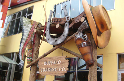
The unlucky trader? Buffalo Trading Company, that exceptionally well-themed little store joining onto Buffalo Bill’s Wild West Show. Popular amongst fans, even more so amongst Western aficionados, it is one of the few venues in Disney Village left mostly untouched since 1992. Whilst almost every other boutique had has themeing removed or priorities shifted, Buffalo Trading Co. has stayed on the straight and narrow.
Image
Photo: william_tropico, Flickr.

The news that Starbucks Coffee will replace the store was shared by member Kinoo on magicforum. Can it be taken as concrete? Well, let’s say the concrete has indeed been poured but is yet to dry — the way things change at Disneyland Resort Paris, nothing can be guaranteed until you actually see it.

Introducing a Starbucks Coffeehouse to Disney Village, however, now seems more certain than ever. Another member on magicforum, penfold12, shared the information from a recent article which stated that whilst Starbucks continue to have worldwide success, they were having a hard time getting a foothold on France and were looking for new locations to improve awareness and acceptance of their brand.
Image

New locations? Awareness and acceptance of their brand? Disney Village seems to fit their requirements perfectly, and equally Starbucks to Disney Village. The nearest competitor would be New York Style Sandwiches, which focuses — as you’d expect — on the sandwiches and not on its regular Nescafé instant variety of hot drinks. Amongst the dining and drinking locations at Disney Village, there are few with this kind of informal, relaxed café style.

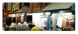
To replace the most popular boutique amongst fans will be a hard pill to swallow for many, though. Inside, Buffalo Trading Co. has sunset dioramas, western storefronts and even a giant window looking into the pre-show area of the Wild West Show, for which it serves as a merchandise store. Against the watered-down offerings of the other stores, replacing this shop will lower the benchmark for boutiques significantly when — or if — Euro Disney SCA decide to expand the Village for real.
Image

It would be accurate, however, to guess that Buffalo Trading Company is one of the least profitable stores in Disney Village, taking on quite a niche area of souvenirs — not least one that is already well-served by the stores of Frontierland and Disney’s Hotel Cheyenne. Undoubtedly the ideal size for a coffeehouse, the only problem with this unit could be the lack of space to join the craze for outside terraces.

As for the second rumour of a new sandwich shop in Disney Village, all remains quiet…

[Photo credits: Flickr, Starbucks, Photos Magiques]
Saturday, 5th July 2008

Disney Village turns over a new leaf for Summer

You might be rubbing your eyes in disbelief (or at least hayfever) as you stroll toward Disney Village this Summer. Because, this once famously dank and industrial entertainment district has turned a new leaf. We saw the work begin and progress start to be made, and now we can see it in bloom for the first time…

Image

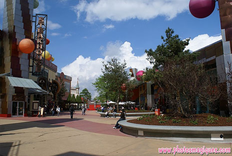
At least 8 new planters and over 30 large new trees have suddenly transformed the space into a welcoming, green, human environment. Each planter automatically serves as a new place to sit and watch the bustle of the Village pass by, whilst breaking up the expanse of buildings and that unforgiving, minimal industrial architecture of the original build.

Image

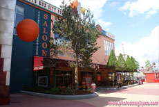
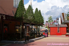
Most thankful for the changes is sure to be Billy Bob’s Country Western Saloon, now surrounded by customised planters with stylised, pruned trees and a fully-covered terrace complete with heavy wooden furniture. Suddenly, the bar is modern and appealing — but not without a little Western charm.

Image Image

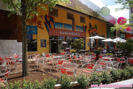
Equally transformed by a new terrace is the other side of the street, outside Sports Bar and New York Style Sandwiches. Here, a fantastic thin, curved planter encloses a wooden-decked terrace complete with trees and shrubs. The red Coca-Cola chairs add a splash of colour outside the Sports Bar, whilst trendy wooden parasols on the customised New York Style Sandwiches-branded tables make the space ever more modern and human.

Image

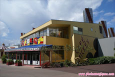
At the far end of Disney Village, Café Mickey now has an increased capacity for the Summer thanks to its fully-enclosed terrace, functioning as a full extension to this, the most popular restaurant. The curved glazing wraps around the front of the building with several regular doors and several patio-style doors which slide open, all decorated with white and silver branding with red Café Mickey logos.

Image Image

The blue, white and red decoration around the roof still appears to be as flimsy and creased as when we thought it was a temporary decoration during construction. Against the yellow of the actual building, it all adds up to looking like a circus tent or a poor ‘Dizneeland’ imitation of the original Café. Not great when you see the prices on the menu that apply equally here.

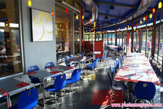
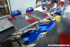
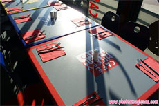
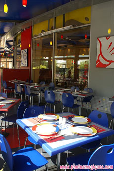
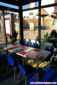
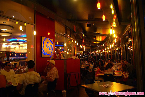
Inside, you might think the primary colours and modern furnishing look like something straight from IKEA, but don’t judge just yet. Look a little closer and you’ll see there is actually a nice attention to detail here. Tables are decorated with dalmatian spots, Minnie Mouse polkadots and contrasting Café Mickey logos. Portraits of Mickey Mouse body parts on the walls are illuminated from behind.

Image Image

Tiles surround the bottom of the old exterior wall, dotted with several red, yellow and blue colours. From here, you get a great view across the lakeside of Disney Village and PanoraMagique.

Image Image

Admittedly, the terrace doesn’t quite have the same warm feel or spacious round tables as the original restaurant area. You might feel a little cheated if you were seated here and paid the same price for your meal. But, as a Summertime overflow area, it already seems to be serving its purpose well. And, once Chef Mickey arrives, no-one cares about anything else.

Image

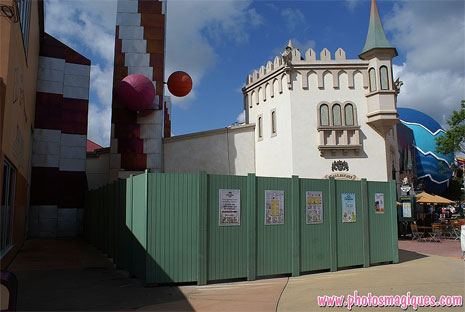
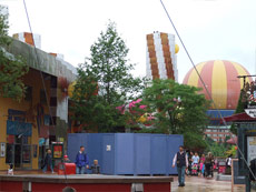
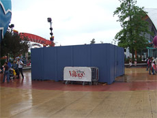
Similar expansion plans now also appear to be afoot over at King Ludwig’s Castle. Designed and built by EDLI (the Paris branch of Imagineering) for the German beer firm which owns and operates it, the restaurant appears to be building a more permanent terrace of its own. The space which used to simply host a few tables and chairs — plus the red carpet leading into the restaurant — has been surrounded by construction fences for several weeks now.

Image

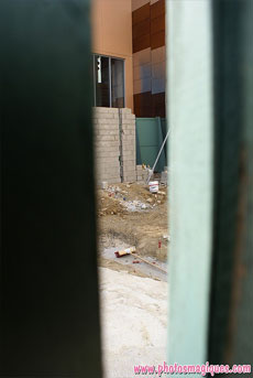
Behind, movement is slow and no visible progress has yet been seen, even in the latest photos from the past few days. Foundations and a new brick wall were certainly spotted by Photos Magiques on 22nd June, however.

Image Image

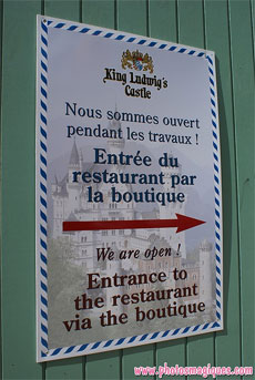
The restaurant of course remains open throughout the works, with the entrance instead through the medieval boutique — as highlighted on the sign (above). Notice the background there? That’s Neuschwanstein Castle in Bavaria, from which Le Chateau de la Belle au Bois Dormant took much inspiration.

Image Image
Photos: Disneytheque.com

Finally, the erasing of the past. When Frank Gehry envisaged a giant “open air warehouse”, held up by giant steel pylons made out of scaffolding, did he know they’d be erased so brutally? The concrete bases of the old pylons have been lying around for several years now, serving no purpose other than to have their paint worn away within a few months, and so it’s a real pleasure to see the money finally spent on removing them for good:

Image
Photo: Scrooge, Disney Magic Interactive forum.

At least three have now been replaced by appropriately-coloured concrete flooring, whilst a couple which fall inside one of the new planters have actually been kept for use as small performance stages during special events.

In fact, it transpires that these trees and planters were intended to be implemented as early as 2005, when Karl Holz joined the resort and was apparently quite horrified by what he saw here. Alas, money did not allow it — until now. Thanks Karl & co, we no longer have to pretend Disney Village doesn’t exist when we dream of the magic. In fact, on a warm Summer’s day, those cafés and terraces suddenly seem quite tempting.

Now, about replacing the rest of that concrete floor…

[Photos: Photos Magiques (more), Disneytheque.com, Scrooge]

Tuesday, 24th June 2008

Prince Caspian: French Narnia premiere at Gaumont Disney Village

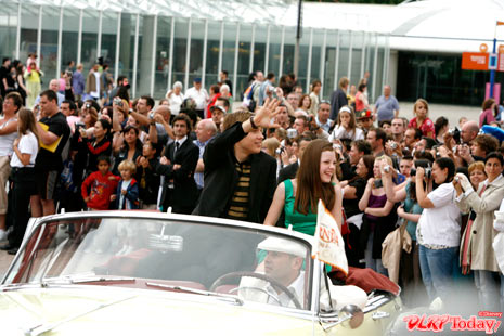
The wide resort esplanade in Paris is usually a place of guests rushing hurriedly from hotel-to-park or park-to-park, eager to begin their Disney experience. Last Friday at around 7.00pm, however, they were in for a shock — the gateway to Narnia had sprung open right there, bringing the stars of the film and their medieval extras on a long route all the way from Disneyland Hotel to Disney Village…

Image
In the first car, William Moseley (Peter) and Georgie Henley (Lucy).

Image
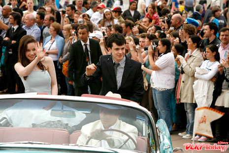
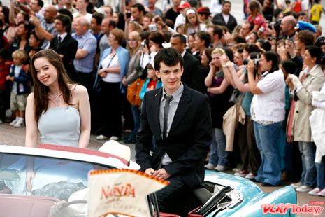
Following, Anna Popplewell (Susan) and Skandar Keynes (Edmund) made their way through the gardens, past the train station, to the newly-green (is “Narnia-like” pushing it?) Disney Village.

Image
A large crowd was gathered well in advance of the arrival of the lead actors, thanks to plentiful publicity by the resort and Walt Disney Studios Motion Pictures — not to mention the many camera crews setting up outside the cinema doors. Each car, in fresh Narnia-like colours, was decorated with themed flags bearing the film’s logo.

Image
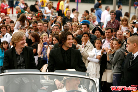
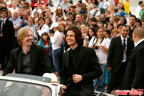
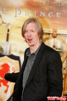
The biggest star of the film arrives — Prince Caspian himself, Ben Barnes, joined by director Andrew Adamson.

Image
Prince Caspian will likely be Adamson’s final time directing a Narnia film. For the third, The Voyage of the Dawn Treader, due in 2010, British director Michael Apted has already been signed on. Adamson will remain as a producer.

Image
Many fans like those hoping for an autograph and photo here, will be glad to hear that all the principle cast have already been signed onto the third film.

Image
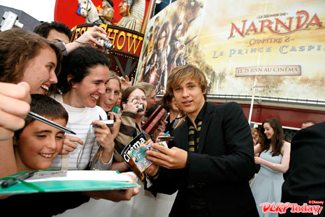
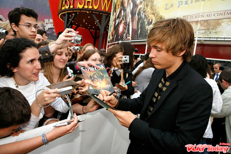
For William Moseley, that means another long line of adoring (and mostly female) fans.

Image Image
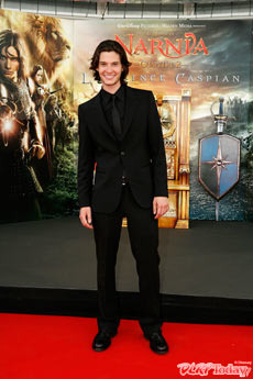
But now, he has competition — Ben Barnes has been thrust head-first into the big time as lead character Prince Caspian, with Disney trumpeting its choice to begin promotion of the film with a single one-sheet poster featuring just this star. / Andrew Adamson asks if the throne (behind) is intended for him

Image
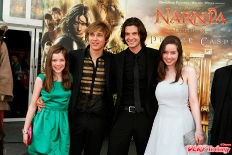
Georgie Henley, William Moseley, Ben Barnes, Anna Popplewell

Image
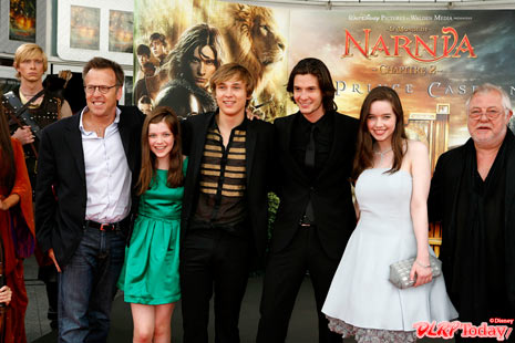
The young cast with producer Mark Johnson (left) and Vincent Grass (right), who plays Doctor Cornelius

Image
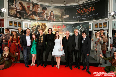
The entire company pose for the bank of photographers and journalists in front of the entrance doors to Gaumont Cinemas in Disney Village, surrounded by actors from the earlier medieval ceremony.

Numerous French celebrities and personalities, such as Emilie Dequenne, Geraldine Pailhas, Jovanka Sopalovic, Clovis Cornillac, Antoine de Maximy, David Halliday, Richard Dacoury, Laura Flessel and Julie Gayet also attended the premiere, posing for photographs and interviews on the throne positioned in front of the giant ‘Prince Caspian’ backdrop.

« Part 1 of our Prince Caspian series ‘¢ Part 3 of our Prince Caspian series »

[Photos: © Disney]

The Chronicles of Narnia: Prince Caspian is released in the UK this Thursday, 26th June 2008.

Monday, 31st March 2008

Fibre optics light up Village of new trees, terraces

Since the loud neon lights which protruded into the middle of the Disney Village street disappeared just a few years ago, the streamlined Frank Gehry architecture of the large Eastern building has felt more flat than ever before — save for the odd illuminated balloon or two. Today, this unusual stretch of Disney architecture is well on its way to being “humanised”.

Just over a week ago, construction walls surrounded the entire area of the former Sports Bar and New York Style Sandwiches terrace. This was previously an enclosed, slightly raised area before it met its end when much of the seating moved to the undercover area on the left.

Image

Last weekend, all was revealed — more new trees for the Village! There continues to be a mix of evergreen and deciduous, with the fir tree between Disney Fashion and New York Style Sandwiches joined by these — currently skeletal — new trees.

Image

Somewhat like Walt Disney Imagineering’s ‘placemaking’ works for Walt Disney Studios Park, the works at the Village will turn it from a vast expanse of concrete into a place where trees and planting invite you to explore slightly more hidden corners.

All well and good, but let’s not forget that the 2005 removal of the pylons in the middle of the street — which looked less than beautiful during the day — also caused one of the best things about Gehry’s original design to disappear: the starry sky. Long stretches of lights between the pylons, like a roof to Gehry’s “industrial factory” party space.

Image Image

Now, many years later, a reasonable replacement has arrived — bright, colour-changing, fibre optic lights, laced along the branches of each tree! The ends of each wire light up throughout the day and change colour continuously. They are being fastened in place to illuminate the branches and should certainly add to the effort to help Disney Village feel a little more like an extension of the parks, rather than an unwelcome distant relative.

And what of those new terraces? At Billy Bob’s Country Western Saloon, the mysterious work continues to go on without much word as to what exactly will become of the bar/restaurant’s exterior. It is clear that more “relief” and texture is a likely addition to the flat, un-themed building, which was last year given a border around its roofline to begin the process, but no exact details are known about the redesign.

Image Image

The terrace area, which often became nothing more than empty wooden pen during Winter months, has seen some destruction to provide a home for another new tree and planter. Some sources on the usual Disney Central Plaza forum have suggested a proper cover for the terrace could be a possibility.

Image

At Café Mickey, meanwhile, it looks like a covered terrace is a reality. As the photo above shows, a new curved steel framework is going up around the edge of the building, where previously an uninviting tarmac terrace was bordered by temporary potted plants.

[Photos by Photos Magiques and Disneytheque.com]

Tuesday, 18th March 2008

Rumours abound for new Village eateries

Whilst the look and style of Disney Village has been evolving through a series of enhancement projects in recent years (the latest being the new planters), one thing has remained pretty much stagnant since the opening of King Ludwig’s Castle in 2003 — the choice and availability of dining.

However, amongst all the renewed interest in the Village thanks to the latest enhancements, strong rumours now suggest two small new food locations will almost certainly open within the next year. Information from several members on the French message board Disney Central Plaza suggests that these will be two new, separate buildings — not small stands or kiosks, nor large buildings for the new street next to the IMAX cinema. Instead, they will be slotted into the existing Disney Village area to increase the district’s range of food and capacity.

18-dveateries-01sm.jpg
The current area and carousel, very much unloved by fans

So, which two companies could be involved in these new eateries? Whilst the insiders originally held the information close, it has now emerged that none other than Starbucks could be involved, with rumours even strong enough to suggest that the new location would be behind Rainforest Café, on the site of the current “rainforest carousel” (pictured above).

This would provide enough space for a kitchen and serving area with some, rather limited, seating. It would also make this Starbucks visible from all around the Lake Disney area, perhaps one of the most lucrative locations they’ve ever won in their ongoing world domination.

18-dveateries-02.jpg
Example Starbucks franchise

It is expected the design would be overseen by DLP-I, the Paris branch of Imagineering who work on Disney Village projects and most recently completed the PanoraMagique and IMAX developments with a noticeably more discreet and Parisian style than other areas of the Village. With Starbucks‘ branding being much subtler than other chains, the two could fit together well for a welcome lake-side coffee shop.

But what for that second new eatery? The admin of Disney Central Plaza, Grandmath, promised that at least one of the two was already operating at Walt Disney World. Since there are no Starbucks franchises on Disney’s Florida property, the second location must surely be the Orlando import.

Indeed, current rumours, again very strong and from reliable sources, point to an Earl of Sandwich opening at Disney Village. Think of this as a more exclusive, slightly upmarket version of high street-favourite Subway. No location for the second building has been rumoured, and no tentative dates for construction of either have yet been given.

With the new planters, a sandwich shop and a coffee shop, Disney Village could well morph from its metallic, hung-over past to a pleasant, leafy place to spend a lazy afternoon. We’ll have a Strawberries & Cream Frappuccino and a Tuna Melt, please.

Yes, we can wait.

[Photos: DLRP Today and dontthink.feel on Flickr]

Monday, 17th March 2008

More planters, more progress for Disney Village

The planters might still be largely plant-less, but they’ve already had an impact on the look and feel of Disney Village, adding curves and hidden corners to the previously flat and square street. Curiously, they’ve been used to enclose many of the concrete footers of the old pylons, with no signs of these being removed.

Image

Either the square bases will be expensive or difficult to remove, due to electrics and cabling inside, or they have been kept for some other reason, perhaps seasonal decorations or events.

Further down the street, near New York Style Sandwiches and Disney Fashion, the planters circle outwards from the supports of the undercover areas. There are around seven new planters in total, ranging from a small circle next to Annette’s Diner to the large expanse now covered under Planet Hollywood‘s staircase.

Image Image

At the entrance to the Village, where wooden-bordered planters first appeared before the full concrete edges arrived, nothing has yet to fill the extra gap, as the concrete pieces are still slotted into place. The planters here create large circular seating areas from the empty area previously used by attractions such as the mechanical bull.

Image Image

The planters aren’t the only additions to Disney Village in the 2008 slate of improvements. Behind the wall of blue fences to the left of the entrance, another new stand is currently under construction. Its metal structure can just be seen above the fence. This follows the recent addition of a proper stand for Marriott’s holiday village sales next to the Planet Hollywood boutique (see the first photo on this page).

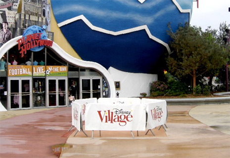
On the subject of Planet Hollywood itself, there’s reason for a real celebration. Because, whilst the rest of the Village might be “going green”, the iconic globe of this restaurant has finally lost its years of green moss and dirt to return to a bright blue, thanks to a long-awaited refurbishment…

Image

The globe had already been given a substantial clean-up in recent weeks, before the arrival of stakeholder Sylvester Stallone, but the two photos below do give a good impression of the improvement to this location which, for many, is their first impression of Disney Village. The repainting is still ongoing, with the lowest section of the globe still awaiting paint and new white cloud patterns still to be applied on top.

Image Image

There’s a return to form elsewhere in the Village, too, and quite an unexpected one. Just a few years after closing in favour of the new NEX Arcade underneath the IMAX cinema on the Village’s future new street, the games arcade in the former Central Stage area has reopened!

Image Image

The area has remained empty and untouched since the arcade “moved”, but has now reopened with a dark and simply interior design and simple, rather amateurish signage outside. This must raise questions about the popularity of the NEX arcade, and their feelings about being made practically redundant with the reopening of this location. The games at NEX might be better, and it might offer miniature 10-pin “fun” bowling, but will any guests now walk so far out of the way for it?

Finally, with all these additions, it might be hard to overlook one of the most dramatic and surprising losses from Disney Village in recent weeks — the iconic Billy Bob’s Country Western Saloon sign.

Image

As shown in the photo inset, the sign has survived all previous refurbishments and improvement programmes at the Village, but lost at the final hurdle. It follows the removal of the Billy Bob’s signage, awning and many painted decorations from the building in recent weeks. There has been no word of the Country Western Saloon theme disappearing, and so we can only assume this refurbishment will simply be much, much more ruthless than any in the past…

[Photos by Photos Magiques and Scrooge, Disney Magic Interactive forum]

Sunday, 9th March 2008

Village goes green with surprising changes for 2008

The changes began back in December of 2007, when, as if preparing for its New Year resolutions, new planters suddenly appeared at the esplanade entrance to Disney Village. Contained within simple wooden borders like you can find at any garden centre, the new trees, shrubs and plants were a shock to the system, wrapped around either side of the entrance and behind the staircase into Planet Hollywood. It was a very good start — not great, the Disney “finish” was lacking, but certainly a major plus for the once barren, concrete areas.

Image Image
Late December 2007 [Fabawan, DisneyGazette.fr forum]

Whilst the fans on magicforum whiled away the first month of the year dreaming of concrete borders à la the American Downtown Disney areas (and the esplanade leading to the Disney Village parking lot, in fact), little did we all know what would suddenly appear at the end of the month… Yes, concrete borders. Disney’s standard issue for planters in the resort area, and one of the first true, permanent “Disney” touches the multi-year makeover of the Village has seen so far.

Image Image
Image Image
7th-8th February 2008 [Photos Magiques]
Before we knew it, walls were popping up here, there and everywhere — brand new trees climbing into the sky behind them, housed in new footers being dug into the concrete flooring.

Image Image
21st February 2008 [Disneytheque.com]

Next to Annette’s, between Planet Hollywood and King Ludwig’s, between Sports Bar and Disney Fashion and between Disney Fashion and the Hollywood Pictures store they arrived…

Image Image
29th February 2008 [Mousy.be]

The entire lot reaches its crescendo at Café Mickey, where the uninspiring black tarmac terrace, bordered only by temporary potted plants for years, is finally being ripped up and replaced by a brand new pavement terrace, like the great cafés of Paris itself.

Image Image
6th February 2008 [Fabawan, DisneyGazette.fr forum]

After the balloons and garish repainting works, Disney Village finally looks to be on the right track. With its harsh architecture softened by greenery and “through-passage” feel broken by all the extra seating on the concrete borders, wrapping and curving their way along the street, the area is finally beginning to appear like a real extension of the parks themselves.

Well, it at least now, finally, has that aspiration.

— Look out for another update following this soon, with the latest progress from the project.

[Photos by Photos Magiques, Disneytheque.com, Mousy.be and Fabawan on DisneyGazette.fr forum]

Sunday, 1st July 2007

The Good, the Bad and the Ugly at Disney Village

As we’ve watched the Village change its colours over the past couple of years, removing pillars and the “starry sky”, adding garish colours and poorly designed signs, there’s no doubt the thought that has always been at the back of our minds – “It’s ok. It’s only temporary. Once Tower of Terror is complete, Disney Village will be next on the agenda.”

But what then? Sure, we might finally get a brand new ‘World of Disney’ Store, but in the old part of town, will all this work be replaced again? They’ll have another go, but with a bigger budget? When you stop to think about it, the future for the current street — unless they do something seriously drastic when they start to expand — doesn’t look that good after all. Nor does the present…

DLRP Today is a happy place, let’s not forget that. We’ve had complaints, we’ve had moans, we’ve had could-have-been-done-betters, but, of 300+ articles, very few contain anything remotely negative about Disneyland Resort Paris. In that spirit, let’s start with a few kind words before the real disappointment begins…

The GOOD

Now, it’s quite unfair to entirely blame the current team on the state of Disney Village. The blame really has to go back to the original lead architect – Frank Gehry – or better still the person who comissioned the entire project – Michael Eisner. It’s no secret Eisner wanted Disney to become reknowned for world-class modern architecture as well as world-class theme park design. Whilst he may have given us the most stunning Magic Kingdom, he also gave us the most stunning mess right outside its gates.

Frank Gehry’s minimalist, geometric styles are all well and good – but at Disneyland? Even upon opening, the effect of this rather clever, giant “outdoor warehouse” with its pillars and “roof” of lights was ruined by the necessary signage for Disney’s stores and restaurants. Minimalism needs to be minimalism, not minimalism-with-a-giant-‘STEAKHOUSE’-sign-stuck-on-top. It’s simply impossible for a place like Disneyland to use this type of architecture.

Recently, they’ve added even more to the blank, uninspiring buildings in an attempt to “soften” the atmosphere, such as the rather nice stencil lettering and blocks of colour across the front of Billy Bob’s Country Western Saloon. Already one of the better-looking locations in the Village, the bar/restaurant and its adjoining Steakhouse have now been de-minimalised further with large boards wrapped around the top of their facades, finally giving them the look of real buildings, rather than overstated portakabins.

Image Image

With the boards also wrapping around the top of The Steakhouse, which still has a fairly empty front, could a final stage in the makeover see some extra decorations here?

The first refurbishments to the work carried out back in 2005 are also happening, such as the much-needed repainting of the dark red pillar bases.

Image Image

Even from a distance, the new, completed facade of the Disney Store is colourful, attention-grabbing and unmistakably “Disney”. With the balloons applied on top, the Village can now look colourful and welcoming even during the day… That said, whoever thought a red and white tape to cordon off the platform on the left would be OK needs to remember this is meant to be Disneyland, and not some war-torn country.

Image Image

Hurricanes has some rather nifty new projections across itself, and another new kiosk has popped up over by Disney’s Hotel New York to advertise the Marriot Ile-de-France vacation club. Simple, stylish and with an understated Disney touch – we need more like this, please!

Image

Ironically, it’s placed next to possibly the worst, ugliest, tackiest, (etc), feature in the entire resort – that New York “driving school” which continues to ruin the grounds of Hotel New York. Would the resort really not survive without this feature, would they have to close because they need the profit so much? No. So why, oh why, is it there?

The BAD

We’re definitely onto “the bad” now. You know, in almost an entire year of DLRP Today being online, we’ve rarely added any opinion or comment to our news reports about Disneyland Resort Paris. But when you see things like the “new” Disney Store facade, you just feel like screaming.

First and last impressions are always the ones people remember. With its location right at the heart of the resort, Disney Village is both the first location guests explore upon arriving and the last place they visit before leaving. Oh dear… Sure, there’s the excuse that all of the resort’s money is being pumped into the two parks right now, but that’s no excuse for awful design, especially when they clearly do have money to spend on Disney Village, and have in fact spent it on the following…

Image Image

The odd, 2D signage, apparently in the style of a child’s colouring book, looks even more bizarre when you take a closer look at the characters. It’s almost as if you’re hallucinating.

I’m sorry, you’re not.

The UGLY

And it gets worse. On the entrance of the Disney Store facing the Sports Bar, the cute “Mount Disney Store” decoration, featuring the heads of Donald, Mickey and Goofy rather than George Washington, Thomas Jefferson, Theodore Roosevelt, and Abraham Lincoln, has just been given an extra-special coat of paint…

Image Image

So what was once a fun salute to one of America’s greatest landmarks now becomes something that makes you feel like you just stepped through the gates of that fake Disneyland in Beijing. They could have taken this “American landmarks” theme and ran with it – Minnie Mouse as the Statue of Liberty, Daisy Duck in Hollywood… but no, that might be too boring. That wouldn’t look anywhere near enough like a rip-off market stall at all, it’d never work.

Come to think of it, Mount Rushmore is pretty boring isn’t it? It’s just a load of pale, grey rock. They really ought to follow the lead of Disney Village and get painting some bright primary colours across the faces of those dull presidents.

If they’re so intent on refurbishing Disney Village to a tight budget, a good place to start tightening the purse strings might have been shrinking the size of Donald and Mickey’s pupils, don’t you think?

Disney Village… will you ever be a worthy hub for Disneyland Resort Paris?

All photos by Photos Magiques.

Friday, 29th June 2007

Disney Village to host European Festival of Martial Arts 2008

The new event will see martial arts teams, clubs and organisations descend on the resort from 26th to 28th September 2008, competing in special tournaments inside the Disney’s Hotel New York convention centre and joining in streetmosphere at Disney Village that will include entertainers, market stalls, themed restaurants, demonstrations, lion dance and live video feeds from the ongoing tournaments.

The Disney Village and Lake Disney area of Disneyland Resort Paris has built quite a name for itself over the years hosting seasonal and sporting events,which have ranged from the recent “Tropical Festival” and annual “Country Western Festival” to major sporting occasions such as an X-Games tournament and the annual Xtra Jet jet ski competition. Announced well over one year in advance, this upcoming event shows the amount of time and planning which goes into each of these seasonal events, always a good boost for the resort – and particularly its hotels.

One of the organisers of the event has kindly contacted us with information and a brochure (aimed at clubs who might wish to take part), which can be seen below. Long-time fans might notice the recycling of various graphics and photos from Disneyland Park‘s old Mulan – The Legend show, as well as the Disney Village Chinese New Year events – could some of the props from these events also reappear?

Image Image

Image Image

The Times Square ballroom of Disney’s Hotel New York will host the main tournaments, “transformed into a warriors’ arena with fully matted competition, seminar areas and tiered spectator seating”. Competitions will culimate in a grand final at the Disney Village Dome. The event claims it will welcome everyone “no matter what age or level you’re at”, and allow competitors in a wide range of areas, such as Karate, Kung Fu, Tae Kwon Do, Judo, BJJ, Kickboxing or Capoeira.

With promises that the organisers will be “turning Disney Village into an oriental-themed festival”, it seems that – for those of us without a black belt – this future event will also offer more than just sporting matches.

Brochure images © Disney / EFMA2008. See the official website here.

Wednesday, 4th April 2007

Souvenirs prêt à  vendre

The lower section of Disney Store at Disney Village has been transformed almost into a dedicated 15th Anniversary boutique, both with its standard Lumière banners, wall decorations and floor stickers and with its new golden yellow colour scheme outside. Like almost every boutique across the resort, Hollywood Pictures has a special area reserved for the general merchandise line of the 15th, complete with 3D Lumière decorations and banners.


Disney Store decorations / Hollywood Pictures sale display

The same selection is available almost everywhere, and much of it is currently aimed at children, with colouring books, clothing and stationary completing the standard range of merchandise. More variety has just arrived though, such as a new clothing line with a more “adult” anniversary logo – featuring the date of 2007 and “15 Magical Years”. Strange, since the Anniversary continues into 2008, but with several different t-shirts and sweatshirts already available this provides welcome variety to the offering.


Generic 15th merchandise / New 15th clothing line

A little more exclusive and exceptional Anniversary merchandise has also just appeared, such as the 15th Anniversary wine revealed a few weeks ago, now available from Disney’s Newport Bay Club, Disney’s Sequoia Lodge and Disney’s Hotel Cheyenne. The first wine with the Disney stamp on it, this has yet to actually be spotted inside the Disney Parks, perhaps suggesting it’ll be a resort-hotel-only offering, to keep the more traditional Disney execs happy.


15th wine at Sequoia Lodge / Pair of 15th glasses at Harrington’s

But how to drink the wine in perfect Anniversary style? Head to one of the more exclusive stores, such as the glass workshop section of Harrington’s Fine China & Porcelains in Main Street USA, and you’ll find these beautiful pairs of glasses with the 15th Anniversary logo etched into the glass, supported by none other than Mickey and Minnie Mouse themselves.


Limited edition Swarovski pendant

And finally, for the most exclusive of all Anniversary merchandise and souvenirs so far, splash out on a limited edition Swarovski Crystal pendant featuring Tinker Bell, created exclusively for the resort and its 15th Anniversary! The price tag? Probably larger than the pendant itself…!

Subscribe to the Magic!

Tags & Archives