Thursday, 17th November 2011

20th Anniversary Disneyland Paris brochure now available, events line-up confirmed

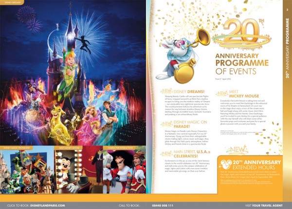
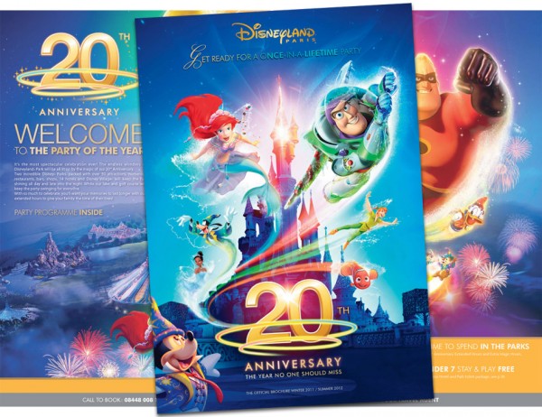
Here it is: the 20th Anniversary Disneyland Paris brochure! The multicoloured edition has been spotted out in the wild at travel agents in the UK since its limited launch a couple of weeks ago, but now it’s available online for all to see. Check it out here. Of course, there are new prices, new options and yet another new design for all the pages, but it’s the 20th Anniversary events and images we want to see. The final line-up to make the brochure cut is modest but promising. Star of the show in 2012 will no doubt be Dreams – the “magical, immersive” nighttime spectacular that’s due to take over the Castle, Central Plaza and even Main Street with projections, special effects and — yes — at least a few fountains, as it plunges guests inside a journey through classic Disney dreams.

Also given top billing is Disney Magic on Parade!, actually a reworking of Disney’s Once Upon a Dream Parade that will see the 15th Anniversary‘s showstopper (certainly the best parade ever to be seen in Paris) given new costumes, music and characters. The current Dreams of Romance Finale float will be turned into a mountain ledge for Sorcerer Mickey, with the gang expected to appear in their spangly multi-coloured outfits seen throughout the brochure, while the original opening float will become home to the fairies, wizards and sorcerers of the Disney world. Oddly, that appears to oust the Princesses from the parade almost entirely, although Rapunzel and Flynn are said to be taking over from Aladdin and Jasmine on the smaller Romance Prelude float to freshen up that aspect.

The new magician-themed permanent meet ‘n’ greet for Mickey is advertised simply as Meet Mickey Mouse, while the fourth and final 20th Anniversary event is the mysterious Main Street, U.S.A. Celebrates. The brochure blurb is suitably blurry but its references to “twinkles” and “glowings-on” are spot on with our sources, suggesting a gold theme for the street and certainly a lot of lights…

As we revealed in September, longer opening hours for Disneyland Park are due to be one of the big bonuses of the year. Advertised as 20th Anniversary Extended Hours, they’re confirmed to be in operation from 1st April to 30th September 2012, although there’s no mention of just how many extra hours we can expect beyond the usual closing time. Presumably, just as many as it takes for the park to see nightfall, providing a suitable canvas for Dreams.

Whilst the 20th Anniversary doesn’t coincide with any major attraction investments, the chance to stay in the park until nightfall every day of the year represents a big gear-change for Disneyland Paris. Add to that a real, signature finale to each day with Dreams — produced by Disneyland California entertainment legend Steve Davison and the team behind World of Color, did we forget to mention? — and the culmination of a huge investment in refurbishments. Looks like an E-Ticket year here.

VIA Disneyland Paris 2012 Brochure

Wednesday, 27th April 2011

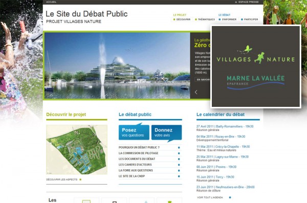
Villages Nature website launches with public debate on 259 hectare project …and a logo

Les Villages Nature de Val d'Europe

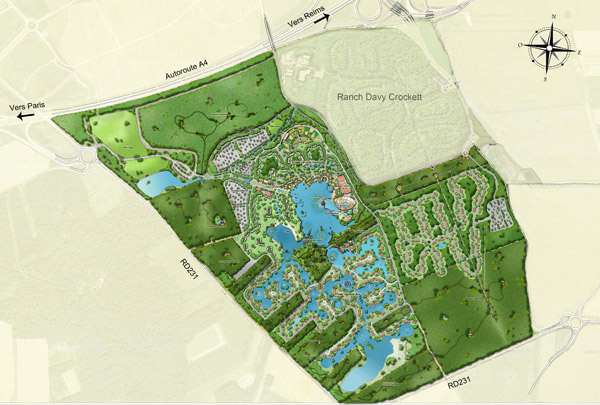
Les Villages Nature de Val d’Europe might not have the most catchy name, particularly for non-French speakers, but the project’s new website has just launched at a more succinct www.villagesnature.com. This is the 50/50 development between Euro Disney and Pierre & Vacances Center Parcs, a huge new leisure and accommodation destination planned to be built on land surrounding Disney’s existing Davy Crockett Ranch a few kilometres south-east of the parks. A first phase of 1,730 accommodation units (710 apartments surrounding the main lake, 1,020 individual cottages further south) would also see the creation of a unique geothermal heated lagoon and the largest water park in Europe, along with restaurants, shops and other amenities. This new website seeks to collect questions and opinions from those affected in the local area, with a budget  of €700 million “subject to public debate”. Of that, €430 million would be for accommodation units, to be leased to individual investors for periods of 9 years, whilst €260 million would be for the water park, leisure facilities, shops and restaurants.

The results of this public inquiry will be known in August, when the authorities are hoped to give the go-ahead. Marketing would then begin towards the end of this year with construction starting in the first quarter of 2013 for a first phase opening date of first quarter 2015. Don’t think this project will be a self-contained expansion, either — we’ll certainly see the effects back up at the main esplanade. The Transports page confirms some big changes, such as the long-awaited construction of a southern entrance to the TGV platforms, opposite the new World of Disney, allowing travellers from Val d’Europe and the south to access the high speed rail station without crossing the busy park entrances. Not only that, but a southern RER entrance is now also planned, and a southern bus station to be positioned in front of the Disney Village parking building.

Les Villages Nature de Val d'Europe

Even more dramatic, Disneyland Paris would no longer be the end of the RER A line, with a plan to extend the line to join up with RER Line E at the town of Esbly to the north-east — currently very close but hard to access from the resort. Sadly for international travellers there’s no such rail extension in the pipeline up to Charles-de-Gaulle Airport (which would surely be both profitable with tourists and hugely useful for locals, better than using the TGV for such a short hop), but an “intensification of shuttle services”. The envisaged tramway system also appears to have hit a buffer-stop when Val d’Europe lost its bid for the French Open tennis tournament, meaning the super-eco-friendly project will probably be relying on shuttle buses. Although a stop at least looks to be provided for Davy Crockett Ranch, which will remain separate from the project, allowing trappers to leave their cars behind to get to the parks. Finally, the road network would be improved — in particular with an entrance to the Villages Nature themselves branching south from the main Exit 14 of the A4 autoroute, visible in the map above.

Les Villages Nature de Val d'Europe

Les Villages Nature de Val d'Europe

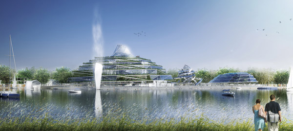
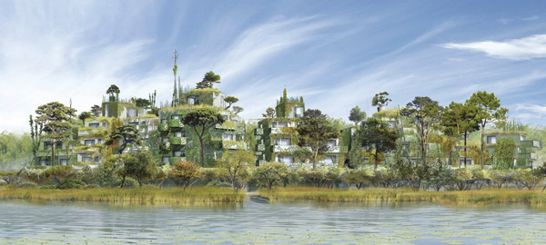
Architecturally, many of the buildings revealed so far are certainly daring. In fact, you might worry that these are going to be the 2015 equivalent to 1992’s soon-dated Festival Disney. But a strong artistic direction at this stage could also be reassuring. The most exciting aspect so far is that Joe Rohde, the lead designer of Disney’s Animal Kingdom, has been mentioned as part of Walt Disney Imagineering’s artistic involvement, and it seems you can see that influence already in the buildings overgrown by plants, creating a mélange of man and nature. Arts & Crafts and Art Nouveau are strong influences, with the styles of Frank Lloyd Wright and Friedensreich Hundertwasser quoted officially as inspirations.

VIA Projet Villages Nature

Thursday, 25th February 2010

New Gen website connects you to the festival stars

At last, it has landed! The official website of the New Generation Festival has belatedly opened this evening, two days later than originally promised. We were posting progress updates on Twitter over the past few days and it seems that this new website is very in tune with the latest social media, too.

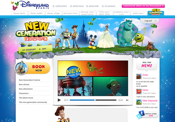
But first, the main page:

Disney New Generation Festival website

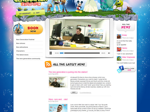
As we revealed, the first “plus” of this new website is that it’s actually integrated within the regular Disneyland Paris website, not standing alone as a Flash minisite (that’ll inevitably get forgotten about) like the Mickey’s Magical Party or 15th Anniversary efforts. And there’s another big plus: the use of Flash animations is kept to a minimum, mainly just used within the page for videos.

The design is indeed quite similar to the new Casting website launched a year ago, with a clean white background and three columns for information. Graphics are crisp and colourful; it’s a definite step up.

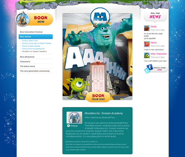
Disney New Generation Festival website

Each “new show” has its own page, with a large image at the top and a snippet of information below. The website pushes the “book” button on each page very heavily — far more heavily than we’re used to from Disneyland Paris — with the whole of the main image (above, Sulley and Mike) linking to the official site’s Hotels page.

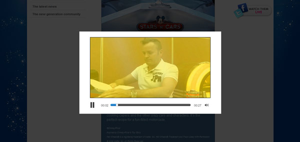
Clicking the “Enlarge” link doesn’t enlarge the image but actually opens a short 30 second video about each new feature in a pop-up within the page:

Disney New Generation Festival website

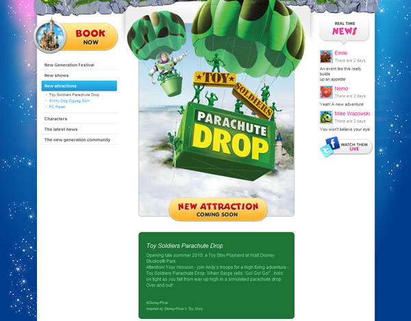
The “new attractions” section doesn’t have much to share yet, except for stating slightly more specifically that Toy Story Playland is due to open “late Summer”. There’s no mainpage for Toy Story Playland itself, each of the three new attractions are simply listed in the menu with separate pages:

Disney New Generation Festival website

The next area is where all that newfangled Twitter and Facebook stuff comes out to play. We’ve long been confused, baffled and dismayed the Disneyland Paris hasn’t set up its own account on these social networking services, or even on something like YouTube. Walt Disney World and Disneyland have hundreds of thousands of “fans” or followers (Disneyland over 1.2 million) on these services, whom they can address directly with news, photos and offers.

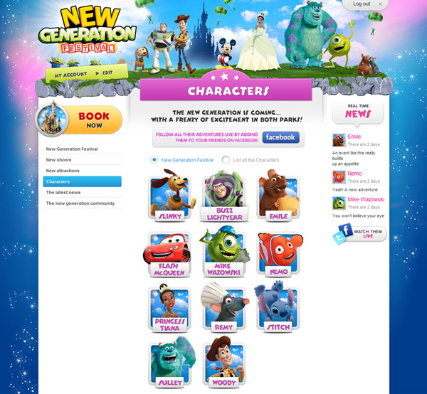
Whilst this new website embraces that idea, it doesn’t appear to be putting it to much good cause. The ‘Characters’ section gives you unique pages for each of the ‘New Generation characters’…

Disney New Generation Festival website

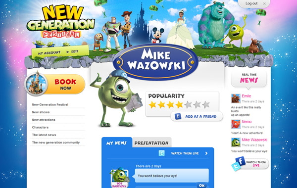
The pages mimic Facebook to present a profile for each of the stars, complete with live Twitter status updates. So far, only a few of the characters have updates posted — below, Mike Wazowski says “You won’t believe your eye!”…

Disney New Generation Festival website

This networking game is probably the “hook” of the website that would, in the past, have been filled with a Flash-based minigame, designed to get people to visit more than just the once.

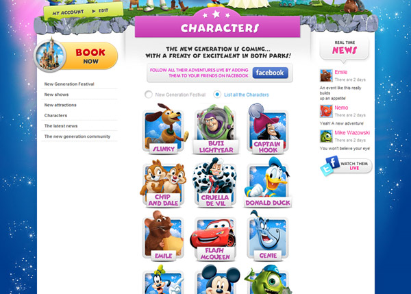
You can also choose to see “all the Characters” for a wider (and quite random) selection of stars…

Disney New Generation Festival website

The people behind the website have been busy setting up accounts for each of the characters involved. Here’s an example of Lighting McQueen (listed by his French name, Flash McQueen, on the UK site) on Facebook and Twitter.

All good fun, and a good way to build some affinity with the “star” characters of the coming year, but with such a large number of characters it remains to be seen if these accounts will all be updated right throughout the year — not to mention how they’ll manage the difficulty of serving different languages.

One section that may well become a great source of more worthwhile updates is the “latest news” area. Not since the 15th Anniversary blog has the resort had a space like this to share official news updates with the general public. This is very welcome indeed.

Disney New Generation Festival website

It’s all pleasantly Flash-free and comes with a good selection of backstage videos — more on those soon.

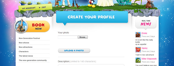
The final section strays back into the hit-and-miss land of social media. Click the “register” button at the top of the site and you’ll then have the chance to “create your profile”, including uploading a photo and setting information like your “favourite place at Disneyland Paris” and whether you have an Annual Passport.

Disney New Generation Festival website

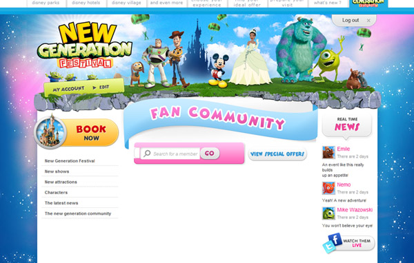
Near the end of this form you can choose to make your profile public. Doing so seems to make it viewable as part of the “Fan Community” pages… are they trying to take over from magicforum?

Disney New Generation Festival website

In fact, this again currently seems to be lacking reason. At the time of writing no “fans” appear to have added their profile to the directory, and the “search for a special offer” function is confusing — what are we searching for? It’s hard to see what all this is meant to achieve that official Disneyland Paris pages on Facebook couldn’t, much more successfully.

Visit the New Generation Festival website here.

Images © Disney.

Tuesday, 16th February 2010

‘New’ official website celebrates soft opening

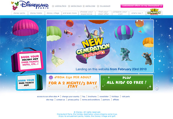
Yes, it’s finally goodbye to this…

Disneyland Paris.com

And hello to this…

Disneyland Paris.com

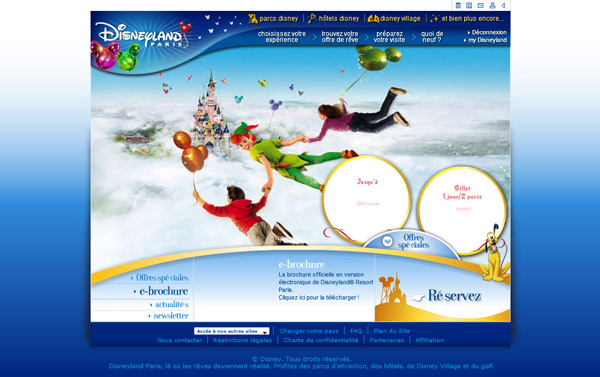
The change is radical in some places — not only are pages finally allowed to “breathe” with a wider format, but the Disneyland Paris resort logo has finally thrown off that curvy corner enclosure it’s been stuck inside-of in so much print and advertising since as far back as 2002. Unfortunately, it retains three unnecessary balloons from the outgoing Mickey’s Magical Party design theme.

Because yes, in other areas it’s not too different — the menu options remain essentially the same, simply listed all on one line and presented using basic HTML rather than animated Flash as before, a big “no no” for accessibility these days. This replacement, though, currently looks somewhat unfinished, with the two-line options not quite fitting in the boxes and the grey text colour being noted by many people as too light.

And that old dependence on Flash-heavy pages? Still there. The entire home page, including the “book” buttons on the left (which aren’t even animated) are rendered using this animation format, including a musical intro which doesn’t remember your “mute” preference. Perhaps just temporary?

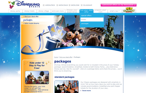
The website pages themselves are exactly the same as before, only having a new background added and the top menu replaced (which has also unfortunately taken away the option to mute some animations):

Disneyland Paris.com

So far, so disappointing. But there’s hope for the future — thankfully, we’ve heard that new pages are being developed. Perhaps that main box on the new homepage, stating the New Generation Festival is “landing on this website from February 23rd 2010” gives a clue as to when they’ll launch? Only a week left to wait and see.

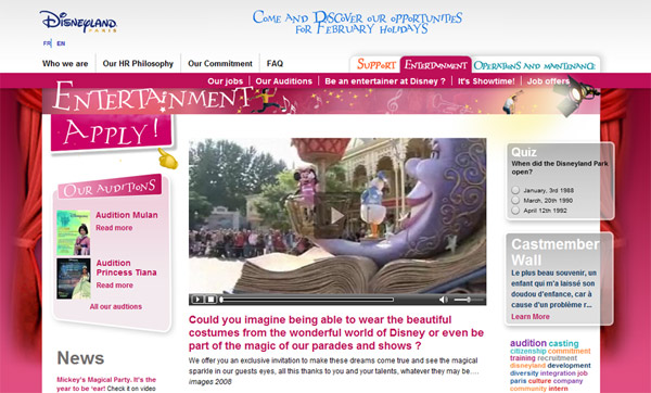
Hopefully they’ve been inspired by another website in the resort’s portfolio — the rather nice Casting website which opened exactly one year ago. Featuring wide pages, clear information and good use of colours, it’s a real pleasure to browse in comparison to the current visitor site:

Disneyland Paris.com

This site also crucially handles things like navigation and page URLs (addresses) so much better. When the official Disneyland Paris website relaunched in 2006, it introduced a mind-bending array of different domains and sub-domains as you navigate through the site, so that all the UK pages are on a “.co.uk” website separate to the “.fr” site. Within this, pages such as What’s New are located at “news.disneylandparis.co.uk” whilst park information is at “parks.disneylandparis.co.uk”, adding up to a completely confusing way of setting out the website to the end user.

Though this new menu on Disneyland Paris.com has retained the same sections as before, including “Choose your experience” (Experiences?), “Find your ideal offer” (Booking?) and “Prepare your visit” (Plan?), can we expect more than just just a re-dressing of the old pages, and see things be simplified yet further for the user?

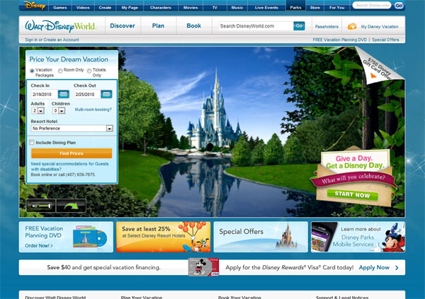
The gold standard for this is the US website for Walt Disney World, which has a wonderfully boiled-down top menu of simply “Discover”, “Plan” and “Book”, not to mention something we’ve never had on the current Disneyland Paris site — a search function.

Disneyland Paris.com

But, all criticism aside, a quick surf around the other Disney resort websites — particularly California and Tokyo, or the abysmal UK version of the Walt Disney World site — reveals we’re actually not doing too badly. Hong Kong relaunched its website last year with a lovely initial design, but within a few pages you find yourself in the same situation as the current Paris website, with the new menu at the top and an older page sitting uncomfortably below.

Hopefully Disneyland Paris won’t spend quite so long in this web design limbo…

Images © Disney.

Sunday, 22nd February 2009

Official website (almost) ready for new celebration

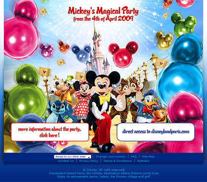
Though the special mini-site for Mickey’s Magical Party launched just at the start of last week (see a full tour here), they’ve wasted no time in promoting it via the splash page as you arrive at disneylandparis.com:

Official website

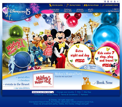
Visitors now have the choice between going to the special celebration website or through to the actual disneylandparis.com. Choose to stay on the website, and the homepage opens up to reveal an updated design featuring the main Mickey’s Magical Party visual — itself updated slightly…

Official website

As we’ve noticed elsewhere, the resort’s marketing seems to have back-tracked on the original balloons seen in all the visuals to go with darker, shinier foil balloons rather than the lighter pastel colours of the originals.

Two more images are also included on the homepage; Minnie’s Party Train and Disney’s Stars ‘n’ Cars:

Official website Official website

But wait a minute — we’ve got two celebrations at once! Though 2009’s Mickey’s Magical Party might fill the main image space of the homepage, the resort logo at the top is still in its (rather hard to read) “Disneyland15” incarnation. Two years and still the 15th Anniversary clings on — we’ll have to wait and see if it’s finally gone before 7th March, the official end date…

Website screencaps © Disney.

Thursday, 19th February 2009

Mickey’s Magical Party website goes live: full tour!

It’s a Disneyland Resort Paris tradition to accompany their newest attractions and events with a flashy, flash-based “mini site” separate from their main website, from the opening of Walt Disney Studios Park right through countless seasons and carnivals to the 15th Anniversary. In fact, they’re really the only Disney Resort which spends such money and effort on these kind of sites.

For Mickey’s Magical Party, we’ve got yet another to explore. Officially launched on Monday, you could arrive at the landing page to find only a few languages available — and not the ones you might expect, either. Denmark, Switzerland and Austria were the first countries officially launched, but with a bit of guesswork you can easily find the actual English-language site for the UK at www.mickeymagicalyear.com/uk/uk.

Currently, the landing page now also features Ireland and Italy, as well as the general “Other Countries” international option.
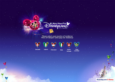
Mickey's Magical Party website

Though mickeymagicalparty.com redirects here, they apparently weren’t interested in mickeysmagicalparty.com when these domain names were registered last year. In fact, on the UK version of the new website there seems to be a little confusion about the celebration’s name — getting us off to a bad start, the title in your browser will instead read “Mickey’s Magical Year“.

Let’s begin our full commentary and tour here…
Mickey's Magical Party website

Pick your language and a pink balloon flies into view from the bottom of the screen, carrying an envelope. These carrier balloons are also being used extensively in the marketing campaigns for the US parks this year, although the balloons, for some reason, have a completely different design.
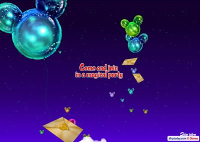
Mickey's Magical Party website

Gradually, more balloons float up into view on the screen. Immediately you’ll notice something different about this website compared to those of the past — it fills the entire screen, and resizes itself accordingly.
Mickey's Magical Party website

All the resort’s previous flash mini-sites have been a static size within the middle of a regular page, whereas this new style offers a more involving experience. The introduction continues with the tagline “Celebrate the greatest part of the year” and the Disneyland Resort Paris logo — which curiously has a little miniature balloon graphic floating above it… see it? That probably shouldn’t be there.
Mickey's Magical Party website

The introduction ends with five much larger balloons floating into the sky decorated with images of the five key new events of the celebration. You’ll notice throughout that the website doesn’t use the “daytime”, blue skies style we’ve seen in earlier marketing images or even on the Central Plaza fences. The entire design style appears to have suddenly been changed to a purple twilight sky with foil rather than rubber balloons.
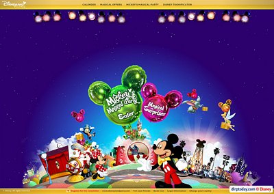
Mickey's Magical Party website

The homepage features an animated backdrop of locations from around the resort, with simply the celebration logo inviting you to “enter”. The style here is obviously meant to be busy and informal, with some of the graphics cut out of photos and others properly drawn. The animated characters of Stitch, Minnie and Mickey seem to clash with the neater style of Tinkerbell and Dumbo floating in the sky — especially the thick-outlined, puppet-like Mickey. In previous websites, we’ve come to expect live-action characters to be superimposed into the flash animation.
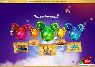
Mickey's Magical Party website

Click “enter” and you’re actually taken across to the “Toonificator”, but we’ll head there later. Instead, we’ve clicked “Calender” (yes, rather than the correct spelling of “Calendar”) to find not so much a list of dates but five simple, floating balloons displaying the five new events.
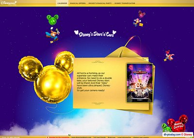
Mickey's Magical Party website

Click an event and you’re given a very (very!) brief description lifted straight from that slightly baffling marketing text, along with the event’s poster artwork.
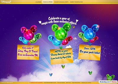
Mickey's Magical Party website

The next option along displays the three key special offers they’re running to launch Mickey’s Magical Party — the seemingly eternal Kids Under 7 Stay, Play & Travel FREE, a continuation of the 15% discount on tickets booked in advance, and another extension of that huge package discount that has been running since late last year. With both the economic problems of the moment and the awful GBP/Euro exchange rate, British guests are now being enticed with a huge 40% off their package booking, with the offer now extended to arrival dates right up to September!
Mickey's Magical Party website

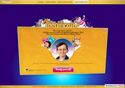
And now, we reach the main section of the website — Disney’s Toonificator. This seems to be inspired both by the cartoon-style images offered by instant messaging providers such as Yahoo and Windows Live and, probably more so, by a feature on The Simpsons Movie website which swept the internet a couple of years ago, allowing users to create themselves as a Simpson character.
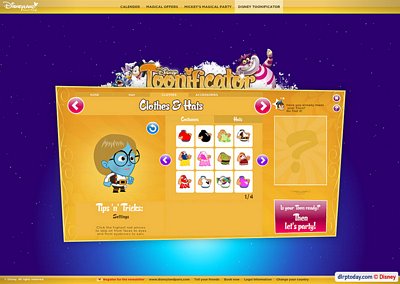
Mickey's Magical Party website

For this Disney version, you’ve got a seemingly endless range of hairstyles, face types and colours to Toonify yourself with, along with several special Disney costumes and accessories. Such a range, in fact, that you can create some rather bizarre Toons indeed (see above). You can also upload a photo and have it “Toonify” yourself automatically.
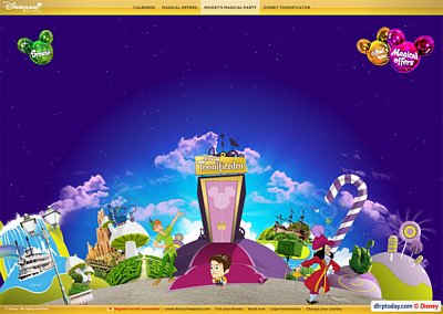
Mickey's Magical Party website

We settled for something a little more ordinary, and we’re now in the “virtual” Mickey’s Magical Party, a globe-type horizon filled with more cut-out landmarks and locations, which you explore by using the left and right arrow keys.
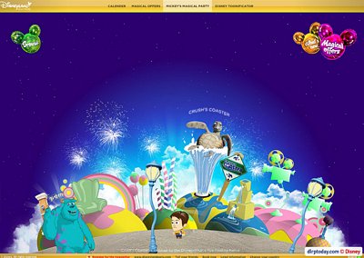
Mickey's Magical Party website

You’ll immediately notice that it’s not only the Mickey’s Magical Party events featured here — you’ll wander across landscapes representing both parks, with most of the resort’s recent attractions featured, such as Crush’s Coaster.
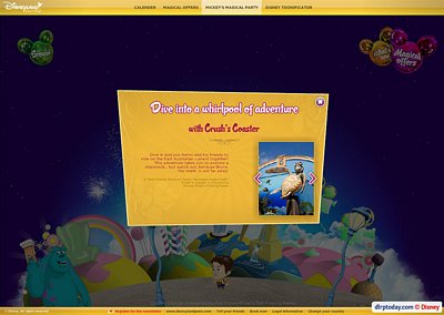
Mickey's Magical Party website

It’s good to see Disneyland Resort Paris realising many people might not yet have experienced these brand new attractions for themselves, with pop-up boxes providing brief descriptions and photos.
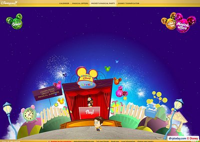
Mickey's Magical Party website

For the actual Magical Party events, however, you’ll find something a little more — a special game for each one. Here, we’ve arrived at Playhouse Disney – Live on Stage!.
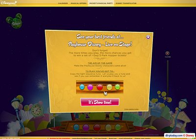
Mickey's Magical Party website

Luckily for us, all the games are incredibly simple and easy to complete. For Playhouse Disney, you need to simply remember a very short series of colours. This, perhaps, confirms the far younger age group Disneyland Resort Paris appears to be marketing itself towards lately…
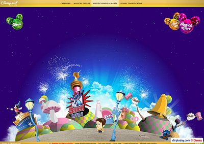
Mickey's Magical Party website

We pass by a bizarre landscape of Toon Studio lampposts, Stitch Live! and… giant mushrooms?
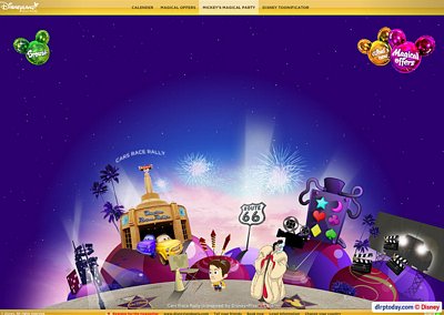
Mickey's Magical Party website

Cars Quatre Roues Rallye, some large fireworks and a strange machine decorated with shapes.
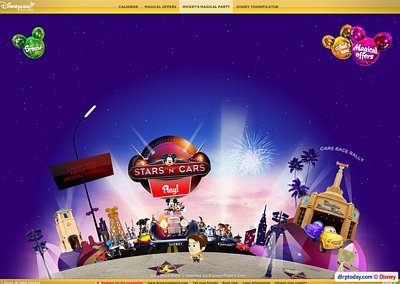
Mickey's Magical Party website

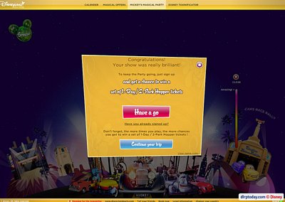
Disney’s Stars ‘n’ Cars finally rolls around.
Mickey's Magical Party website

Here you’re shown a lineup of five of the cars and have to click on the one which is illuminated for it to beep its horn, as simple as that.
Mickey's Magical Party website

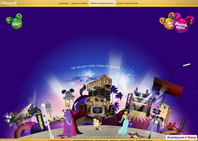
The Twilight Zone Tower of Terror, CinéMagique, and the Studio Tram Tour billboard entrance we’ve not seen for over 18 months.
Mickey's Magical Party website

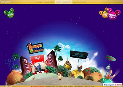
Discoveryland is represented fairly well, with airships and plently of ironwork…
Mickey's Magical Party website

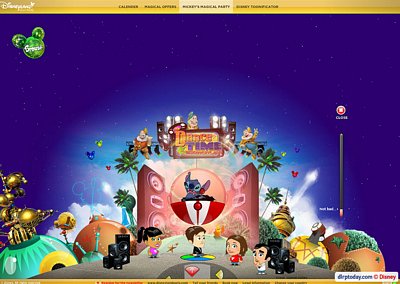
…Only disturbed by the Dance Time going on at its centre. This game actually gives a very accurate preview of the real event, with visitors having to use arrow keys to step their feet on the segments of the coloured floor mat in sync with the counter at the bottom of the screen.
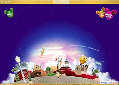
Mickey's Magical Party website

Disneyland Park seems a little barren from here, though Disney’s Once Upon a Dream Parade does make a welcome appearance.
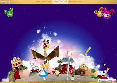
Mickey's Magical Party website

Several of the background graphics also animate when you click on them. Here, Mickey Mouse pops out of a giant cuckoo clock as fireworks explore behind. Because, that makes you want to visit the resort, right?
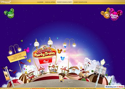
Mickey's Magical Party website

Minnie’s Party Train steams into view…
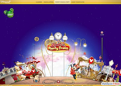
Mickey's Magical Party website

…with an interesting party game which seems to invite you to connect up a webcam and then move around to guide the train into position. Or, you can just use your mouse to trace the figure-of-eight path.
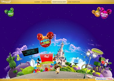
Mickey's Magical Party website

Finally, we arrive in front of Le Château de la Belle au Bois Dormant where It’s Party Time… with Mickey and Friends is happening. Take a close look at the Castle — see anything different?
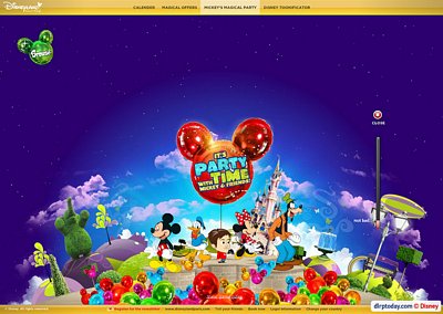
Mickey's Magical Party website

For the new Central Plaza show, you’ve simply got to stop balloons floating into the air.

And there we have it, a little journey across the resort’s newest attractions with a few ultra-simlistic “party games” thrown in. The audience here is obviously intended to be very young, whilst the overall design style leaves a little to be desired — especially since just last year we were wowing over that spectacular and spectacularly well-built Tower of Terror website.

The Toonifyer game has obviously been given the majority of the effort put into this website, but the result is made slightly pointless since your created character only serves to walk left and right through the virtual world. You can enter an email address and save the character, but there seems to be no option to save an image of the character to use as a forum or instant messenger icon/avatar, for example.

Ultimately, this website also includes little to no real information about the new events of Mickey’s Magical Party — some of which, especially those at Walt Disney Studios Park, are actually probably well worth visiting for.

In fact, upon arriving at the website, visitors will surely be confused as to the overal purpose or theme of the event, since it jumps straight to the point of the Toonifyer game and the events, without a real introduction. A 15th Anniversary speaks for itself, but what’s the point of this celebration? What’s the reason for visiting? We fear guests won’t find the answers here…

• Take a look for yourself here and leave your own comments below!
Monday, 9th February 2009

New casting website opens up (too much?)

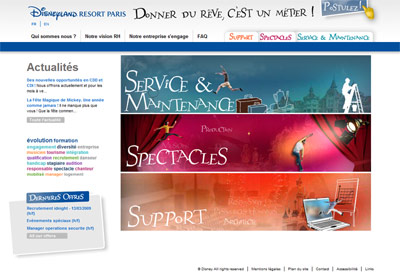
This new website can be found at the same address — www.disneylandparis-casting.com — but takes on an entirely new and entirely modern design, very different to the current www.disneylandparis.com or Euro Disney SCA corporate sites. Clean, simple navigation, blogs, keyword searches, Cast Member “walls”, colour-coordinated sections, videos and interactive quizzes.

Arriving on the new homepage, you’re confronted not by a flash animation filling the screen but primarily by just three large, simple boxes — Support, Operations & Maintenance and Entertainment — which, curiously, change position between the French and English versions.

New Casting Website

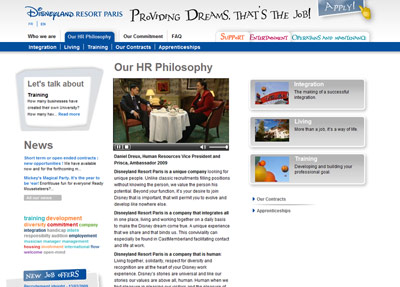
The first few sections introduce the resort as a whole, including several new videos — both flashy B-roll footage of the resort and useful interviews with actual Cast, such as here 2009 Resort Ambassador Prisca interviewing Vice President of Human Resources Daniel Dreux, or here a look at the lives of the Big Thunder Mountain cast.

New Casting Website

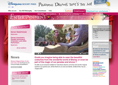
Once you get into the key sections for the employment categories, such as Entertainment, they’re each colour-coded and nicely customised, with even more videos, blogs and news updates specific to each department. Here, for example, you see the latest auditions for character look-a-likes and other roles.

New Casting Website

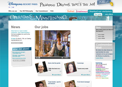
Operations & Maintenance offers another look behind Big Thunder Mountain in its key video, but check out the second page, too, for a smart commercial showing Cast Members remembering the “first time” they did things ranging from booking someone’s trip or preparing Buffalo Bill’s horse!

New Casting Website

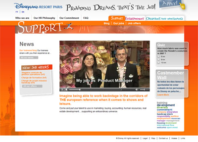
Surprisingly, it’s the Support pages you might want to check out though.

New Casting Website

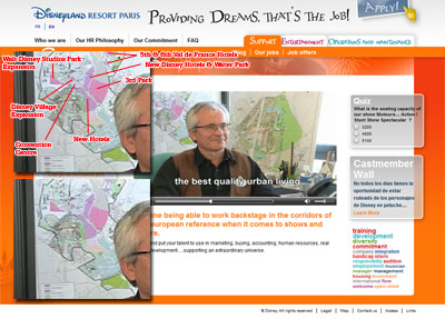
Because, there’s something in the first video — namely when we’re watching one of the Architecture & Urban Planning cast members — that we’re not entirely sure they wanted us all to see so clearly. Or maybe they did…

That’d be the current future development plan of the entire resort, as it currently stands. Now, you may well have seen one of these plans before, but this is their current plan, and it seems to reveal a few new specific details…

New Casting Website

Note, for example, the 5th and 6th hotel at Val de France, the huge space reserved for a dedicated Convention Centre, the masses of land awaiting new Disney Hotels either side of the main parking lot access road and the brand new patch next to Val d’Europe also ready for hotels (in the very, very far future).

Happily, there’s (slightly realigned) space still ready and waiting for a 3rd park, but the most interesting and probably most relevant aspect here is Walt Disney Studios Park — now extended into a huge rectangle, more than double its current size, extending off to the West. As you’d enter this fully built-out park, it’d actually therefore be more of a stretched diamond shape. It’s finally a specific expansion footprint, not the general shaded area we’ve seen in the past.

But, leaving those dreams of the future behind… the new casting website. Clean, easy to navigate, flash animations only where they’re necessary and full of information in a design that makes you want to click another link.

We’re left wondering… why can’t the resort’s actual website be more like this?

Thursday, 15th January 2009

More than 85,000 pictures to make the magic in 3D

How many pictures do you take on a trip to Disneyland Resort Paris? A few hundred? A couple of thousand? Well, your collection may have just been trumped.

In anticipation of the official launch of the complete 3D recreation of Disneyland Resort Paris on Google Earth, the resort has released some surprising facts and figures behind its creation. More than 85,000 pictures were taken over 20 days to create a complete virtual representation of the resort.

Disneyland Resort Paris Google Earth 3D

Impressive? Sure. But know also that no less than 2,221 of those were for Le Château de la Belle au Bois Dormant alone! From the pictures, the creators picked out 20,651 different textures to map onto a total of 1,587 three-dimensional models of the resort.

And it won’t just cover the main attractions — you’ll be able to explore all of Disneyland Park and Walt Disney Studios Park, featuring more than 50 attractions, plus the 7 Disney Hotels and Disney Village!

Here’s the official text:

For the first time ever, you can Google Disneyland® Paris… in 3D!

Live on Google Earth as of 28 March 2009

“Imagineer” a visit to Disneyland® Resort Paris on Google Earth!

Imagine a Disneyland where dreams come true. A place where you can fly like Peter Pan over Sleeping Beauty Castle, zoom down to Main Street, U.S.A.®, or board Captain Hook’s Pirate ship.

From the imagination of Disney and Google comes a 3D experience like no other. Disneyland® Resort Paris. From the sky. From the ground. From anywhere you want. It’s as big as imagination itself. All at the click of a mouse!

Every inch of Disneyland® Resort Paris

Disneyland Paris in 3D is enorMouse: 2 Disney Parks with more than 50 attractions, 7 Disney Hotels and Disney Village. Now you can explore every inch of the resort in superb Disney details! And you’ll be one of the first to get a sneak peek of Mickey’s Magical Party, starting 4 April 2009.

With the publication of the latest issue of annual passport magazine Envie de+, which we featured in our first article on this new venture, a web address on the official Disneyland Resort Paris website was given for more information. Though it has been reported and written on most fansites and forums that the link is not yet functional, it appears we’ve actually been typing the URL provided a little too perfectly.

The magazine quotes http://www.disneylandparis.fr/googleearth3d, which brings up a page error.

However, the actual address, as confirmed in the footer of the official text we’ve got hold of, should be /googleearth3D, with a capital ‘D’ in 3D. You can therefore already view the page in French here or English here.

Disneyland Resort Paris Google Earth 3D

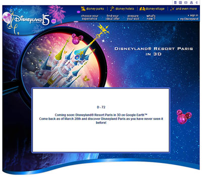
The page currently provides a countdown to the official launch date, 28th March 2009.

Update (22:14 GMT):

Since we posted this article, the page URLs on the official website were magically updated! That means we’re back to ‘3D’ with a lower-case ‘d’ and therefore the French page can be found here, with the English page here.

Tuesday, 13th January 2009

First images of Google Earth 3D resort released

What’s all this? Google Earth? 3D recreation? Let’s explain…

Google Earth, we’ll begin back here, is a like a super-duper version of the flat aerial views you might have used in Google Maps. It lets you type in a location anywhere on Earth and fly there, instantly, getting an amazingly clear aerial view of the landscape. It lets you plan routes, see your house from space or just go for a virtual fly around our planet.

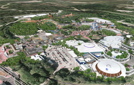
In the newer versions of this free software download, though, the concept becomes almost hyper-real. In specific locations, you can now pan and tilt the viewpoint and fly right down to the ground to see computer generated images of selected landscapes and buildings. By moving the camera around, you can visit places and fly through them, seeing exactly what it’s like to actually be there.

May 2008 brought the announcement that Disney had struck a deal for Walt Disney World Resort in Florida to get its very own complete Google Earth 3D recreation. At the same time, we got a tiny snippet in most news articles simply stating: “Plans call for similar tours of Disneyland Paris to be produced”.

Google Earth 3D

Even if you’ve never been to the Orlando resort, with the Walt Disney World recreation you can explore all of its’ parks as if you were there, with the Cinderella Castle, Tree of Life and almost every inch of the Imagineered landscape “popping out” of the flat Google Earth aerials.

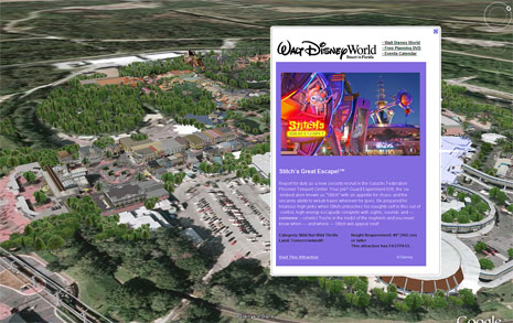
What’s more, if you hover around one of the attractions and click a special icon, you get a special Disney-created pop-up with an excerpt from the attraction’s page on the official Walt Disney World website.

Google Earth 3D

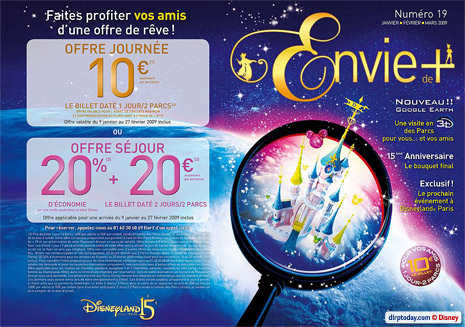
And the Disneyland Resort Paris version? We’re in luck — the latest issue of annual passport magazine Envie de+ has confirmed an official launch date: 28th March 2009!

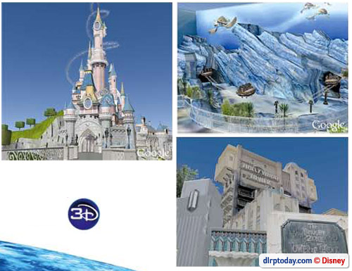
But that’s not all. You can see how Walt Disney World looks right now by downloading Google Earth, but how would the parks and lands of Disneyland Resort Paris be imagined in Google’s 3D software? Space Mountain with the giant Columbiad cannon… Le Château de la Belle au Bois Dormant in all its extravagance… Crush’s Coaster, Indiana Jones et le Temple du Péril, Adventureland Bazaar and other unusual sights?

Fancy a preview? Envie de+ obliges, with a beautiful cover too…

Google Earth 3D

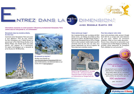
A double-page introduces these 3D recreations:

Google Earth 3D

And here are those preview images up-close!

Google Earth 3D

Here we see what Le Château de la Belle au Bois Dormant, Crush’s Coaster and The Twilight Zone Tower of Terror will look like in the software when you’ve flown right down to the ground and tilted the camera upwards at these famous Disney landmarks. Pretty amazing, right?

Join us on 28th March 2009 to discover the rest of the magic!

Wednesday, 2nd April 2008

Stitch broadcasts new key visual

One of the first ever posts on DLRP Today exclusively revealed the full set of key visuals for the 15th Anniversary. Today, we bring you what will likely be the last visual to be used as part of the two-year event — for Stitch Live!’.

Key visuals are used by Disneyland Resort Paris for all promotions and publications related to the specific attraction — flyers, brochures, etc. — and are also broadcast for use in media coverage. Preparing for its inauguration this weekend, Stitch Live! has revealed its own addition to the back-catalogue Disneyland Resort Paris visuals:

Image

In primarily blue colours and using the actual computer-generated animation screen from the show, the visual features two children connecting to Stitch with a “spark” between their fingers.

Meanwhile, the attraction is lucky enough to already have its own attraction page at the official website. Featuring photos from outside the Paris attraction and inside the Hong Kong version, the page actually reveals something we’ve been noticeably missing from this project up until now — the concept art:

Image

In a similar style to other recent Walt Disney Imagineering concepts, this depicts the show room with its redesigned surround for the Paris version.

Also on the official website, you can see a larger version of the attraction’s official logo and, on the main page for Production Courtyard (yes, they’re still persisting with that name for now…), you can even find a small snippet of the actual concept/design piece for the sign which sits above the entrance.

Image

Unlike most other “living character” experiences at other Disney resorts around the world, ‘Stitch Live!’ continues to be broadcast as an attraction in its own right. And, judging by the crowds which gathered outside this past weekend, a very popular one at that.

[Images copyright Disney]

Subscribe to the Magic!

Tags & Archives