Thursday, 25th February 2010

Explore the Art of Disney… only every half hour?

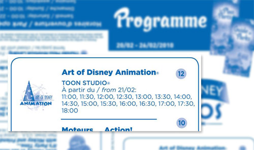
Now, if you’d like to take the tour through the three initial rooms of Art of Disney Animation, you’d better check your Programme times guide. The attraction is now listed alongside the likes of Moteurs… Action! Stunt Show Spectacular with pre-determined “show times” for the start of each presentation.

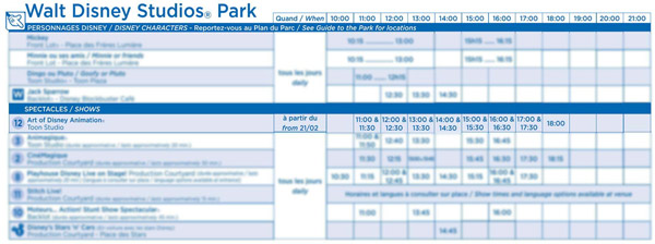
This week, you can visit the attraction only at 11:00, 11:30, 12:00, 12:30, 13:00, 13:30, 14:00, 14:30, 15:00, 15:30, 16:00, 16:30, 17:00, 17:30 and 18:00.
Art of Disney Animation

Normally, Art of Disney Animation runs continuously right through the day, with guests waiting outside or in the pre-show area for the start of the next show around every 10 minutes, passing from room-to-room between the Disney Classics Theatre and Drawn to Animation theatres for a total show time of around 20 minutes.

These new scheduled times therefore cut the number of chances to tour through the attraction by around two thirds, not to mention leaving the attraction in the dark for the first hour of park opening, until 11am, and for much of the final hour of the day.

That said, Art of Disney Animation is far from bombarded by guests. Not really providing enough interest to most visitors for repeat viewings, the outdoor queue line, now hidden partly behind the Hollywood Boulevard façades, very rarely sees any real use. This new test for low season days could ensure that audience numbers are never embarrassingly low, whilst allowing cost savings with Cast Members potentially doubling-up roles for the first two rooms.
Art of Disney Animation

The continuous start times of each presentation have previously been confusing and unhelpful to visitors. Sometimes you can rush inside just as the doors are closing and end up missing the whole pre-show, other times you appear to be waiting for far too long. Even if it means fewer showings per day, this kind of transparency is probably a good step.

But isn’t it just highlighting a bigger problem with Art of Disney Animation? Looking at the concept of the attraction as a whole, switching to scheduled times means a vast amount of central floorspace in this very small park suddenly becomes useless for long periods of time, cutting capacity and adding yet another complication to visitors planning their day — if the scheduled times of Playhouse Disney, Stitch Live, Animagique, CinéMagique and Moteurs Action! weren’t enough.

Wouldn’t a much better way to present “the art of animation” be to restructure the attraction to work more like the Disney Animation pavilion at Disney’s California Adventure?

Warning, self-indulgent home-Imagineering ahead…

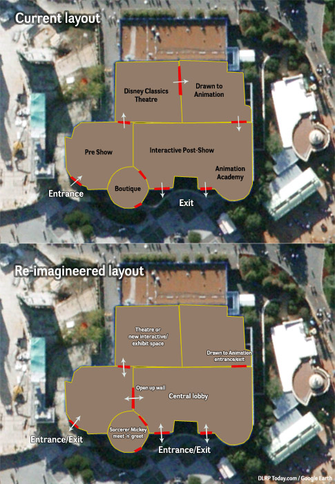
In California, guests enter into a central lobby area and are then free to roam through several different rooms at their own pace. In Paris, the current post-show area would be perfect for this, with a single wall knocked through (by the video screens in the pre-show, the Jungle Book artwork in the post-show) to open up direct access to the pre-show room and theatre. The post show is already accessed directly by a lot of guests, using the exit doors to drop in and out. The pre-show and Classics theatre are, however, completely cut off.

Art of Disney Animation

Drawn to Animation with Mushu also exists as one of those rooms in California, and is really the only part of this attraction concept which needs to be presented as a scheduled show. Its current exit in Paris, behind the Animation Academy drawing boards, could double up as a single entrance, with these new half-hourly showtimes posted outside.

Though emotional and enjoyable, the Disney Classics Theatre in Paris is largely quite pointless, simply playing a series of themed clips from Disney and Pixar animation. The theatre could be better used as a “Cinéma Mickey/Main Street Cinema”-style drop-in space playing classic Disney shorts, or ripped out entirely for other interactive exhibits.

While we’re at it, replace The Disney Animation Gallery boutique with an indoor meet and greet space, for Sorcerer Mickey. The returns on souvenir photo prints would surely be better than current sales at this tiny shop, which has recently had its original remit of animation books, prints and collectibles watered down to a samey array of High School Musical merch anyway.

Open up the current entrance and exits to traffic in both directions et voilà — an open, free-roaming covered walkthrough, exhibit and show space in Walt Disney Studios Park that’s open at all times. An equivalent to Videopolis, Liberty Arcade or the original Adventureland Bazaar. Shelter from the rain, something to fill-in between other show times and a real heart for Toon Studio.

Knocking through a wall or two here might not even be all that outrageous for the park, given all the knocking down and rebuilding that went on at Walt Disney Studios Store last year just to give that shop more light.

Rather than cutting back access to this great, covered, central space, open it up!

Images © Disney, Google Earth.
Monday, 2nd November 2009

EMH + WDS = Confirmed!

We reported last week that, for three weekends in late November and early December, both parks would be opening at 9am rather than 10am, as has been custom since the introduction of those two Extra Magic Hours (EMH) at Disneyland Park.

Better than that, there were hints of those extra hours making their way to Walt Disney Studios Park for the first time. Hints that are now… confirmed! From the official Disneyland Paris website:

NEW
Walt Disney Studios will be exceptionnally opened from 8am to 9am for Extra Magic Hours on November 28th and 29th, and on December 5th, 6th, 12th and 13th, 2009.

So, if you’re visiting on those six dates (and qualify for EMH), you’ll get to enjoy a world-premiere: one hour of exclusive ride time in the Studios, from 8am to 9am, before other guests.

EMH + WDS = Confirmed!
Coming soon to a Studios near us?

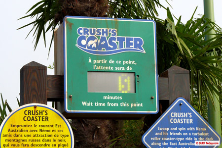
The attractions to be opened for the trial haven’t been publicly announced anywhere, but it appears generally agreed upon that they’ll be the most prominent ride-based favourites: The Twilight Zone Tower of Terror, Rock ‘n’ Roller Coaster starring Aerosmith, Flying Carpets Over Agrabah and of course, Crush’s Coaster.

Riding the EAC may no longer take an hour or more of queueing, but it remains to be seen what effect this has on regular, non-EMH-qualifying guests. Since it became the norm to run straight to Crush as soon as the park opens, how will these regular visitors feel if they arrive only to find the Crush’s Coaster queue already populated by more privileged ride fans?

Finally, park hours for the rest of December have now been published. Though they’re not as generous as these three weekends, we do see the opening time at Disneyland Park giving way slightly to regular guests — now set at 9.30am, rather than 10am, making EMH a still-respectable hour and half window. This is the first time in almost 10 years we’ve seen park hours go into half-hours, and the flexibility is very welcome indeed.

• Check the December 2009 park hours
• Find out more about Extra Magic Hours

Wednesday, 14th October 2009

Mickey’s first Not-So-Scary night of ’09 in video

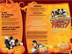
The first extra-ticket night of 2009 took place last Friday, 9th October, with three more Not-So-Scary parties still to come on the 16th, 23rd and 27th. The nights give guests special access to Disneyland Park from 8pm to 11pm for exclusive entertainment, character meet ‘n’ greets and far more attractions than in 2008.

Last year confined to Fantasyland, the party has spread in 2009 to include Frontierland, as far as Big Thunder Mountain and Phantom Manor, plus Pirates of the Caribbean in Adventureland. Main Street, U.S.A. and Central Plaza also now play a role, whilst the tally of attractions open in Fantasyland now stands at seven — including Peter Pan’s Flight and “it’s a small world”.

If reports from the first party are anything to go by, the queues — particularly outside of Fantasyland — are definitely on the light side. Kaleo on Disney Central Plaza forum, for example, notes a wait of just 5 minutes posted at Big Thunder for the entire party, although these events do grow in attendance as we get closer to Halloween itself.

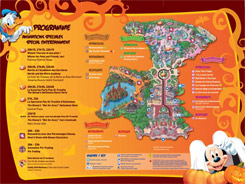
So far as attractions, it’s looking good for your €25 entrance. But what of the special entertainment? Our thanks to DCP member fandlrpstyle for sharing the full programme online:

Mickey's Not-So-Scary Halloween Parties Mickey's Not-So-Scary Halloween Parties

Last year’s Merlin and the Witch Academy show returns at the Castle Courtyard for three performances at 20:30, 21:30 and 22:30, whilst Fantasy Festival Stage hosts regular performances of its Winnie the Pooh and Friends, Too show, just the same as the daytime version.

The real highlight of the entire event, however, happens out on Central Plaza, where the new stage has been put to fantastic use for the huge new show “Le Spectacle Pas-Si-Trouille d’Halloween”Disney’s Not-So-Scary Halloween Show, as announced by show director Emmanuel Lenormand. Here’s a full video by Vidimouse:

This lengthy 20-minute spectacle has a pleasingly large (for Paris) cast of dancers and characters, as Mickey arrives in his purple Halloween suit to enjoy a “Not-so-scary” night amongst his Disney friends.

From Snow White to Belle, to a surprising (but very welcome and fitting) focus on The Hunchback of Notre Dame, the first half of the show sees a medley of relatively peaceful song and dance numbers. But, you’ve guessed what’s coming — Maleficent. Bursting up through the stage, just like her appearance in It’s Party Time… with Mickey and Friends during the day, she speaks live — and in English!! — to tell Mickey that Halloween should be scary. And then, we see the show again — from the Villains’ point of view, with the relevant villain theme songs and characters for each of the films just presented.

Happening twice each night during the events, at 9pm and 10pm, the show makes great use of a number of investments made around the area in recent years — the high-powered spotlights either side of the Castle, the new stage lifts and the on-stage pyrotechnic effects installed just this month. Though the numbers involved might restrict such a wish, this is probably the kind of thing we should have had every night during Halloween, rather than the small “cameo” within the regular Central Plaza show.

It at least gives us much more hope for the now-firework-free finale of the separate Disney’s Halloween Party on 31st October.

Closing the Not-So-Scary Halloween Parties is a cavalcade, just like last year. Except this time, it’s not the Disney Characters’ Express travelling down the Disneyland Park parade route but… Disney’s Stars ‘n’ Cars! Here’s another full video with thanks to Vidimouse:

Aside from the music, taken from Walt Disney World’s Disney Villains Mix and Mingle event, and a few extra characters, there’s little done to put a Halloween stamp on the regular Walt Disney Studios Park parade. It’s a unique chance to see the cars filing down Main Street, but probably not “special” enough for a special party night.

However, being given a few more free packets of Haribo — now the official “treats” of Halloween in Disneyland Paris, and handed out after each event during the party — when the cavalcade stops on Town Square, probably sweetens (sorry) the deal, right? Well, it helps.

For only their second year, Mickey’s Not-So-Scary Halloween Parties have really grown up.

• Buy your tickets for the Halloween Party Nights at www.disneylandparis.com!

Tuesday, 6th October 2009

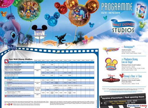
Another week, another new Programme

It seems like only a few weeks ago we were adjusting to a new layout for the all-important Programme. Probably because it was just a few weeks ago.

Well, they’ve been at it again! Take a look:

Another week, another new Programme

Another week, another new Programme

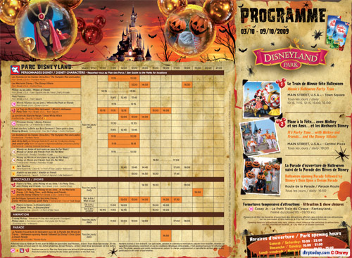
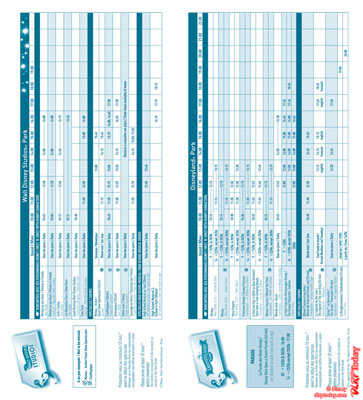
The new format spreads itself much more freely over three pages, with one side for each park.

Rather than having both times grids together in the middle, they’re now positioned horizontally on each park’s page, surrounded by additional images and graphics. On the front, the “featured” events remain from the previous design, giving extra prominence to the key events of the day.

For the Disneyland Park programme, the entire side has been given a very smart Halloween dressing, far better than we’ve become used to in recent years. The Halloween events themselves are picked out with an orange background, courtesy of the new full-colour printing method.

Will it be all-change again once Halloween is over? Hopefully not — the Programme could look fantastic with a full-colour Christmas overlay, although whether such “extravagance” would continue into the quieter Winter months is debatable. This format is surely somewhat more expensive than the previous, greyscale on lower grade paper, but does help make the Halloween Festival seem that little bit more special.

Wednesday, 16th September 2009

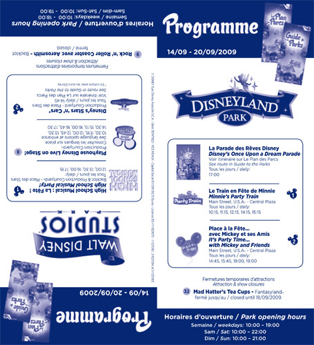
Ent programme goes topsy-turvy in latest tweak

This new design solves a few of the flaws in the old version (introduced in June 2008) and allows for the folded paper guide to be a little more “customised” to each park.

Well, look at this:

Programme

As you can guess, the Cast Members are now able to place the Disneyland Park side face-up under Main Street Station and the Walt Disney Studios Park side face-up at the entrance of Disney Studio 1. Very smart.

Unlike the old design, which wasted a lot of space on its cover and reverse, each park is given its own little “notice board” to boldly display the times of the main featured events, park opening hours and any attraction closures.

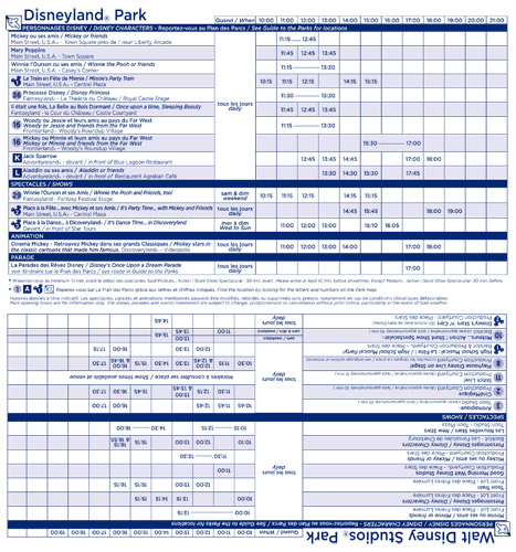
Then, when you open it up, the times for your current park are shown straight away, with the times of the other park upside down, making the divide between the two much clearer (who knows, maybe guests were looking for Minnie’s Party Train in the Studios?).

Programme

The sensible change here is that now the events being pushed are on the front cover, this clever grid can fill the whole page — and crucially, include all the events. The previous design didn’t feature the times for say Disney’s Stars ‘n’ Cars in the main grid if it was also in the “featured” column, making the whole idea of having this hour-by-hour grid quite pointless. Problem solved.

Also pleasing is the new typeface used throughout — rounder and more legible in small print. The only downside to the whole re-think is that the resort still provides a PDF download of the Programme as an answer to providing entertainment times on its website, rather than having a fancy calendar like Hong Kong or California.

So, anyone who doesn’t want to print and doesn’t know of the “rotate” function in Adobe Reader… will be getting a bit of a twist in their neck.

The Programme was re-introduced back in 2006. Always looking for shameless promotion, this is a good time to mention that you find various versions of this new-generation Programme — and several fascinating old programmes — on our Memorabilia pages, well worth a look.

Images © Disney.

Tuesday, 12th August 2008

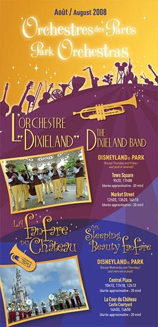
Live music talent finally given its own times guide

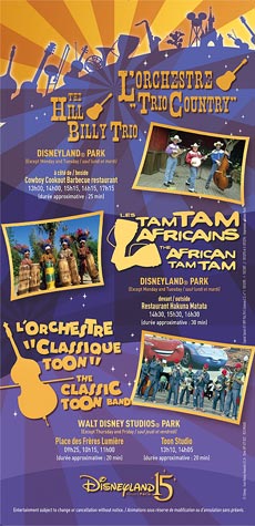
Say a big thank you to Nicolas Gobin, the subject of our latest “behind-the-magic” Media Magic Interview. Because, not only has the resort’s Atmosphere Talent Manager brought live music back to the parks in a big way, he’s taken a future item off our Wish List by finally giving them their own proper showtimes guide!

Available now at Disneyland Park, Walt Disney Studios Park and the Disney Hotels, this brand new flyer presents the latest performance times for the resort’s live music talent.

Image Image

Download the original PDF version of the new flyer here (3.5Mb).

The design is colourful, clear and also surprisingly “extravagant” for the resort, using new graphics of musical intruments, new photos and even a proper logo in French and English for each act. Considering we’ve hardly even seen an official logo for Disney’s Once Upon a Dream Parade, this is a job very, very well done.

Now, we can finally be right on-time to enjoy the five musical acts of the two Disney parks!

Click here to read the Media Magic Interview with Nicolas Gobin in full, about his history at Disneyland Resort Paris and how he came to introduce and manage the musical acts you see above »

[Flyer © Disney]

Sunday, 6th July 2008

2 Parks, 1 Plan – Meet the new, single park map

Some might say it’s a way to save paper. Others might say it’s to coax more people across to the Studios. The more romantic might even say the “love” theme of The Enchanted Fireworks brought them together at last.

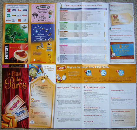
In fact, several months in the planning and design, yesterday saw the launch of a brand new park map ready for the Summer season. As expected for a while now, big changes lie in store for us. There are no more “Little Park Guides” and no more blue or pink covers. No longer will each park have its own, unique leaflet to guide you around.

Meet the new… Plan des Parcs. Two park maps… in one.

Image

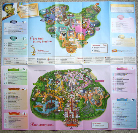
The pocket size of recent years is ditched in favour of a size more similar to the maps pre-2003, a regular leaflet size, which folds out across five sheets horizontally and double the size vertically. This seems like a big park guide, but then it does need to cover two entire Disney Parks:

Image

It’s a landmark day for Disney theme parks, the first time two parks have ever shared the same plan. But why? Well, imagine this scene…

You’re visiting Disneyland Resort Paris just for one day. Naturally, you pick Disneyland Park to spend all your time in and stroll straight past the entrance to the Studios. What’s in there? No idea. As you pass through the turnstiles and pick up your map, you get a full guide to Disneyland Park, and nothing more. That other park across the way looked like nothing more than a series of giant yellow buildings — there’s no way of really knowing what lies beyond the imposing Disney Studio 1. You can’t be blamed for missing such top-rated classics as Rock ‘n’ Roller Coaster, CinéMagique or Crush’s Coaster.

Now, with the two maps in one, a visitor just stopping by at Disneyland Park opens their map to find a whole new park at the top, with plenty of rather interesting sights. Attractions themed to new films like Cars and Finding Nemo, not to mention truly special experiences like The Twilight Zone Tower of Terror and Stitch Live!. You’d want to hop over and check it out, wouldn’t you?

Rather than keeping visitors in the dark about what lies within the park next door, it does indeed make much more sense to advertise it to all, make the most of its great guest satisfaction scores.

Are there bad points? Sure. Beyond the fact that converging the parks like this might make their individuality a little less special, the new design has for some reason completely dropped the descriptions for some of the major attractions. How are first-time visitors really meant to know what happens in Pirates of the Caribbean, Phantom Manor or Art of Disney Animation? The restaurant listing also exposes a real horror for Walt Disney Studios Park‘s dining, listing its limited number of eateries in one category, alongside entire lands at Disneyland Park.

The good points and the positive effect this double park plan should have on guests’ awareness of the two, separate parks, especially now Walt Disney Studios Park has some top-notch themeing along with great attractions, will far outweigh any niggling negatives. Last month we consolidated our two cumbersome Entertainment Programmes into a single, simpler leaflet, and now we only have a single park map to carry around.

Not that we need a map to find our way around Disneyland Resort Paris, of course, but we still have that collection to think of…

[Photo credit: Mouetto, Disney Central Plaza forum]

Tuesday, 10th June 2008

New Programme fills every hour with magic

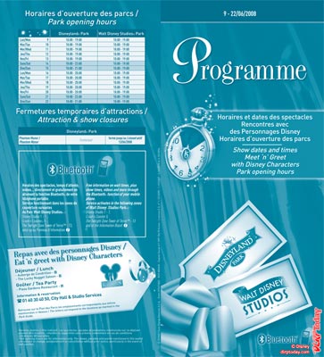
Since 6th October 2006, the show, parade and character meet ‘n’ greet times have been separated from the main Park Guide of each park with a special Entertainment Programme, later shortened to simply the “Programme”.

Similar to the Times Guides you find at other Disney parks around the world, these are printed on lower grade paper in a single colour tone. However, collect them all and you’ll be carrying around four separate leaflets to plan your day — for two parks which likely see more “park hopping” than any another resort. Excessive? It seems the park planners at Disneyland Resort Paris thought so.

The two Programmes have just become one:

Image

Compared to the previous design we saw at the start of ‘The Celebration Continues’, the new Programme immediately appears to boast a much more accomplished front cover design. The shiny wrapping paper and ribbon themes are carried through, with the two park logos on two labels. A new clock graphic with a ’15’ symbol at its centre sits next to the text “Show dates and times, Meet ‘n’ Greets with Disney Characters, Park opening hours”.

You’ll notice right away that the row of Mickey Mouse silhouettes carrying languages (such as FR, GB, ES, IT) which used to be at the top of the cover is now gone. The new Programme is instead intended to be a language-free affair, cut down from eight pages to four and using only French and English inside. Since the show and parade names are mostly the same for each language, certainly in announcements and signage around the parks, it makes sense.

On the back, you find the latest opening hours, a new box for any current attraction closures, the box advertising Walt Disney Studios Park’s new Bluetooth trial and an advertisement for character meals.

Open it up, however, and things are suddenly a whole lot different…

Image

Gone is the simple vertical list of characters, shows and parades. Instead, the times guides are turned on their side to stretch across the page. With each hour given its own column, the showtimes are then slotted into the relevant boxes, the idea here being that, say you’re in the park at 4pm looking for something to see, you can now go straight to the relevant column, rather than scanning the whole listing for any times close to 16:00.

Initially the table may appear slightly confusing and unnecessarily complicated, especially with the constant “French / English” doubling of text, but in practice, in the parks, the TV-guide style is likely much more convenient. The only downside? For the resort, it shows the gaps in the park entertainment schedule — no afternoon meet ‘n’ greets at Disneyland Park or not many shows close to the Studios’ closing time, for example.

For the environment, the new Programme means a huge 75% reduction in the use of paper to produce these guides every single day.

But what do you think? Another step forward, or a stumble backwards?

Thursday, 10th April 2008

The Celebration Continues… The Park Maps

It was during our 15th Anniversary Launch coverage in April 2007 that we discovered the updated park maps for the long-awaited celebration. With Disneyland Park bathed in gold and both parks sporting ’15’ symbols, confetti and streamers, they were a flashy welcome to the events that lay beyond the park gates.

One year on, and ‘The Celebration Continues’ with a brand new redesign, bigger than before. The covers of both guides have taken a darker approach with their pinks and blues fading to a neat black as rays of light shine out from each park logo. Mickey’s hand pulls the wrapping paper away in the bottom corner — the ’15’ now a much smaller icon in the lower right.

Image

They’re an improvement not just in the beauty stakes, with the cover information now displayed much more clearly in a single bar along the top, with both a larger and clearer country flag and textual language title identifying each guide either side of the date period.

Inside, the maps are largely the same as ever. A few subtle tweaks have been made, however. In the excerpt from the Walt Disney Studios Park guide below, notice the small outline of the park and the colour fill showing the location of each land, just to make it even clearer. Of course, the new designated smoking areas are also marked — with a tiny cigarette symbol.

Image

The key to the symbol reads “For everyone’s comfort and convenience, special areas have been set up for those who wish to smoke. Please smoke only in these designated areas.”

Also note that the Walt Disney Studios Park map itself has again had a small design update — the addition of a large Stitch Live! attraction sign to the Walt Disney Television Studios building. And, whilst Jiminy Crickett is your guide to Disneyland Park, Stitch is now fittingly your host on the Studios’ map.

One change to both guides is a new box stating very loudly “IMPORTANT! Pick up the Programme!”. We can only assume that many guests are taking the map and failing to realise all the entertainment times are in a separate leaflet. Talking of the Programme, those have also been given a modest update to match the park guides:

Image

The back cover of both park guides gives us one final surprise — an updated Official Partners list, now looking bigger than it has done for many years.

Image

New additions are Danone and Dole, which has been featured in-park for some time but never as an official parter. Kellogg’s is now a regular feature and IBM has returned following its disappearance several years ago. The Orange (sponsors of Studio Tram Tour) logo is now featured over France Télécom (sponsors of “it’s a small world”). Since they’re the same company, we’d assume this is simply because Orange is used worldwide and not just in France.

Image

Finally, the Extra Magic Hours leaflets available in the lobbies of Disney Hotels have also been given a refresh, with a smart new logo and simplified information now that the hours are strictly morning-only.

Saturday, 17th March 2007

Work-in-progress Walt Disney Studios

Today’s edition of the newspaper included a special supplement dedicated to the 15th Anniversary of Disneyland Resort Paris. A clever publicity stunt from the resort’s Dutch sales office, it includes details of the aniversary events, articles on the history of the resort, an interview with Imagineers and countless travel offers and promotions for trips during the anniversary year. The entire supplement has thankfully been photographed by the members of Themepark.nl, including an entirely unprecedented special inclusion on page 9.

To show the impact of its new attractions on the park, a work-in-progress version of the 2007/08 Walt Disney Studios park map has been printed. As with most new attraction additions, the rough plan has been available to the international sales offices of Disneyland Resort Paris for some time. Almost never before though, has a plan such as this been released to the public. It’s a daring move from the Dutch team, and another bold attempt to really make an impression on the public as the anniversary year approaches.

Disney theme park maps always have to power to allow fans to stare away at them for hours, so a map which gives us a look 12 months into the future? Well, there’s a lot to take in…

(Nr.1) Extra plants between Disney Bros Plaza and Toon Studio, with the first appearance of the Sorcerer Mickey entrance statue! Strangely, Mickey is shown as a gold statue as in the latest concept art we’ve seen, rather than the full-colour statue generally expected. The plinth he stands on also appears to match that in the latest concept, mirroring the blue and stars of the Sorcerer Hat.

(Nr.2) The Sorcerer Hat now features golden stars, stripes and moon with its upcoming golden Disney characters also featured. Dumbo in particular can be spotted below the word “Disney”.

(Nr.3) New planting areas in front of Animagique! These were shown in an old piece of concept art which was uncovered recently (see image on WDSfans.com), but their inclusion in the final plans for the land still isn’t confirmed.

(Nr.4) The new, extended “oasis” area in front of Flying Carpets Over Agrabah.

(Nr.5) The colours of Flying Carpets Over Agrabah’s backdrop have been updated and the reverse is now purple.

(Nr.6) Crush’s Coaster. With pink rockwork, a hazy queue line (the pink path leading to nowhere) and a different design to Studio 5, this isn’t the most accurate view of the attraction but should be adequate. The logo is featured above the building to match the rest of the attractions on the map.

(Nr.7) The Toon Town backdrop and new Toon Studio area. The Toon Town hills backdrop features only limited buildings, in the exact design of the steel frames recently erected on-site, and the smiley-faced Sun from the 2007 Resort Map and early concept art doesn’t appear. Two planters are featured, and, though hard to make out, there appears to be a yellow, faux Toon Studio security booth at the “entrance gates” to the backlot – a great touch, if it becomes a reality!

(Nr.8) The ImagiNations costuming workshop is no longer featured at all on the plan, with the corner of a plain building just peeping out from behind the Toon Town backdrop. Curiously, there doesn’t appear to be a clear path between Studio Tram Tour and Toon Studio here.

(Nr.9) Cars Race Rally. The large neon “Cars” sign atop the circular entrance building is used as the main symbol of the attraction, with Flo’s V8 Café next door. The area isn’t particularly detailed – only two turntables are shown, as previously seen in the 2007 Resort Map. We’ll have to wait and see if the final version of the map brings further updates.

(Nr.10) Now we’re onto Hollywood Boulevard/Studio – probably the most interesting part of this early plan. As a sign of its work-in-progress nature, two skyscraper buildings appear to have been grafted in from Disney-MGM’s New York street sets, coloured dark red here to likely show they’re only placeholders for a custom design on the final plan.

(Nr.11) The new Studio Tram Tour tunnel entrance and Hollywood Hills backdrop is shown, but hasn’t been matched up to the rest of the plan yet (the old entrance can still be seen behind). The tunnel appears almost identical to that seen on the fresque inside Disney Studio 1.

(Nr.12) The Twilight Zone Tower of Terror itself. The design appears to have been copied over exactly from the Disney’s California Adventure plan.

(Nr.13) A new street now runs diagonally from Place des Stars to Studio Tram Tour, right past The Hollywood Tower Hotel. The Hotel therefore looks likely to have more of an on-street inner-town feel like Tower of Terror at Tokyo DisneySea, rather than the abandoned hillside location of the Florida version. The iconic fountain has retained its position from California, therefore appearing to make the Production Courtyard side the main entrance to the new attraction.

(Nr.14) And finally, most fascinating of all – their current plans for La Terrasse. It appears there will only be a minimal path through to the Tower from Hollywood Boulevard, with the entire current La Terrasse building now surrounded by the new Mediterranean/Pueblo Deco building described previously, creating a new area surrounded by trees and what appears to be a fountain. An outdoor terrace seating area appears to be featured behind the sets, looking across the street to Tower of Terror. Across the boulevard, the Gone Hollywood storefront can be seen.

The Walt Disney Television Studios and Rendez-Vous des Stars/Backlot Express buildings have also been shrunk compared to the current map, and extra plants and details have yet to be added to Production Courtyard and Toon Studio.

And there we have it. Disney theme park maps are never the most accurate of plans, but this certainly gives a fascinating look at the bare minimum of additions and improvements currently being worked on.

Imagine… in just 12 months’ time this won’t be work-in-progress, this will be Walt Disney Studios Park. Now, that really is a Studio of dreams…

Many thanks to Pantagor and the members of Themepark.nl for sharing this plan!

Subscribe to the Magic!

Tags & Archives