Friday, 16th October 2009

Thierry Marx reinvents outdoor vending treats

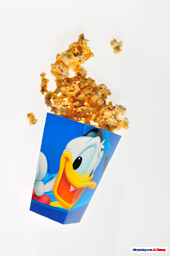
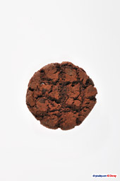
Popcorn, the cookie and the toffee/caramel apple. Three of the kings of outdoor vending in Disneyland Paris, a resort with, in fact, very little variety in its snacks and treats from street kiosks.

The flavoured popcorn of Tokyo Disney Resort has yet to hit the parks over here, whilst the famous churros of Disneyland Resort have yet to oust the tasteless, pre-packaged “trio of doughnuts” from its unwelcome place on so many menu boards.

Is all that about to change? For a couple of months at least, yes. Famous French chef Thierry Marx has agreed to reinvent three of the parks’ staples using modern cooking techniques and some of his “molecular” tricks — a style of cooking where the science behind the process is as important as everything else. Perhaps he’s the French equivalent of Heston Blumenthal in the UK, only tackling popcorn and cookies rather than animal parts.

A press release and a series of photographs have been released today.

Thierry Marx réinvente l’art des friandises « street food » à Disneyland Paris

Le célèbre Chef a imaginé une nouvelle façon de savourer le pop corn, la pomme d’amour et le cookie pour un Noël gourmand et innovant à Disneyland Paris

Après le succès de la Pâtisserie Ephémère en l’honneur des bûches « haute couture » de Chantal Thomass, ORA ITO et Vanessa Bruno réalisées par Sébastien Gaudard, Disneyland Paris régale à nouveau les papilles avec une toute nouvelle expérience préparée par Thierry Marx, Chef emblématique de la cuisine moléculaire.

A l’occasion des fêtes de Noël, Thierry Marx présente trois créations inédites dans l’art de la gourmandise et de l’innovation. Le pop corn, la pomme d’amour et le cookie : trois plaisirs sucrés transformés grâce à une nouvelle interprétation qui promet de réveiller tous nos sens. A savourer uniquement dans les allées de Disneyland Paris.

From the classics:

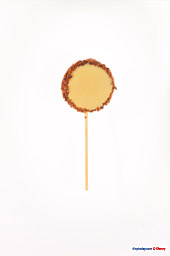
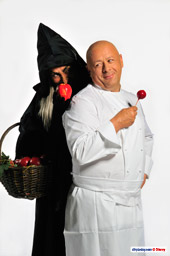
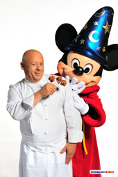
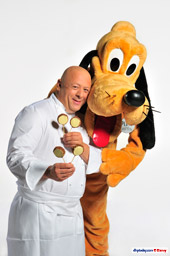
Thierry Marx reinvents outdoor vending sweet treats Thierry Marx reinvents outdoor vending sweet treats Thierry Marx reinvents outdoor vending sweet treats

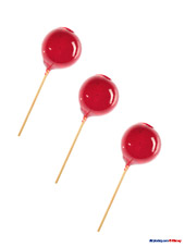
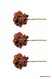
To the reinvention:

Thierry Marx reinvents outdoor vending sweet treats Thierry Marx reinvents outdoor vending sweet treats Thierry Marx reinvents outdoor vending sweet treats

Les “recettes magiques” d’un Noël tendance et gourmand dans les Parcs Disney

La pomme d’amour : « Souvent trop dure, j’ai voulu redonner à la pomme d’amour une certaine douceur en créant une pulpe de pomme verte, enrobée d’un sucre léger beaucoup plus diététique ».

Le pop corn : « Avec cette nouvelle interprétation, le pop corn est caramélisé en différentes cuissons avant d’être floqué d’une savoureuse couche de chocolat ».

Le cookie : « Ce dessert très enfantin préparé par les mamans, j’ai souhaité le transformer d’un biscuit dur en un biscuit moelleux grâce à de la crème de cookie ».

Passionné de « street food », le Chef étoilé réputé pour ses jeux de texture et de température a tout naturellement souhaité présenter ses trois créations sur un bâton, à l’instar de sucettes à croquer.

Thierry’s new Toffee Apple, Pomme d’Amour, tries to address the usual too-hard-to-bite snack by mashing and pulping the apple and then coating it in a lighter sugar, making it a little healthier.

The new Popcorn treats are caramelised using various techniques and then coated in a tasty layer of chocolate, resulting in an extra-large clump of chewy, chocolately goodness.

Finally, the humble Cookie has been reinvented with a softer, chewier bite than a regular biscuit thanks to extra cream and rich dough, all dipped in cookie crumbs.

Thierry Marx reinvents outdoor vending sweet treats Thierry Marx reinvents outdoor vending sweet treats Thierry Marx reinvents outdoor vending sweet treats

As you can see, the three special snacks exclusive to Disneyland Paris are presented on sticks as special tasters and will be available alongside the regular versions, as a seasonal special, during the Christmas events at Disneyland Park from 8th November 2009 to 5th January 2010. No specific locations have been stated.

And the price? An online article published just in advance of the press release states… €7. Seven Euros! For one stick? For two or three? It’s not clear.

Looking at these photos, we’d better have a diet plan and a lottery ticket ready for New Year…

Photos © Disney.

Friday, 11th September 2009

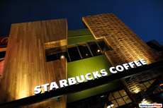
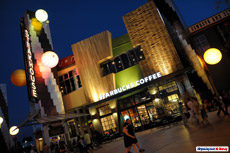
How much does a Disney Village Starbucks cost?

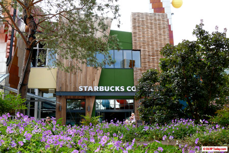
The multinational chain is already known for its high prices, so that combined with the strong Euro and prominent Disney location risked an inflated price rather too high for many regular guests — though you wouldn’t know it from the queues stretching back to the door for most of the day, particularly after park closing.

Starbucks Coffee

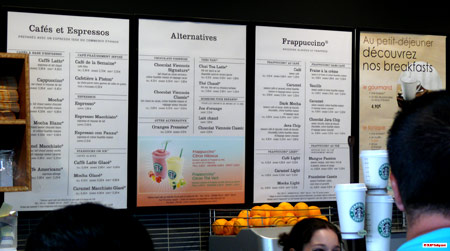
Still wondering? We snapped a quick photo just for you:

Starbucks Coffee
(click and zoom in to check out most of the prices)

Your Grande Latte or Cappuccino costs €3.90, whilst the simpler Americano is priced down at €2.80. Frappuccinos are up at €4.50 and above, Viennese hot chocolates priced from €3.60.

How are those prices for you? For comparison, a regular 40cl Nescafé in the parks will cost you €2.60, with a new 60cl option available for €3.00. Depending on your view of coffee, 90 cents or so might actually be a small premium to pay for a rather more “real” cup…

Pictures: DLRP Today.com

Wednesday, 2nd September 2009

More chance at new Last Chance Café extension

Last Chance Café has long been on the list of Disneyland Parks see-sawing open/closed restaurants, sometimes open for weeks, sometimes completely shuttered. Considering its incredibly prominent location right opposite Thunder Mesa Riverboat Landing and en route to Phantom Manor, it has long been a wasted dining opportunity.

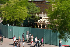
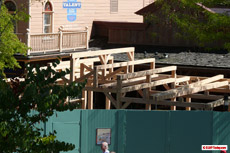
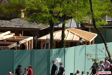
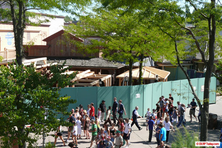
Well yeeha! It took 17 years, but we’re in luck! The location is now finally getting a proper outdoor terrance, a full wooden extension in the Western style, with its signage being moved outwards to the edge of the new construction.

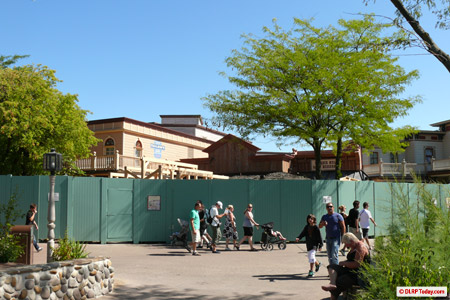
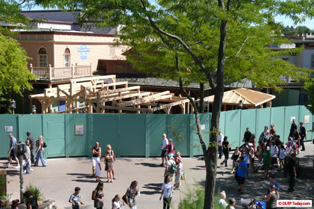
The fences were put in place a couple of weeks ago, with the work expected to just be a general refurbishment. But as you can see, it has become much more than that…

Last Chance Cafe

For a better view, let’s climb aboard the Mark Twain…

Last Chance Cafe

Last Chance Cafe Last Chance Cafe

Last Chance Cafe

The “restaurant” itself is really nothing more than a small indoor counter service queue area, so, despite its excellent placing right on the beaten track, Last Chance Café has frequently offered guests no chance at all for a drink or snack. Aside from the small hot dog stand nearby, they’d have to jump on their horse and ride off all the way to Main Street or Fuente del Oro Restaurante for a meal.

Last Chance Cafe

With this large new structure in place we can hopefully expect the location, sandwiched between the table service Silver Spur Steakhouse and the buffet service Lucky Nugget Saloon, to be giving us much more chance for a bite to eat, on the dusty road to Boot Hill.

Pictures: DLRP Today.com

Wednesday, 19th August 2009

Long-awaited premiere for Disney Blockbuster Café

In reality, the former Backlot Express has been open for all but a couple of weeks as it has been re-dressed to become Disney Blockbuster Café these past months, with only the Pirates section closed for its more major changeover.

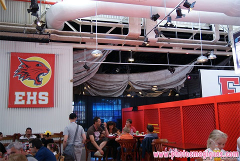
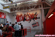
The result gives a mostly bare, mostly bland restaurant filled with High School Musical banners and posters… with a surprisingly ambitious Pirates of the Caribbean room tacked onto one side.

Early reviews are in, and they’re calling it’s the “coolest” place to eat:

Image

Well, at least the correction printed in the current Programme for the Park Guide (which still lists Backlot Express until November) says so.

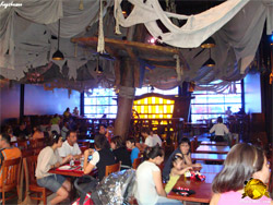
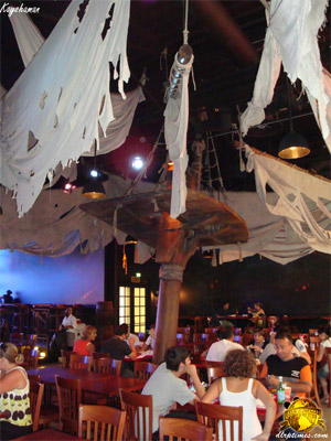
And, with the first guests seated in the new area, Kayshaman for DLRP Times provides the first photos:

Image Image

There’s the tilted mast — the large platform and sail above it helping to give this area a much more intimate feel from the bare warehouse before. The lights have also been changed, to a flickering candle effect, and the props appear to include — hold onto your seat — something related to the films themselves: the circular map from At World’s End, the third film?

Image

The idea behind the restaurant appears to be similar to Planet Hollywood, dining amongst movie memorabilia and themes, yet with only look-a-like items and reprinted High School Musical posters for the memorabilia. At least, we have to assume so — if any of these items are real props, they’ve made the same mistake as before: not labelling them.

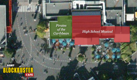
In case you’re not familiar with the building, here’s a plan to show the new layout:

Image

As you can see, there’s a whole lot of High School Musical in there. That’s not surprising, considering it’s been so easy to give a feel of that film’s perfect, whitewashed school in this empty warehouse, but could turn out more than a little disappointing if the rumoured continual updates of new films and themes don’t materialise.

According to the original rumours, after all, the restaurant would see changing themes every year or so, allowing a place for the Walt Disney Studios Motion Pictures arm of Disney to promote their latest films without covering Disney Studio 1 with, say, a giant billboard.

There’s your preview. Look out for our full, scurrilous review with both pictures and video in a couple of weeks. Until then, give your verdict (from 1 to 5 stars) in our Question of the Week to the right of this article.

Pictures: Kayshaman for DLRP Times.

Saturday, 15th August 2009

Jules Verne theme pub in Disney Village talks?

Trust a Disney fan — particularly a Disneyland Paris fan — to spot a throwaway reference to our resort hidden amid a run-of-the-mill write-up of a Nantes restaurant. But, that’s exactly what tinkerbell7 did here, and it certainly makes for an unexpected new possibility.

Read French? Read on…

Image

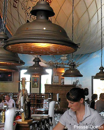
Vu de l’extérieur, c’est un petit bâtiment cubique entouré de quelques palmiers. Rien n’indique que le French Pub, implanté zone des Gripôts, abrite un décor grandiose, à la hauteur de l’oeuvre de Jules Verne. «C’est voulu assure Ludovic Quefellec, le patron de l’établissement. Nous souhaitons surprendre le client».

Disney Village serait intéressé pour reprendre l’idée d’un pub consacré à l’univers de Jules Verne «Nous sommes encore en pourparlers confie le patron. Disney nous propose une surface de 500m2».

Find the full article here.

Alors… quoi? This is a place simply named “French Pub”, near the city of Nantes, which has been decorated inside to what looks like a quite lovely Jules Verne theme. They’re apparently having huge success, and the owner happens to mention — Disney Village are interested in taking up the idea of a pub dedicated to the universe of Jules Verne. ‘We’re still in discussions’ entrusts the owner, ‘Disney have proposed an area of 500m2 to us’.”

So, where is this 500 metres-squared? A replacement for the Sports Bar and New York Style Sandwiches? Perhaps even for Disney Store, when World of Disney eventually arrives? Or even a brand new building, sometime in the future?

Whether anything comes of these discussions of course remains to be seen, but it’s interesting to hear that they’ve been looking beyond the everyday Starbucks and franchised Earl of Sandwich to expand Disney Village. Should the Village ever finally expand into a full second street of restaurants and shops, they’ll certainly need a lot of tenants to fill the space.

And, between the German experience of King Ludwig’s Castle and the very likely upcoming British experience of Earl of Sandwich, it would be a shame not to have this new, international, Village anchored by something much more closer to home.

In the words of Jules Verne himself — “Nothing is impossible… only improbable.”

Picture: PresseOcean.fr

Friday, 14th August 2009

Earl of Sandwich next to seize land in Disney Village?

There’s no doubting the breath of fresh air Starbucks Coffee has given Disney Village. Time for another? Yes, it’s looking likely.

Back in 2008, we reported:

“But what for that second new eatery? The admin of Disney Central Plaza, Grandmath, promised that at least one of the two was already operating at Walt Disney World. Since there are no Starbucks franchises on Disney’s Florida property, the second location must surely be the Orlando import.

“Indeed, current rumours, again very strong and from reliable sources, point to an Earl of Sandwich opening at Disney Village.” … “No location for the second building has been rumoured, and no tentative dates for construction of either have yet been given.”

Ahh but now, with the benefit of Starbucks’ completion and around 18 months, some rather more precise rumours are beginning to surface about the possible Earl of Sandwich store. This new chain of restaurants, founded by John Montagu, 11th Earl of Sandwich himself, on the basis that his ancestor, the 4th Earl of Sandwich, popularised the sandwich in Great Britain in the 1800s, launched at Downtown Disney in Walt Disney World in 2004 and has recently been expanding rapidly in the US.

Image
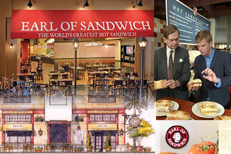
Various ‘Earl of Sandwich’ images, including artwork for a standard franchise outlet

Most importantly for us — they’ve got their sights set on Europe. This business plan was revealed due to a rather embarrassing start over here, however, when the Earl of Sandwich chain made news in the UK for taking incredibly fierce legal action against a small sandwich shop in Aberdeen, Scotland, unknowingly bearing the registered name.

The reason, buried inside the filling of those reports (hey, sandwich puns are hard), was confirmed by a spokesperson for the company:

We now have plans to launch in the UK and Europe and we have trademarks both in the name Lord Sandwich and the Earl of Sandwich in relation to various things, in particular sandwiches and the provision of sandwiches.

‘With the launch of shops in the UK and Europe we have to avoid confusion with similar businesses – that is essential for a successful launch.’

So, with Earl of Sandwich clearly stating UK and Europe, there’s certainly weight to these rumours. The latest of which are pointing to one clear fact — that the restaurant will be in a brand new building — and also offering some very interesting, perhaps unexpected, suggestions for locations within the Village.

Image

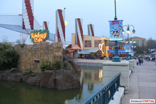
Naturally, with the long-awaited removal of the despised Rainforest Carousel this April, this big vacant space looked promising for the British-themed toasted sandwich restaurant.

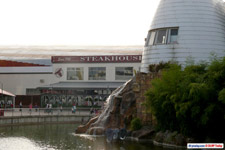
But perhaps not, after all… An interesting snippet of information was posted by phantom247 on magicforum, stating simply: “By the end of the year Earl of sandwich preparations for construction should begin with the lake area nearest Steakhouse and the dome being filled in.”

So… by the end of the year, that’s good to hear. But wait a minute — the lake area nearest Steakhouse and the Dome being filled in…? Yes, we said these rumours were surprising.

Image Image

A more likely area of this inlet to be filled in would have been the corner between Rainforest Cafe and the bridge (above right), allowing an Earl of Sandwich to use both this and the area vacated by the old carousel, becoming a part of the main thoroughfare.

Alternatively, placing the restaurant on the other side, opposite The Steakhouse (above left), seems on the first hand incredibly unlikely, but could turn this forgotten corner into a more worthwhile second area of Disney Village, adding something more to the corner currently dominated quite negatively by McDonald’s.

However, whilst the area does currently feel a little run-down, losing too much of this precious water could take away the possibility of it ever becoming a nicer, but still sedate patch of the entertainment district.

Image

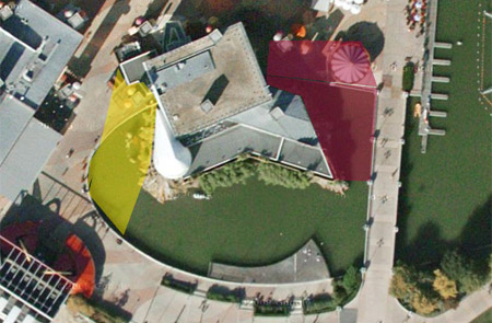
The size of the restaurant is completely unknown, so these are just guesswork — but the two general areas at least have been marked on the satellite photo above to help visualise the possibilities. Clearly this will be a much larger construction project than Starbucks, especially if any infilling of the lake inlet is required.

Though which area the Earl ultimately seizes — if any! — we’ll just have to wait and see.

Pictures: DLRP Today, Google Maps.

Tuesday, 11th August 2009

More maritime previews from Blockbuster Café

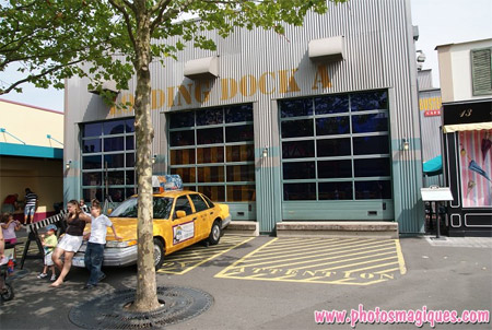
The modern, silver Ford Focus parked outside, its windows covered in High School Musical 3 stickers, has miraculously disappeared from beside the yellow taxi.

Image

Though vehicles are a feature elsewhere in Backlot, this car looked entirely out of place. So, with a removal, Disney Blockbuster Café actually scores new points.

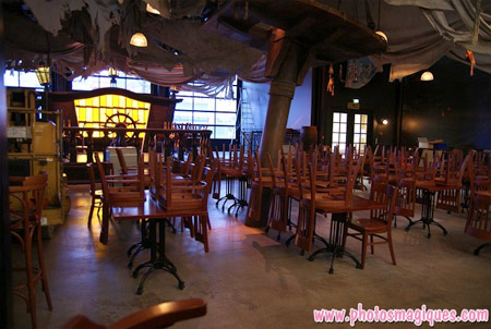
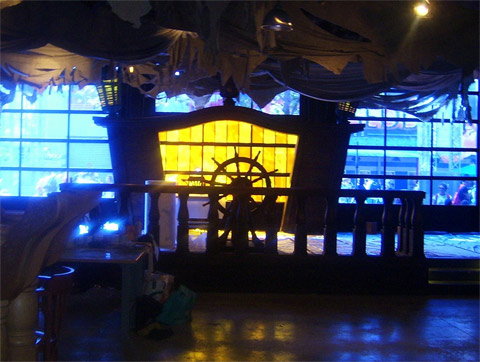
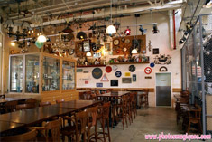
And inside, those points have begun to mount up considerably when you take a look at the progressing theme in the Pirates of the Caribbean room. The sails, wooden banisters, wheel, yellow stained windows and ship’s stern have been joined by at least two huge ships’ masts jutting up from the floor at angles.

Image

One has a torn piece of wood angled across it halfway up, whilst the other, seen in the picture above, appears to have a crow’s nest. Notice also that the large garage windows have been given a blue-tinted covering, perhaps to simulate moonlight!

Image

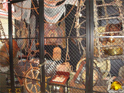
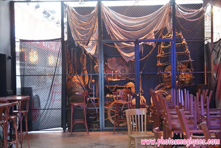
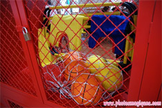
Walking back around looking at the reverse of this area, through the door next to Restaurant des Stars, we can see that the storage cage next to the serving area has been dressed up with a full set of nautical accessories and props, from chests and barrels to bottles, nets and a wheel.

All looking very good — atmospheric, well-dressed. The only problem still? A distinct lack of Disney’s pirates. However, perhaps that’s where those display cases will come into play. A couple more, in fact, have popped up in the room on the far side of the restaurant.

Image

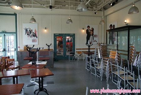
This additional room was actually originally just a raised outdoor terrace, but was soon enclosed for the park’s first Winter. It remains very cold, however, heated only by electric coil heaters, and the basic High School Musical posters installed to replace the torn-out props don’t help.

Here we can see the other half of the game — whilst the Pirates area is very well-themed but lacking in relationship to the Disney franchise, the ‘HSM’ area is, honestly, largely unthemed but playing very, very close to the franchise — almost like a walk through the film’s publicity department, in fact.

Pictures: Photos Magiques (see more in the latest update here!)

Thursday, 6th August 2009

Starbucks Coffee added to official photo library

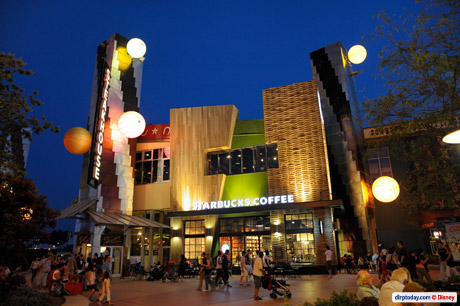
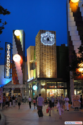
With its huge, framed windows and earthy, warehouse feel, the mermaid-topped coffeehouse has become a beacon for what could be a “new” Disney Village.

Image

Sure, with the long-delayed planters and trees finally spread throughout the entertainment centre since Spring 2008, it’s been looking very, very different for over a year already.

But this is the first actual step in putting some of that feeling into the buildings themselves, the first major addition to the Village since those trees set it on a new path last year. It might have taken a slightly controversial icon of globalisation to achieve it, but the result is incredibly good for the place.

Image

It was all designed jointly by Starbucks and the former Disney Construction Company (DCC, who were behind Val d’Europe), which is now part of DLP-I — the Paris branch of Imagineering, in charge of smaller projects, and especially non-park work (thanks Kristof, magicforum). Between the many Disney-owned and several tired-looking venues in the Village, a Starbucks as swanky as this really gives the street the feel of a “happening” place.

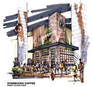
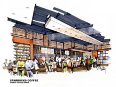
Even better, it’s genuinely eco-friendly, too. Starbucks gushed about the new store on their blog back in June, and included two previously unseen pieces of concept art:

Starbucks at Disney Village Paris

Have you heard the buzz about the new Starbucks store in France?  On June 20th, we opened a new store in the Disney Village Paris that is truly in a class of its own. It is the first international store to be built using our new design concept that connects our stores to our coffee heritage.  This store is also the 50th Starbucks store in France and marks the 5th anniversary of this important market.

So, what’s so special about this new store?  Inspired by artists’ studio environments and modern design in Europe in the 1930’s, this store is not only beautiful but also includes local materials and green design to enhance the customer experience.  This new store design is part of our effort to have all of our new company-operated stores worldwide certified by the end of 2010 under the U.S. Green Building Council’s Leadership in Energy and Environmental Design (LEED) program. This is a key component contributing to the Starbucks ™ Shared Planet ™ goals in environmental stewardship.

The LEED ® Green Building Rating System evaluates a building on various criteria including energy performance, indoor environmental quality, community connectivity and regional materials.  Accordingly, the innovative design of this store includes the following features:

  • Adjustable, low-energy lighting system
  • Mixed-mode HVAC system (mechanical and natural ventilation) saves energy  and makes use of existing building tower feature
  • Large, operable windows provide natural ventilation, ample daylight and fresh indoor air quality
  • Water efficient fixtures in restrooms and bar areas
  • Low emitting materials reduce off-gassing and allow the aroma of our coffee to be the star
  • Salvaged and recycled construction materials & furniture (including reuse of local French wine barrels and authentic champagne riddling racks)
  • Recycling available for customers and store partners
  • Measurement and verification plan to monitor energy and water savings over the life of the store

Image Image

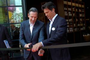
The new location was officially opened on 20th June 2009 by Euro Disney CEO Philippe Gas and Starbucks Coffee CEO himself, Howard Schultz:

Image

You can find a whole fact sheet about the store here, which reveals, for example, that certain wood is from used barrels reclaimed from the French wine industry, the exterior wooden cladding is made with reclaimed Champagne racks from France, the countertop uses a material containing recycled mobile phone parts, and so on.

Image Image

Compare the design of the new Starbucks Coffee to the corner of The Steakhouse just to its left, and the remnants of rethink after rethink are all too clear. The minimalist Frank Gehry architecture of 1992 meets the new colours of 2005, meets the balloons of 2006, meets the red horseshoe border of 2007, and so on.

Hopefully this modern and clear vision set out by the Starbucks won’t just be applied to any other new buildings but to the older buildings, too. That said, it’s not necessarily the design style of Starbucks’ exterior that most of us would like to see transplanted to the other locations like The Steakhouse, Hurricanes and World of Toys

Image

Since the post-1992 additions of Planet Hollywood and King Ludwig’s Castle, for example, there couldn’t (and probably shouldn’t?) be a consistent, shopping mall-type design through this street.

But at the same time, should every location be as loud as this Starbucks or King Ludwig’s? No, smaller stores like Hollywood Pictures should probably have a more standard exterior, with only the larger, more special locations “jutting out” with more outlandish architecture, like the style used at California’s Downtown Disney. The only problem is that those forgotten stores currently have near-enough cardboard cut-outs for their signage, cheaper than those you see in your local town. So, you can guess what it all boils down to in the end — money. Something which Starbucks could pour a lot of into their project.

Image

However, if or when this long, long looong-awaited World of Disney mega-store finally opens in front of the Gaumont Cinema, the Village’s existing Disney Store will likely be redundant. It might even clear out the need for the Hollywood Pictures and World of Toys stores further up, since the former is very similar to those in the Studios and the latter rather dated.

In that respect, you could argue it’s barely worth spending too much money on those old locations — just enough to keep them ticking over until they’re consigned to Yester-Disney Village. But, with the World of Disney forever on hold, that might not be any time soon.

Image

Realistically, Starbucks only adds to the jumble of Disney Village — but it does it with such style and thought that it’s really something to celebrate for the place. Here, at least, the original 1992 vision has finally been successfully updated for the 21st Century.

Perhaps if the entire area were being built today it’d all be like this — a real mixture of materials and textures, trees and planters from the start — the first environmentally-aware entertainment centre? As it happens, we’ve only the mermaid to cling onto… for now.

Pictures © Disney/Starbucks.

Tuesday, 4th August 2009

Pirates dock at Blockbuster Café, Disney on horizon?

After the changes seen in our four month news round-up, now come more new additions. The Pirates of the Caribbean room, situated to the left of the serving area, with large windows looking out across to Armageddon: Les Effets Speciaux, continues to impress rather more than its High School Musical partner.

Now, in addition to the ship’s wheel and wooden bannisters — not to mention the ceiling filled with torn “sails” — a large ship’s stern, with three lanterns and yellow stained glass windows has appeared, just behind the wheel —

Image
Photo: VDR, Main Street Gazette forum

If you’d have asked any fan what the inside of Backlot Express needed — beyond a more interesting menu — they’d have probably said more atmosphere, a more enclosed environment. So, on first glance, this area of the re-do seems to have the right intentions.

Whilst the generic props warehouse of Backlot Express was interesting enough, it was generally too bright and too barren for an Aladdin’s cave — too cheaply-built, to put it bluntly. Will these changes solve that? Banners and posters based on High School Musical and decorations merely similar to Pirates of the Caribbean? This ship’s wheel, stern and torn bedsheets look nice and all, but what relevance do they have to this Disney franchise?

Image
Different themes – very different budgets

For a Disney theme park restaurant — especially one with “Disney” in the name — it all feels slightly distant from the mouse. Imagineering appear to be only very loosely involved — if involved at all. The ‘HSM’ theme was likely a popular choice because a few posters and banners are enough to support it.

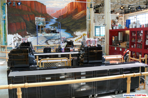
The pleasing canyon mural by the payment desks has been replaced by a giant poster for High School Musical 3. The room is now a branding assault on the eyes, not a themed environment.

Image
Old Backlot Express decoration

Rumours promised us actual props from the Pirates trilogy, to arrive “at the last minute”. Since the restaurant was also rumoured for completion in July, but continues to tip-toe ahead with only slight changes each week, that “last minute” doesn’t appear to have come yet. In fact, no-one truly seems to know how this project will turn out.

Image Image
Old Backlot Express decoration

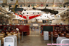
Previously, guests could admire an array of items in this props warehouse ranging from the rather famous (real Armageddon miniature sets, a real Speeder Bike from Star Wars Episode VI: Return of the Jedi) to the not-so-famous (hundreds of bric-a-brac items).

Whether the redecorated venue sinks or swims rests on this. If the new restaurant doesn’t feature real props from its two chosen franchises, what will have been the point?

Image Image
Generic basketballs, bibs and pom-poms now serve as set dressing

The worst thing about Backlot Express was and is its ugly, unwelcoming exterior, second its menu and third its interior. Like every other change across the Studios — the change to Restaurant des Stars, the tiny ice cream kiosk, the plethora of entrances now leading into Walt Disney Studios Store — this could end up just another cover-up job. None of the issues have really been addressed, there just appears to be a hope here that in-your-face branding based on distant franchises will suffice.

But still — we must watch the horizon with hope. Since Jack Sparrow came back from the dead (sorry — spoiler), anything is still possible. Isn’t it?

Pictures: VDR, Main Street Gazette forum; Photos Magiques; DLRP Today.

Friday, 31st July 2009

Did we miss anything..?

Well yes, quite a lot obviously. Just shows you shouldn’t go wandering into the Adventure Isle caves just before park closing… it’s been four long months!

If you’ve been similarly deprived of Disneyland Resort Paris news, given up trying to translate what they’re saying on the French forums, sit back and enjoy a quick and concise round-up of all the big stories of recent months — here we go!

SLEEPING BEAUTY’S BLING

Was it coincidence that updates here ended just about the time that Sleeping Beauty Castle succumbed to its most horrific, misguided meddling-with to date?

The birthday cake, the jester’s hat, the Epcot wand, the MGM hat… you’ve met your match. There truly aren’t enough negative adjectives in the dictionary.

Image

— — —

MAGICAL PARTY LAUNCHES WITH MEGA-PARTY

‘You’re invited!’ …but not to this. Press and media types were schmoozed in spectacular fashion as new theme year Mickey’s Magical Party kicked off with fireworks, projections, lights and so many characters they couldn’t even all fit on the damn stage.

Did it generate headlines, articles, media coverage? No.

Image

— — —

ACTUAL PARTY GROWS ON FANS

Frustratingly-titled new Central Plaza show ‘It’s Party Time… with Mickey and Friends’ initially looked rather like a drab flop on an overbearing and unnecessary new stage, but it has grown on most fans. The score by Vasile Sirli is actually plain fantastic (especially considering the lacklustre music in the year’s other new shows) and it provides a fresh, colourful heart for the year.

Watch the full show in HD here.

Image
ShoulderKids – this year’s must-have accessory

— — —

LIGHT MAGIC GIVEN FORMAL APOLOGY

Over in Discoveryland, the other show with an annoying name — ‘It’s Dance Time… in Discoveryland’ — brought delights such as large, primary-coloured circles on the floor of a retro-futuristic land, and the expertly-chosen hits of Block Party Bash.

Despite the show being considered terrible on every level by most who’ve seen it, the performers put so much effort and energy into their routine they each almost deserve a window on Main Street.

Watch the full show in HD here.

Image

— — —

PLAYHOUSE DISNEY QUIETLY OPENS

Beyond the forced MMP hoopla over the other side of the esplanade, Walt Disney Studios Park gained a brand new attraction — its fifth addition since opening — in ‘Playhouse Disney – Live on Stage!’. Jolly good fun it is too — wonderfully staged, very charming. The Paris version even has a “1 Up” on the two earlier versions with a big new pre-show studio.

Watch the full show in HD here.

Image
Credit crunch souvenirs

— — —

RESTAURANT GENERIQUE

Changing its name to ‘Restaurant des Stars’, the far too interestingly-named ‘Rendez-Vous des Stars Restaurant’ gained a new logo, some new colours and a new entrance canopy.

Image

— — —

DUDE LOOKS LIKE A FIRE!

In a quite bizarre coincidence, just days after fans launched an online April Fool suggesting Aerosmith would be succeeded by French rocker Johnny Hallyday as musical guests at Rock ‘n’ Roller Coaster, a fire began in the roof of the showbuilding.

Luckily the damage was minor — though it did allow for these dramatic photos (below) as the inspection crews ripped off the cladding, checked and replaced it. The attraction reopened just the next day.

Image

Image

— — —

SMEE GIVEN SURGERY

Captain Hook’s bumbling first mate was given a random makeover by the worldwide Disney Parks character team and, unlike most famous faces, he returned from the cosmetic surgery with a face more expressive than before. Remarkable.

Hopefully they’ll tackle some of the clearly worse-looking characters next, like the dead-eyed Woody, Jessie and Buzz…

Image

— — —

HIGH SCHOOL MUSICAL PARTY!

Now back for a third year, the Studios’ High School Musical show this year gained musical numbers from the third film but stopped short of going for the full ‘HSM3’ show the other resorts put on. ‘I Want it all’ is the standout number, but one that certainly won’t win over any new fans.

Watch the full show in HD here.

— — —

THEMED SMOKING

The ‘Smoking Areas’ inside the parks had been extended little beyond their miniature park map icons, so it’s reassuring to see that each area now has its own themed sign, tied into the location. Give it a few years and the public might actually use them.

Image

— — —

STUDIO STORE OPENS UP

Behind construction walls last time we saw it, the Walt Disney Studios Store has now been completed, with three new doors and payment desks in front of new, large windows.

Image
Photo: dlrptimes.com

Image
Photo: dlrptimes.com

— — —

STORYBOOK ENDING

Main Street has always had the best-kept exteriors of the entire park, always popping with a fresh bit of paint here or there. A new development in recent years are the nice tarpaulin coverings given images of the building hiding behind. Even for tiny spots like this one on the end of The Storybook Store, the hidden façade is still presented on top.

Image

— — —

PLAZA GARDENS GLEAMS

After a major refurbishment of the interior, including bringing the central fountain back to daily life, the whole Plaza Gardens Restaurant building was wrapped in themed tarps for an expensive top-to-bottom refurbishment and repaint. It didn’t stand out as being particularly bad before, there are other areas needing paint sooner, but it does look fantastic.

Image

— — —

STUDIO 1 REFURBISHMENT CONTINUES

Over the hub, it’s surprising to see that the refurbishment of Disney Studio 1 continues, the huge centrepiece building of the park still wrapped up in scaffolding. Must be a bigger job than originally thought, right?

Image

— — —

FLOORS OF ADVENTURE, DISCOVERY

Tripped up in Disneyland Park recently? No wonder, some of the concrete pathways are literally falling to pieces. Thankfully, the first resurfacing works seen for many years have been taking place, with areas of Adventure Isle and vast swathes of Discoveryland closed off and given new flooring, the effect — especially just in front of Space Mountain — very noticeably making the whole land look brand new.

Image

— — —

TENNIS, MICE, MAIN STREET

Some of the resort’s press and advertising efforts have been surprisingly inventive this year, like this — turning the top of Main Street into a full-size tennis court and inviting Gaël Monfils and Stanislas Wawrinka to play with Mickey Mouse.

Image

Just a few days later, Serena Williams visited the park and was met in front of the Castle by Minnie Mouse, wearing a special tennis player costume.

Image

— — —

JUST ‘PARIS’

Effectively the biggest change of the past few months, the news in April and subsequent official changeover in May that has seen ‘Disneyland Resort Paris’ — the resort’s name since the 2002 opening of Walt Disney Studios Park — change back to just plain ‘Disneyland Paris’.

It certainly makes sense — the extra word was always unpopular, confusing to non-English speakers and now, with every park from Alton Towers to your local fairground claiming itself as a “Resort”, it simply doesn’t have any value. “Disneyland Resort Paris” is cumbersome and never spoken, “Disneyland Paris” is short and very strong. Whilst things like the official website have changed over, don’t expect this to be an overnight transition — the new (or rather, old) logo will reappear just as and when things need replacing.

Unfortunately, this decision — made by new CEO Philippe Gas himself — came in April, just weeks after the resort had launched a whole new brand campaign for the theme year. These traditionally start in April, and everything from Cast Member name tags to park tickets and guidemaps had already been printed up with the full “Disneyland Resort Paris” name. Smart name reversal, silly timing.

Image

There’s also a whole myriad of logo variations now available (above). Which should be used, when? The standard logo is being presented as two-colour, with the “Paris” in a gold gradient that already looks rather dated.

— — —

BURNING FIRES, FLOWING WATERS

Tasked with bringing back old and forgotten effects, a new “taskforce” within the resort’s maintenance department has been one of the most positive steps in recent months. We already appear to have seen some brilliant reawakened touches, such as the torches on Fort Comstock at the entrance to Frontierland (lit from nightfall)…

Image

And the water channels leading to the drinking fountains beside La Cabane des Robinson.

Image

Whilst a long way short of having the full irrigation system working again (water should be hoisted right up to the top of the tree by the water wheel, before being poured out and running through the channels back to ground level), it’s great to think someone took the time to figure this out.

Elsewhere, these moving fairground balloons inside Boardwalk Candy Palace have been back working again, for the first time in years.

Image

— — —

CAFE DE LA BROUSSE

Mostly sitting closed, Café de la Brousse has never the less just had a large-scale refurbishment completed, bringing colour back to the “bush café” buildings. Dole is presented heavily as the host, but still no one thinks of bringing the legendary Dole Whip to Paris!

Image

— — —

DISNEY VILLAGE NOW ‘COOL’

So. It took a Starbucks to make Disney Village “hip” again.

Image

Yes, it meant losing the wonderful Buffalo Trading Co. and inviting a quite equally despised/appreciated corporation into a Disney-branded area, but the coffeehouse itself was built using genuinely eco-friendly ideas and looks really quite trendy inside, with a wonderfully modern exterior — industrial elements clashing beautifully with earthy materials.

— — —

ROSES PAINTED RED, FINALLY!

The on-off refurbishment of Alice’s Curious Labyrinth — with little areas regaining sparkle each month or so — has continued, the Paris-exclusive attraction even seeing… new paint! The red edgings of the entire labyrinth have finally been repainted, a year after similar edgings on the Fantasyland-Discoveryland path received paint before them, and scenes like the Caterpillar suddenly “pop” like they should again:

Image

— — —

ROBINSONS RETURN TO LA CABANE

Also brought back to life this Summer is La Cabane des Robinson, previously the only other “blackspot” alongside the Labyrinth. For too long the treehouse has been bleak and worn. Props missing, effects broken, no colour. It was as if the Robinsons had long ago moved on from their treetop abode. Not any more — refreshed woodwork, new props and a complete clean-up really make it “pop”. Effects like the self-playing organ are still missing.

Image

Even the water fountains were revisited and given an extra spruce-up:

Image

— — —

WOODCARVER’S WORKSHOP RE-OPENS

Not entirely the amazing news that might suggest, but nevertheless the long-abandoned Woodcarver’s Workshop over in Cottonwood Creek Ranch, next to what is now Woody’s Roundup, has finally been brought back into service — selling drinks and souvenir photos from the character meet ‘n’ greets inside.

Image

A long way from the actual woodcarvers who used to create personalised souvenirs here, but good to see it alive and well in some form, eh?

— — —

ENCHANTED FIREWORKS DAMPENED AGAIN

The Enchanted Fireworks have returned for their second year — dampened again in similar style to the later shows last year, when the nearby town of Chessy apparently banged on the wall and issued a loud “shhh”. Fans, and even apparently some regular guests, aren’t too impressed with the “new” show.

Image

— — —

ATTRACTION OPEN 12:00 – 12:05

The same limited opening schedule of attractions put in place last Summer has returned again this year, with visitors taking much more notice. Some say it’s fair enough that they have to close attractions early, since most people have headed to Main Street to watch Fantillusion, whilst others leave annoyed that the park’s advertised opening time of 10am to 11pm isn’t strictly true.

Most agree that the whole situation would be better if the limited openings schedule was at least published somewhere other than only at the attraction entrances themselves — on the tips board, in the Programme leaflet, for example.

— — —

GOOGLE EARTH 3D: WORTH THE WAIT

The much-publicised and subsequently much-delayed official 3D recreation of Disneyland Paris in Google Earth finally launched in mid-May and proved to be well worth the wait, offering a truly spectacular metre-by-metre recreation of every inch of the parks and resort. Visit www.disneylandparis.com/googleearth3d and lose a few hours.

Image

A few days later, Google Street View was also added for small stretches of each park:

Image

— — —

BROCHURE TESTS THE LIMITS

Have you seen the brochures and advertising for Walt Disney World? How grand and high-class it all looks. For Paris, however, the brochures in particular seem to be getting ever more garish and in-your-face with each publication. The latest, current brochure for Autumn/Winter 2009/10 features some truly frightening images of blurred children flying above the parks, with so much photoshopping and saturated colour you can barely see the resort they’re trying to advertise.

Image

The actual, printed version also comes with a bizarre claim on the cover of “First ever interactive brochure”. Beyond the cut-out on the cover (Mickey is actually on the page behind), the only evidence of this is a French (+33) mobile number you can text to get a video trailer of the new theme year. Several weeks later, nothing received here.

— — —

VAT REDUCTION? VAT CHANCE

The French government has officially lowered the VAT rate for cafés and restaurants from 19.6% to just 5.5% in order to keep the industry afloat, and, while you’ll certainly find many notifications of this within the resort, you’ll be much harder pressed to actually find reductions.

Image

Whilst some things, especially the Half Board vouchers, have come down in price, most scenarios have just seen the prices stay the same and Disneyland Paris pocketing the difference in order to prop up the large drop in food and beverage sales this year — mostly on account of the prices being too high during a recession. Good thinking.

— — —

ICE CREAM ARRIVES ON-SET

Walt Disney Studios Park must have been the only theme park in the world without a proper ice cream location until the latest change in its food & beverages offering. The Franklin Department Store façade (similar to the exterior of Gone Hollywood at DCA, international fans) gave up its wonderful 1950s-themed period window to become a new kiosk serving actual, real Ben & Jerry’s by the scoop.

Image
Photo: dlrptimes.com

The lost window was more interesting than the one remaining, featuring a mannequin woman sitting with a 1950s travel magazine, retro television and monster/sci-fi movie poster. The Tower of Terror across the way has such a minimal build-up in Paris that small period-setting details like this really mattered — the Imagineers would have put an ice cream kiosk in there from the start otherwise.

Couldn’t such a vital theme park component as ice cream have commanded its own building somewhere? Rather than expanding, the park almost seems to be imploding, with under-sized kiosks popping up all over where real, full-size boutiques and restaurants should be. More than anything, one single serving window for this in such a prominent position is madness.

— — —

BLOCKBUSTERS IN THE BACKLOT

Over in Backlot, the big news has been the complete gutting of Backlot Express, the “props warehouse” counter service restaurant, in favour of the more brand-friendly idea of themed rooms dedicated to the Pirates of the Caribbean and High School Musical franchises. The changeover began with the arrival of a plain Ford Focus outside the restaurant, plastered with “HSM3” stickers…

Image

The new logo has been completed on the outside…

Image

And as for the inside? Well, real props from these two trilogies have yet to appear, with the High School Musical area causing much fan hair-tearing already with its “themeing” of bland posters, banners and mini basketballs (taken from merchandise). The “East High” theme does sit well within the building, but this isn’t anything someone with a good printer could set up themselves. Are there not even any costumes from the film lying around over in Burbank?

Image

Beyond the “torn bedsheets” (as described by magicforum members) hanging from the ceiling, the ‘Pirates’ area has defied the odds and just presented the first real surprise of this project — the removal of the metal railings of the raised “garage” area to be replaced with pirate ship-styled wooden banisters and a full ship’s wheel.

Image

— — —

TELEVISION STUDIOS GOES ’50s

…Or is that wishful thinking? With a long-overdue repaint of the Walt Disney Television Studios building (home to Playhouse and Stitch Live) finally beginning back in April and only just making real progress, have the maintenance teams really taken a step back and reconsidered the building, rather than just bursting ahead with the same ugly yellows the original designers chose in 2002?

Image

Yes, it seems so! The architecture was already within the period, but the colours didn’t quite fit. Now, a deep red has replaced the turquoise on the “fins” atop the building, with the yellow turning a much more earthy, peachy shade, in whole much closer to a 1950s Hollywood look and more pleasing next to the subdued tones of the Hollywood Tower Hotel just opposite.

— — —

ANIMAGIQUE KIOSK MARK II

The bland merchandise kiosk which appeared outside Animagique in 2007 now has a partner. Filling in dead space on the right of the same TV Studios building, this little location opened just this week, using the new colour scheme and dressed up in a pleasingly similar style of fins and neons.

Image
Photo: Sean Hamilton

In any other Disney park, such a location would be given a name or some kind of personality (think Crossroads of the World at Disney’s Hollywood Studios). It offers the usual generic collection of character merchandise.

— — —

ROCKEFELLER PLAZA REBORN

Could this be the start of a new era for the environs of Disney’s Hotel New York? The Rockefeller Plaza building, a dull games arcade for far too long, has finally reopened as a lovely café refreshments location for the Summer.

Image

— — —

MICKEY SWINGS INTO — AND ONTO — BUFFALO BILL’S

It was the controversy of the year — nay, the decade — and now it looks like Mickey Mouse has made home. The not-so-great poster previously stuck on the Buffalo Bill’s Wild West Show entrance has just been replaced by a large model of Mickey Mouse abseiling down over the building.

Image

Whilst it looks much smarter now, it has fans worried that the mouse may well be there to stay. On the subject of the show itself, the current Summer park programme leaflets are now advertising Adult tickets for the price of Child tickets. In high season? Maybe adding a mouse wasn’t the best way to sell the scale of this truly epic dinner show.

— — —

FASTPASS FOR MONEY

This one must be the second-biggest controversy of the year, then. In itself not a huge thing by any means, this could however be the first step of a huge shift in how Fastpass works. From 18th July to 4th August, guests staying at Disneyland Hotel, Disney’s Hotel New York and, it seems, Disney’s Newport Bay Club, can buy a special “Premium FASTPASS” for €80 per person per day.

The ticket is effectively a VIP FASTPASS, the unlimited-access ticket previously given only to guests in Club rooms and Suites, allowing you to use the FASTPASS queues for attractions as and when you want, as many times as you want to.

— — —

STUDIO 1 REFURBISHMENT CONTINUES

Image

— — —

GOOFY’S SUMMER CAMP

Somewhere you won’t find Mickey this year is the new show at The Chaparral Theater in Frontierland. Yes, since we last updated the topic, The Tarzan Encounter was cancelled again — for good.

This new show is somewhat like the Summer cousin to the brilliant Mickey’s Winter Wonderland, only scuppered by a desperation for audience interaction, with too few scenes between. However, with a live country band as the big “plus” to replace the Winter ice rink, a great stage and some nice musical numbers, it’s winning more fans than certain other shows this year, and much more fitting for its location than Tarzan ever was.

Image

Image

— — —

MAIN STREET COMES ALIVE WITH MARCHING BAND

Last seen making brief appearances last Summer on the old Central Plaza Stage, the brass band has returned! Now performing a brilliant set of Disney music (even including Hans Zimmer’s Pirates score!) on Town Square, this is the kind of classic Disneyland entertainment we rarely see in Paris, so enjoy! The only problem — no one, not the makers of the park programme, nor the Cast Members inside City Hall, appear to have been given their performance schedule.

Image

— — —

CARL’S HOUSE FLIES OVER FRANCE

The real-life version of the balloon-lifted house from Pixar’s next — and 10th — major hit, “Up”, travelled over to France recently and, amongst appearing in some truly spectacular hot air balloon festivals, paid a visit to Disneyland Paris early one morning.

Image

Image

Image

— — —

AND FINALLY…

Who’d have known — the Sleeping Beauty fountain inside the Castle gallery was actually meant to trickle down into the waterfall below, beside the staircase, as one, complete water system! Now, after truly years of being turned off and ignored, it’s fixed and running. The “crystal” at the bottom of the falls glows, too!

Image
Photo: pussinboots

Wonderful. Utmost appreciation to whoever made this happen.

— — —

So there you go, DLRP Today returns!

With thanks to www.photosmagiques.com!
Subscribe to the Magic!
Tags & Archives